
Your design looks great and you absolutely love it. But will your developers? Is it easy to understand? Does it speak the same language as the rest of your team? Does it have all of the important details laid out clearly? If you can’t answer yes to all these questions, you’ve got something that is pretty but ultimately falls short and could lead to code drifting from your intended design, delays, and ultimately frustration across your entire team.
Designing UI files that developers love means thinking beyond just the visuals. It means taking the time to make sure the details of your files, from essential naming conventions and use of auto layout to clear specs, documentation, and flows for user interactions, lead to a seamless handoff.
Use Consistent Naming to Build the Foundation of Developer-Friendly Design
Messy naming across a design file creates confusion and slows the handoff process, often requiring developers to circle back to you repeatedly for clarification. Clear, predictable naming, however, saves time both for yourself and your developers. Frames, components, auto layout groups, and layers should all be named logically so your developers can quickly understand what they’re looking at. A frame called “Frame 326” provides no context, while a name like “Button/Primary/Default” immediately communicates purpose, style, and state.
Whenever possible, naming conventions should align with the way your developers name things in code. If the team uses camelCase, kebab-case, or specific component naming patterns, mirroring that structure in Figma makes translation that much easier. Being consistent in your naming across files helps developers search, reuse, and maintain components without friction.
Always keep in mind, a good Figma file acts like a shared language. When naming is clear and consistent, developers spend less time decoding designs and more time building them.
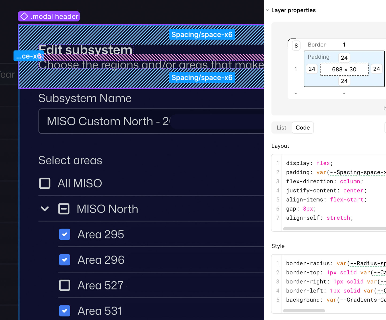
Design It Like It Will be Coded Using Auto-Layout
Auto layout isn’t an optional feature in Figma; it’s an absolutely essential part of your workflow to make your designs production ready. It mirrors how interfaces are built in code, communicating spacing, hierarchy, and responsiveness far better and faster than manually positioning elements. Developers rely on this structure to understand how components should be built and how they will behave across different screen sizes.
Good auto layout usage means avoiding absolute positioning whenever possible and relying on padding and gap settings rather than manual spacing. This helps keep spacing consistent allowing your developers to confidently set exact measurements in code. Additionally, resizing rules, hug, fill, and fixed, should be applied intentionally so it’s obvious how elements should grow or shrink. A simple way to test if this is set correctly is to resize your frame and if the layout breaks or behaves differently than expected, it likely needs refinement.
When you treat it like a core part of your design process, auto layout makes the structure and specs of your design that much clearer to developers.
Remove All Doubt With Clear Design Specs
Developers shouldn’t be guessing or eyeballing measurements in your designs. Documenting clear specs eliminates ambiguity and reduces the time your developers spend asking for clarification during implementation. Spacing, font sizes, line heights, colors, border radii, shadows, and opacity should all be explicitly defined and consistently used throughout your designs.
Design tokens are one of the best ways to document and reuse visual values consistently across your designs. They are also invaluable as a way for developers to map those values directly into code. Random or inconsistent numbers create confusion and often lead to the UI in code not matching the intended design.
Sticking to a well defined spacing and sizing scale makes the interface feel cohesive, makes your design easier to maintain, and makes your developer’s lives that much easier.
Document Decisions as Well as Designs
Screens alone don’t tell the full story. Documentation explains the reasoning behind the design decisions and clarifies how the design should be used. It ensures that your developers, whether they just joined the team or are just returning to an older file, can quickly grasp the initial design thinking and context.
Documentation doesn’t have to be heavy or complex and can live directly in Figma but at a minimum, it should convey the intent of the design, what user goals it is solving for, and what decisions were made during the process.
By documenting intention and not just visuals; you give developers context which leads to better implementation.
Design the Moments Between the Screens
Static designs rarely reflect a user’s real experience. How a user interacts with a screen and how that screen communicates to the user should be clearly defined in your design. It’s these moments that often shape how polished and usable a product feels and if you have them defined, your developers won’t have to guess.
Part of this definition is around the different states the various components that make up your design have. What do hover, focus, active, disabled, loading, error, and success states look like? This documentation shouldn’t just be limited to these states, the entire user flow of a given feature should be mapped out as much as possible. This will give developers a clear understanding of how you expect a user to move through a feature, what potential pitfalls a user may encounter and how the UI will respond, and what edge cases there may be and how the design addresses them.
Figma prototypes are the best way to demonstrate interaction intent but can be time intensive. If you find yourself in a crunch and don’t have the time to build out a prototype for a feature, map out the flow using static screens and written notes. Any level of documentation of interactions and expected behaviors is ideal. Without these being specified, developers are forced to make assumptions which can lead to inconsistent or incomplete experiences.
Collaborate With Developers
You can do everything we’ve suggested in this article to create designs your developers will love, but true success comes from involving them in the design process. When you bring them in, they’ll become invested in the solution. Discussing design challenges and brainstorming solutions together creates a shared understanding and drastically reduces surprises, friction, and delays during development.
Don’t wait to have “finished” designs to show your developers. Bring them in early. Their technical knowledge and unique perspectives will not only help you uncover potential technical constraints but will often lead to stronger design solutions.
This dialogue should continue throughout the life of the project. The more you have these conversations, the more solid your team will become and the better you will work together. When designers and developers both respect and utilize each other’s expertise and work together, the entire process is more efficient and enjoyable.
Ultimately, the best UI is not just the one that looks good, but one that is built correctly, efficiently, and with as much collaboration as possible. Moving from design to production is less about handing off files and more about establishing a shared language and a mutual understanding for the entire team. By using these practices in your process, you’re doing more than just handing off a design, you’re setting your team up for success, ensuring better products, and creating designs that developers will love.
Loved the article? Hated it? Didn’t even read it?
We’d love to hear from you.