
Intro
In Marty Cagan’s book Inspired, he describes the frustrating experience of laboring long to develop product features that went ignored by consumers. The problem that he identifies is that executives would dictate product requirements long in advance without having gone through the product discovery process to determine the product’s value to the user, resulting in technically impressive software that nobody wanted. For UX designers, product usability and learnability can produce a similar dilemma, though further down the funnel. In cases where user experience is insufficiently or improperly considered, the frequent result is cumbersome products which are difficult to learn and therefore go unused. Here the problem is often that although the valuable software “does the thing” according to spec, the experience of the product continually subverts the users’ expectations, making it an utter frustration to use.
In contrast to this, I’m sure that we’ve all had at least one tool that no longer gets noticed when we use it. Instead, that tool feels like an extension of our own body. Before reaching that point of confident comfort though, we had to learn the tool and get the initial practiced hang of it. In software design (as with any tool) this learning period can be longer or shorter depending on how the tool is designed. Therefore, an ever-present concern of UX designers is how do we help the user learn the tool quickly?
How do we learn?
To answer that question, it helps to get clear on our epistemology, or our understanding of how we learn and know things. By considering this, we can get greater clarity on how UX designers can ensure that the value of their product actually reaches the end user. Firstly, humans don’t navigate tools or the world primarily by logic or reason, but rather the majority of our living and doing is upheld by our unconsciously-lived, reflexive and bodily experience. Philosopher Esther Lightcap Meek describes the mechanism by which human knowing takes place as “Subsidiary-Focal Integration,” a process wherein the knower tacitly relies on clues in the world (subsidiaries) to achieve a coming together (focal integration) of those clues. Knowing is that “aha!” moment when the clues come together to become a coherent pattern of meaning, at which point the knower is no longer attending to the clues but only on the integrated whole.
This is a bit technical, but Meek insists that this process is normal in all ordinary knowing and thus bears greatly on our understanding of UX design. According to Meek, we look through the clues to attend to the focus, and this is how we would come to know how to use a tool. To make this clearer, consider riding a bike! At first a child will wobblingly try to pay attention to moving the pedals and balancing and steering and not falling, all the while switching their focus rapidly between these different clues. Yet once they’ve practiced enough, they no longer focus on these clues at all, but rather their focus is shifted to the joy of riding and trying wherever they want as fast as they can. At that point they can even do tricks! Yet if the bike were to do something funny, like their chain caught suddenly, their focus would shift right back to the clues so that it could be reintegrated into the whole.
The ways we know and learn digital tools are no different. As a user interacts with a digital tool, they are building up reflexive confidence in what they are doing as they attend to their goal. At first, they may switch between the buttons, to the navigation, to the data on the page, and back again, but eventually they begin to look through these UI elements to their end goal. If this is how we learn things, then the epistemological question that designers must ask is “which clues do I include and how do I help the user familiarize themselves with them such that they begin to look through them?” It seems to me that Design patterns are part of the answer and are fundamental to building and maintaining the user’s integrated usage of the tool.
Design Patterns are like forest paths
Nielsen Norman Group defines design patterns as “Repeatable solutions for common design problems” and I’d argue that this definition encompasses a broad scope. A design problem is any need that would necessitate augmentation of the tool, and solution can be any element represented in the tool in response to those problems. In the case of digital design, this can be repeated signifiers or objects for communicating affordance or function (like buttons or icons). It could be repeated layout conventions or repeated process or workflow handling. The list goes on and can encompass any decision that’s reflected in the tool, really. The point is that repetition builds familiarity and establishes convention, thus compounding expectation of meaning as that pattern is used more. As a side note, these conventions don’t have to stay local to the medium of digital technology— we see design patterns repeated in road design, architecture, advertising, etc. Design patterns are ubiquitous in our world and should be sourced from the whole of our experience in the world to make the tool make richer sense.
As tools mediate our intent, their usage follows the same process of subsidiary-focal integration that we see in all knowing. Our intent forms a vector starting in the willful agent (the user), it comes to the tool (the UI) and proceeds through it, ending at the outcome. The tool is the means by which the outcome is accomplished, but as we said, the tool has to be inhabited or navigated effectively by the user for that to be the case. In our journey from intent to outcome, we can liken onboarding a new tool to arriving at the edge of a thick forest— the outcome that we seek is through that forest, and we have to get to the other side. A tool that’s designed in defiance or disregard of all conventions is like the Old Forest in J.R.R. Tolkien’s classic, The Lord of the Rings; the trees move and there’s no hope of getting to the other side. There are even websites whose whole purpose as a joke is to confound the user as much as possible through the use of “anti-patterns;” controls so cumbersome and opaque to understand that the frustration is funny. We’ve all probably experienced something like this even in expensive enterprise-grade software, but the service-nature of design should motivate us to avoid these failures and make products that are hospitable to human use.
If the tool itself is the forest that we must traverse, then we can liken design patterns to foot paths in two senses. On the one hand, no matter how thick the woods, eventually a path necessarily will be formed through persistent usage. The path may be crazy and roundabout, but if it’s been trod enough it will be clear and usable eventually. Humans were designed with the uncanny ability to learn and adapt, and given enough time and need, we often learn to cope with tremendous amounts of ambiguity or dysfunction within a tool to use it effectively. In this case, the “pattern” isn’t so much designed as incidental. The other way that design patterns are like foot paths, is as in the case when someone cuts a well tended, clear, obvious, and direct way through. Design and human crafting is so ubiquitous that this is the sort of thing we’re used to and is what we look for if we find ourselves lost in the woods. If we see a clearly maintained path we know not only that civilization is near but also that we can get to it by way of the path. Designing in a convention-fitting manner is like cutting a clear and direct path for the user, and as long as people continue to use it, and the conventions (the path) are “maintained,” the path will remain traversable. Furthermore, the more that people use it, the more the significance of the pattern is compounded! That significance is at one level of magnitude when a pattern is used consistently in a single tool, but it’s another level entirely when the pattern is used commonly across the whole of the internet! In this case, our foot path becomes more like a four lane highway.
How then shall we design?
Thinking back to Esther Lightcap Meek’s pattern of knowing mentioned earlier, let’s consider now what design patterns are actually doing here. When a tool uses a common design pattern, the user is being presented with a familiar clue, one which has become laden with significance through previous encounters. Because this clue has prior meaning, the user can inhabit it more confidently in new contexts, and they can subconsciously gear their expectations toward the outcome they’ve experienced before. To use another analogy, if someone knows how to drive a car well, then it won’t be so hard to drive a bus or a semi-truck given the similar design patterns across the vehicles (steering with the wheel, gas and braking through the pedals, etc.). Design patterns give us familiar handles with which to engage new things.
Two words which serve us designers as guideposts to accelerate user learning are convention and consistency. Firstly, wise designers would do well to lean heavily on common design patterns, as those conventions form the basis of approachability for a new tool. When a designer leverages existing design patterns, they have provided a scaffold of familiarity for the user to rely upon even if the tool is new. In this case, the paths through the forest are clear and direct, so the time it takes to learn the tool is minimized. Convention isn’t much help without consistency though. If a tool relies heavily on strong, conventional design patterns, then deviations from that pattern will be a great shock to the user. It’d be like having a bike whose chain drops at random intervals— if it’s generally a good bike then it will certainly be a surprise, and will immediately draw your attention away from your focus from riding. From there on, you may have the lingering concern that it may happen again sooner or later. Without consistent implementation of patterns within our products, the user grows uncertain, and doubts whether or not they’ll be able to proceed confidently. Although the initial learnability of the product may be high, inconsistent design can thwart the maintenance of that integrated focus, and unfortunately that can begin to affect consumer trust in that product.
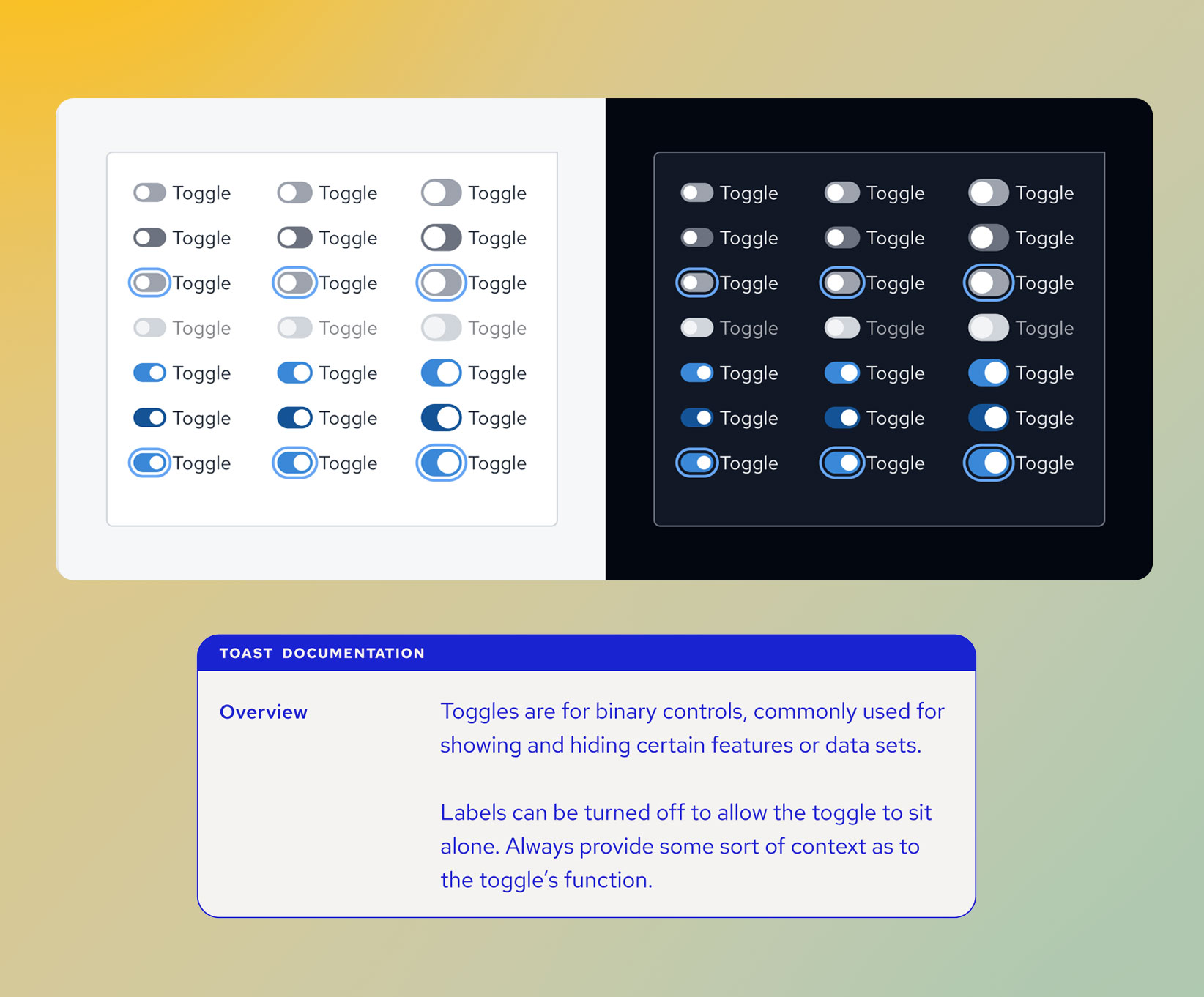
An effective design system is a great way to establish strong convention and consistency within software development. A design system generally consists of both a component library which contains all of the common UI components used in the system, and a set of standards and guidelines on how to design with the components. A design system is like a set of Legos with broad enough instructions to be able to build anything. The discipline of using only the global components available in the library ensures a base layer of consistency at least internal to the app, while the guidelines ensure consistent standards of implementation even with multiple designers working simultaneously. The best design systems, in addition to this, draw heavily on common design patterns and conventions from other applications and build those conventions into the components themselves. So at that point, the system is maximizing universal conventions while maintaining the highest degree of internal consistency— at least from a component level.
A design system is just one powerful tool that designers have in their toolbox, but with attention to these two C’s designers should be able to design products that quickly become effortlessly helpful.
Loved the article? Hated it? Didn’t even read it?
We’d love to hear from you.