
This work was originally presented during the technical paper sessions at the CIGRE Grid of the Future Symposium in Denver. It was an action packed conference, with experts discussing state-of-the-art innovations across generation, transmission, and distribution.
While the sessions covered the full spectrum of smart grid technologies, ranging from AI to grid resilience, one theme kept coming up: Data. Specifically, the fact that we have a massive amount of it, but it doesn’t always speak the same language.
This is especially true when we try to figure out where the grid resides.
It sounds simple, right? We have maps. We have electrical models. We should know where everything is. But as anyone who has tried to align a geographic map (GIS) with an electrical simulation model (like PSSE, TARA, or OpenDSS) knows, it is rarely that easy.
The Grid’s “Where’s Waldo?” Problem
 To modernize the grid, especially to integrate renewables and huge new loads like data centers, we need to know exactly where our infrastructure sits in the real world. We need to check for protected habitats, see if a line is crossing a specific land parcel, or calculate the solar potential at a specific interconnection point.
The problem is that we usually keep this information in two completely different “buckets”:
- The GIS Bucket (The Map): This tells us coordinates (Latitude/Longitude) but is often missing the electrical details like ownership or voltage.
- The Network Model Bucket (The Physics): This tells us the voltage, capacity, and power flow, but it’s often decoupled from the precise geography.
It’s a bit like having a phone book full of names and a separate map of houses, but the names in the book don’t match the names on the mailboxes.
The Data Dilemma: Official vs. Crowdsourced
To solve this, we couldn’t rely on just one source. We had to combine two very different datasets to get the full picture:
- HIFLD (Homeland Infrastructure Foundation-Level Data): This is the “official” dataset from federal agencies like the DOE and FERC. It’s authoritative, but it often has gaps—missing voltage levels or ownership info.
- OSM (OpenStreetMap): Think of this as the “Wikipedia” of maps. It’s crowdsourced and has amazing coverage of both transmission and distribution, but the data quality and completeness varies wildly.
By blending these two, we get the best of both worlds: the authority of federal data with the granular coverage of the crowd.
Building a Translator: The Graph-Based Approach
So, how do we fix this without spending thousands of hours manually staring at maps? We built a methodology that acts as a universal translator. We treat both the GIS data and the electrical model as graphs (nodes and edges) and use algorithms to match them up.
We don’t just look at one thing; we use a “three-check” system to make sure we aren’t making mistakes:
1. Name Matching (The “Fuzzy” Logic)
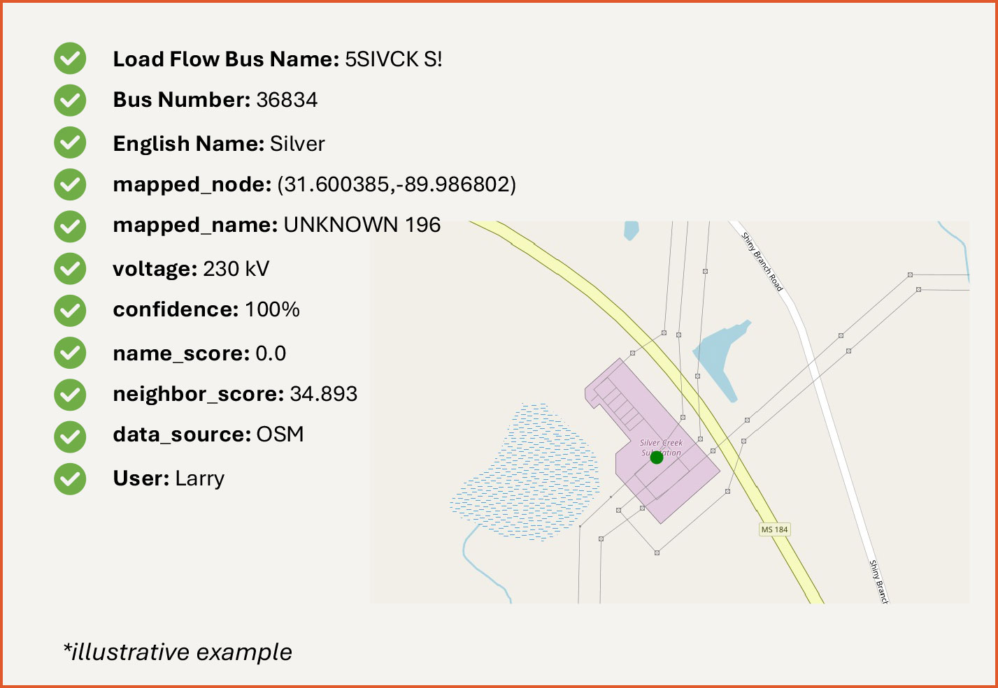
Exact name matching rarely works in the utility world. A bus might be named 3SE. VICKSBRG in the load flow model but SOUTHEAST VICKSBURG in the GIS data. To a computer, those are totally different.
We utilize the thefuzz Python library to handle this. Specifically, we use a method called Token Sort Ratio. This takes the strings, breaks them into words (tokens), sorts them alphabetically, and then compares them. This allows VICKSBRG SE and SE VICKSBURG to be recognized as a match, whereas a standard check would fail.
2. Voltage Check (The Physics Gate)
Physics still rules. Even if the names match, we enforce a strict voltage compatibility check. We ensure that a 230kV bus in the model never accidentally maps to a 69kV substation on the map.
3. The Neighbor Test (Topology)
This is the secret sauce. If the names are ambiguous, we look at the neighbors. If Node A connects to Node B and Node C in the electrical model, we look for a substation on the map that also connects to those same neighbors.
We even check the physical line length. If the GIS line is 10 miles long but the electrical model says it should be 1 mile, we penalize that score.
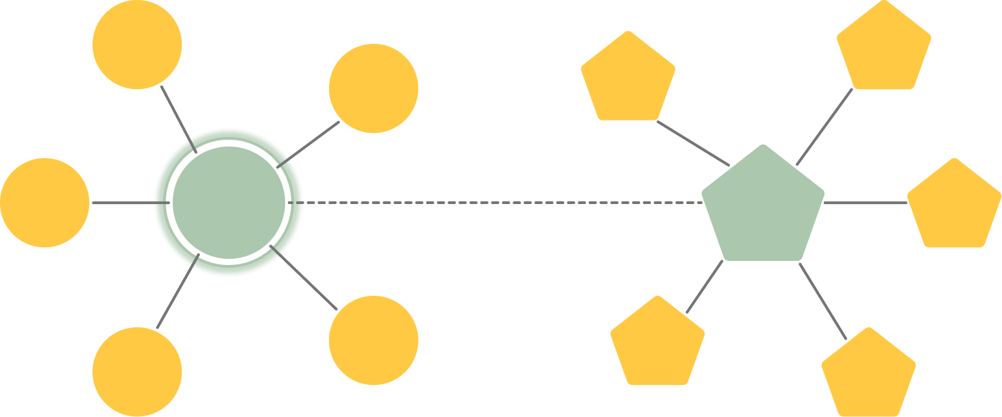
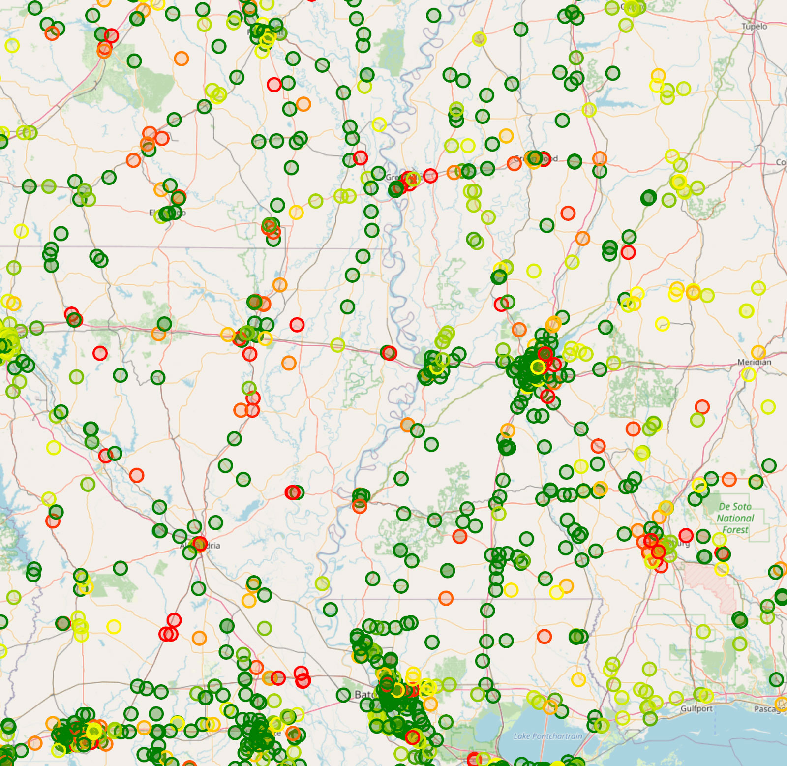
This creates “anchors”—high-confidence matches (70% or higher) that lock the map in place. Once we have those anchors, the rest of the puzzle becomes much easier to solve.
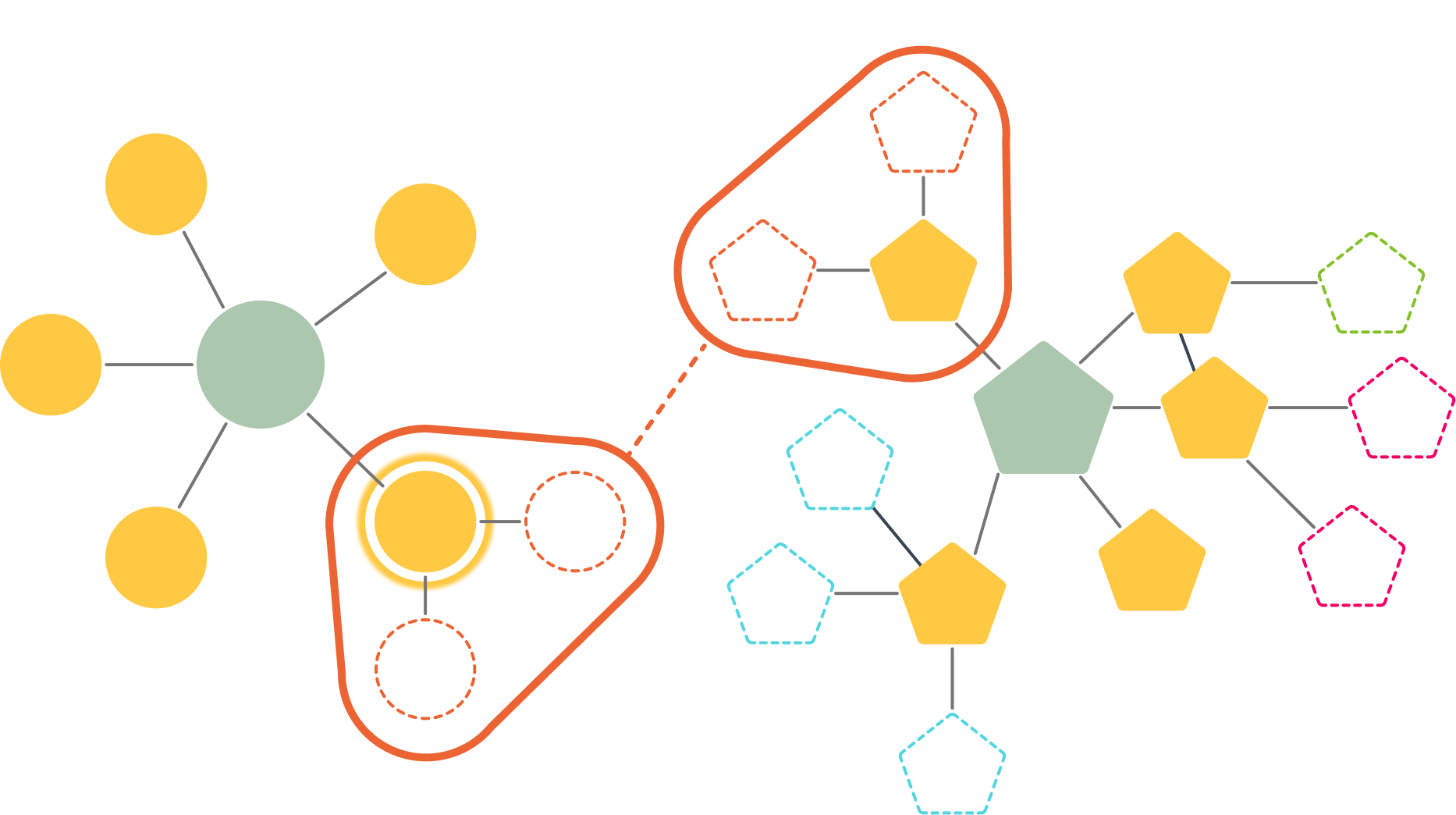
We use these confirmed anchors to triangulate the rest of the network . Even if a substation is missing a name, we can identify it by its topology. By verifying that it connects to the same confirmed neighbors with consistent line lengths, we propagate confidence outward. This allows us to solve the puzzle through structural consistency rather than relying solely on metadata.
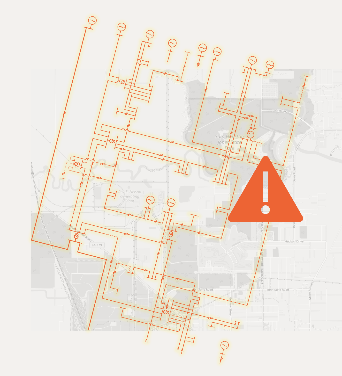
The “Black Holes”: Mapping the Unmapped
What about the equipment that just isn’t on the map? Maybe the GIS data is old, or the line is new.
We developed an iterative technique using Depth-First Search (DFS). If a node is missing coordinates, the algorithm searches the network for the nearest mapped neighbors. Once it finds them, it mathematically averages their Latitude and Longitude to estimate where the missing substation should be along the defined line path. It fills in the blanks, ensuring we have a fully connected, spatially accurate network model.
The Reality Check: Human-in-the-Loop
I am a huge proponent of automation, but I am also a pragmatist. Data is messy. Algorithms aren’t perfect. If we blindly trusted the code, we’d end up with phantom substations in the middle of a lake.
That is why our process includes a strict Manual Validation step.
We take the matches that the algorithm is “unsure” about (medium to low confidence) and have an expert review them against satellite imagery or aerial maps. It’s a “validate first, analyze second” approach. These validated nodes then become new anchors, allowing us to re-run the algorithm and solve even more of the network automatically.
Closing the Gap
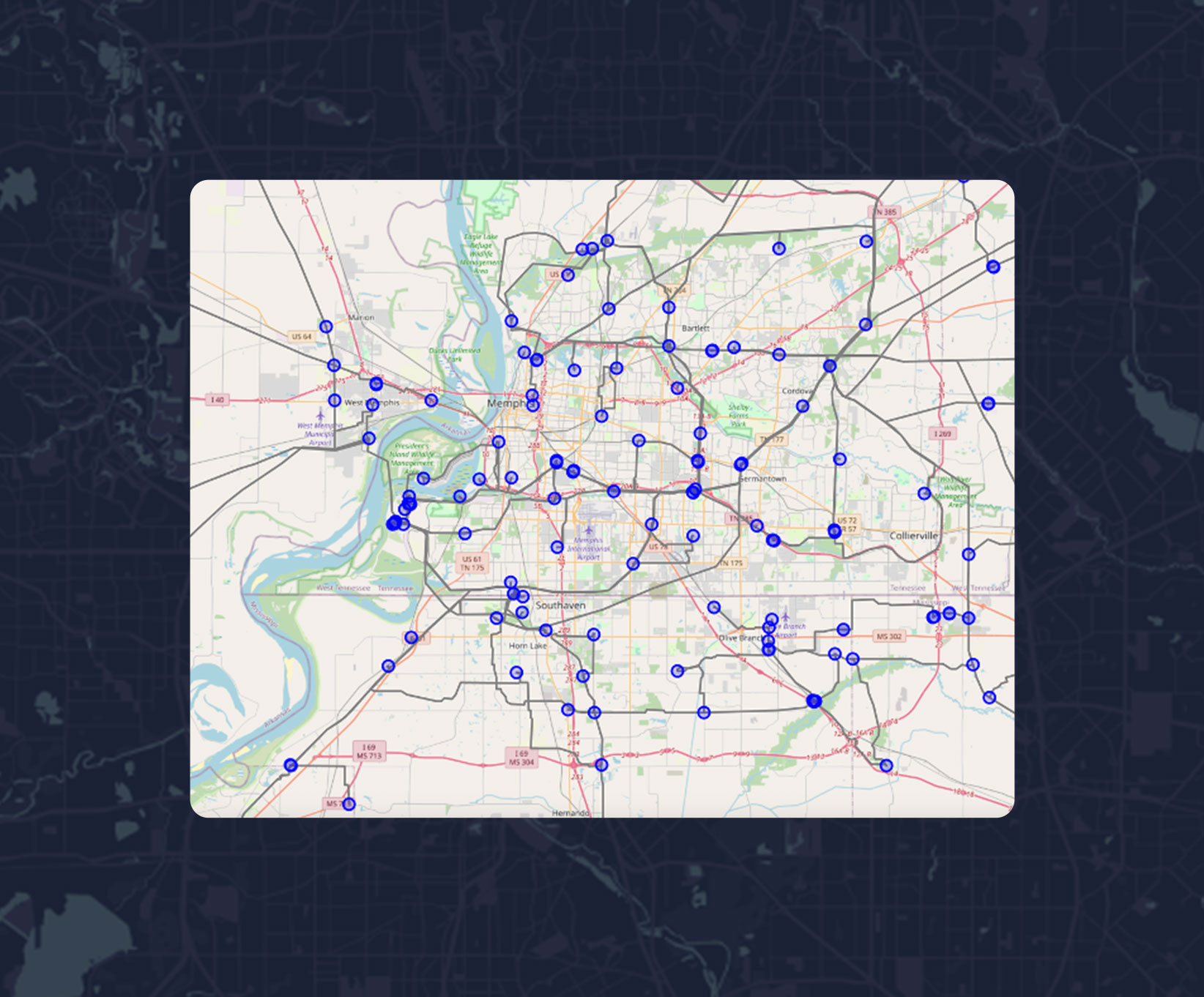
The result? As shown in our results below, we move from a disconnected spreadsheet to a living map where high-confidence matches (the green dots) help us triangulate the rest of the grid.
This isn’t just about making pretty maps. By bridging the gap between “Physics” and “Geography,” we unlock real capabilities:
- Faster Interconnection & Resilient Grid Expansion: We can instantly see if a Point of Interconnection (POI) is viable based on land use and terrain.
- Resource Assessment: We can overlay solar and wind data directly onto the grid model to see their potential..
- Spatial analysis & planning: Visualize available capacity on lines and substations for new generation or load.
If we want to build the grid of the future, we must start by knowing exactly where the grid of today is located.
If you are wrestling with data silos or want to geek out on the specific graph algorithms we used, feel free to reach out or check out our full paper from the CIGRE symposium.
Loved the article? Hated it? Didn’t even read it?
We’d love to hear from you.