
I work with engineers who are solving complex problems on the electrical grid. Their research is sophisticated and impactful. But communicating those ideas clearly to an audience is often the hardest part.
When you can’t see the idea
through the words
It is easy to fill presentation slides with dense bullet points explaining a complex process.
But when an audience is presented with long paragraphs of text, they start reading instead of listening. They try to reconstruct the idea from the words on the slide.
The result is that the core concept, even if the research is excellent, becomes harder to understand.
Heavy text, lack of visual structure, no clear process flow.
Visual design can clarify the concept
Humans can recognize visual patterns and relationships in milliseconds, which allows diagrams to communicate complex ideas far faster than paragraphs of text. Cognitive research shows that images activate both visual and verbal processing systems, improving comprehension and reducing cognitive load.¹²
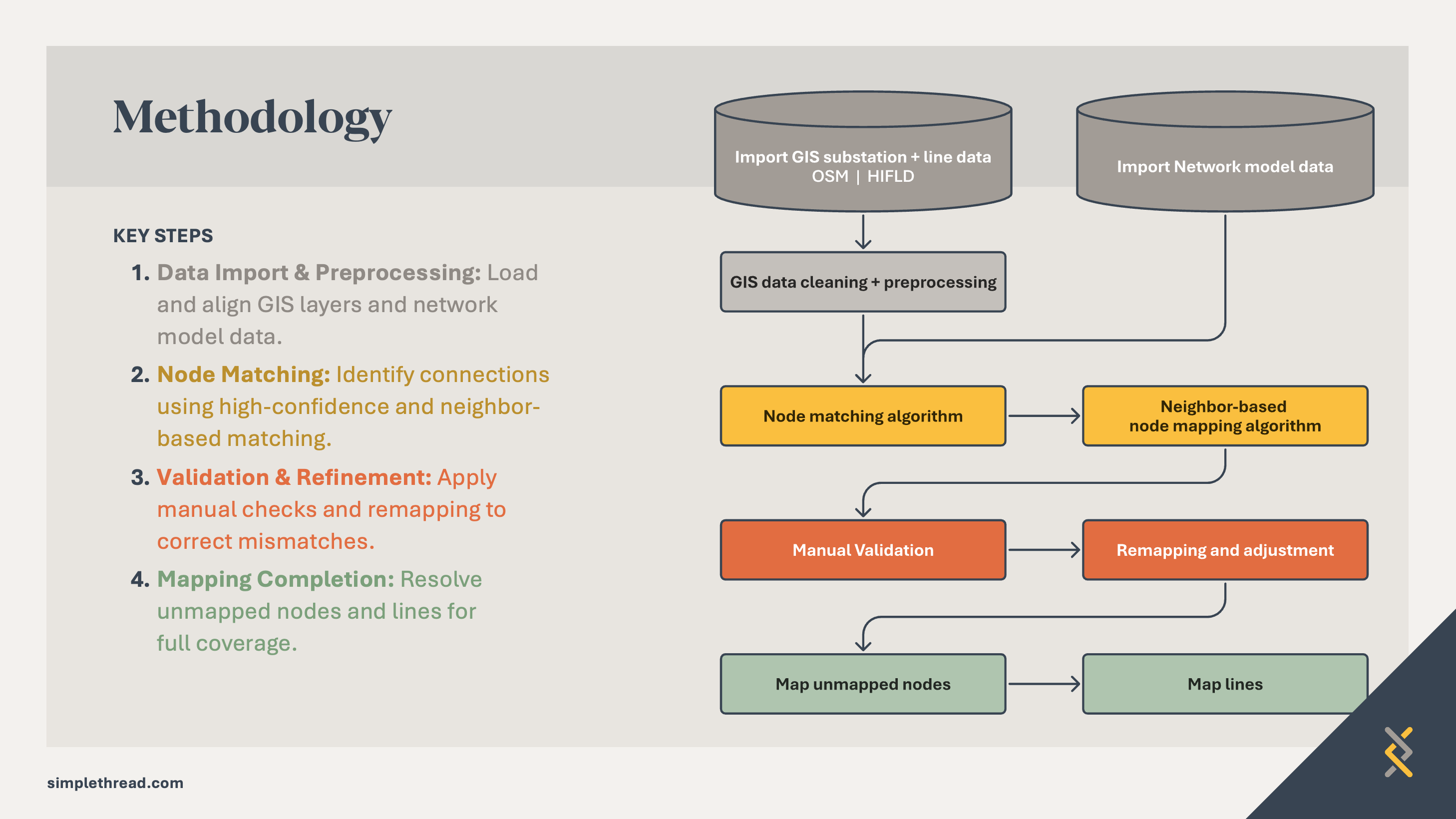
A simple flow diagram communicates the core idea immediately.
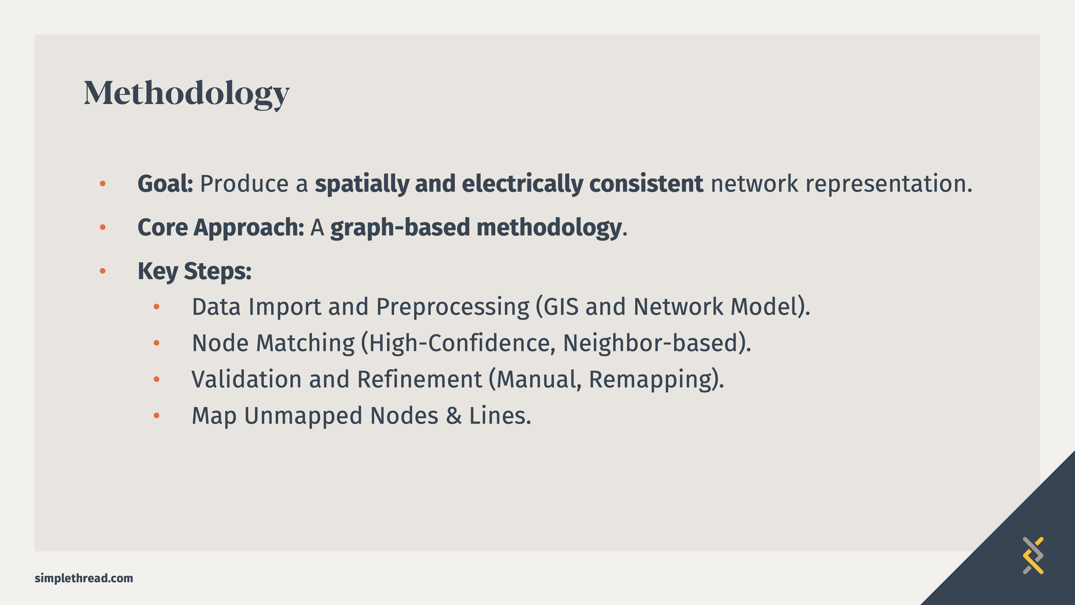
The slide design process
Step 1: Read the text slides
Even though I talk about the text slides not working for the final presentation, they are the first step for me. I review the content to get an initial idea of what the main ideas are throughout the presentation. Usually this is where I will use Google or AI to understand the terms being used and how others may have represented the concept. I’ll throw any images into a collaborative space like FigJam.
Step 2: Meet with the engineer
I am lucky to work alongside Inalvis who is always ready to brainstorm visuals with me. She is not afraid to sketch out concepts. We workshop these together.
Step 3: Utilize visual design principles to emphasize meaning
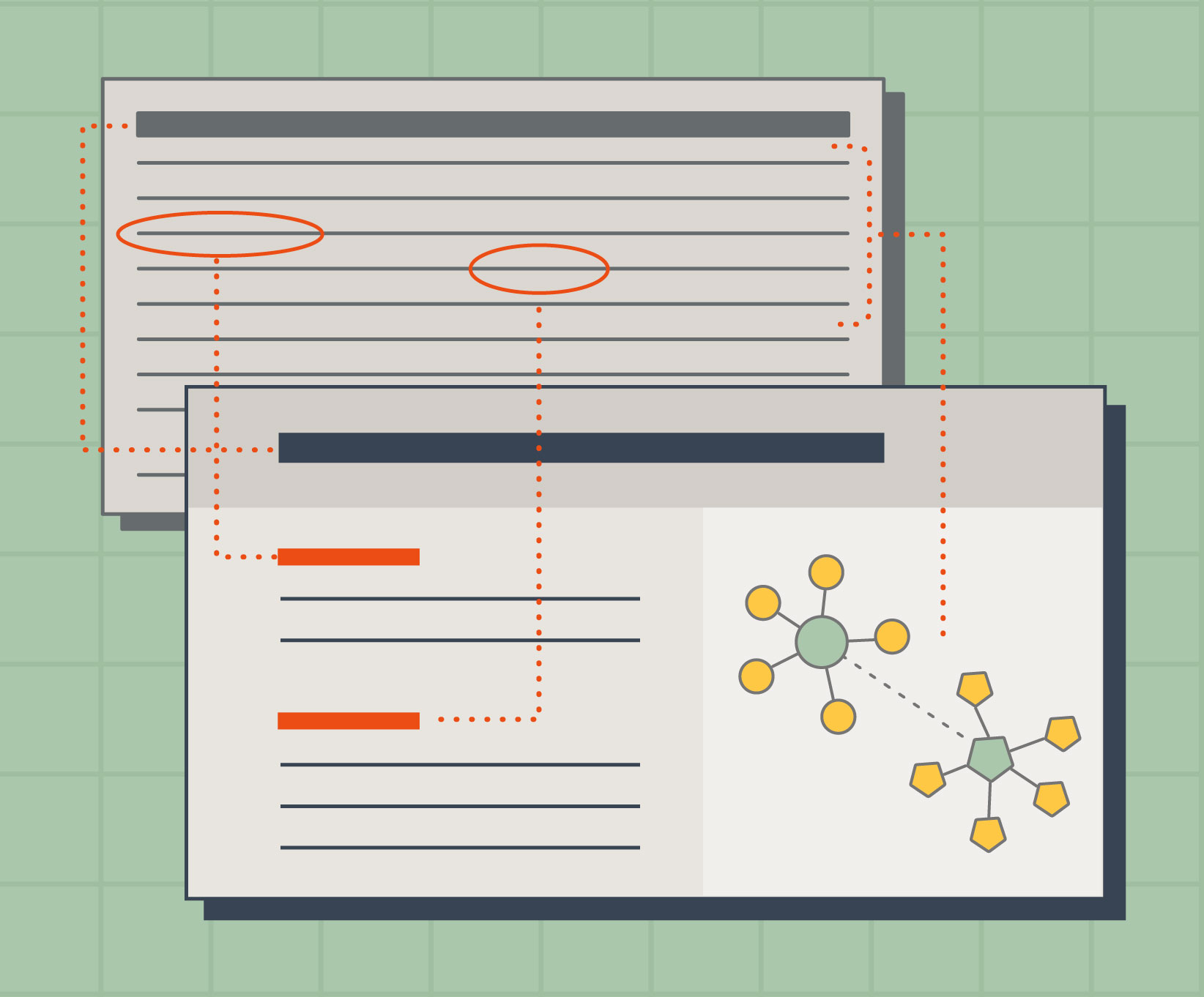
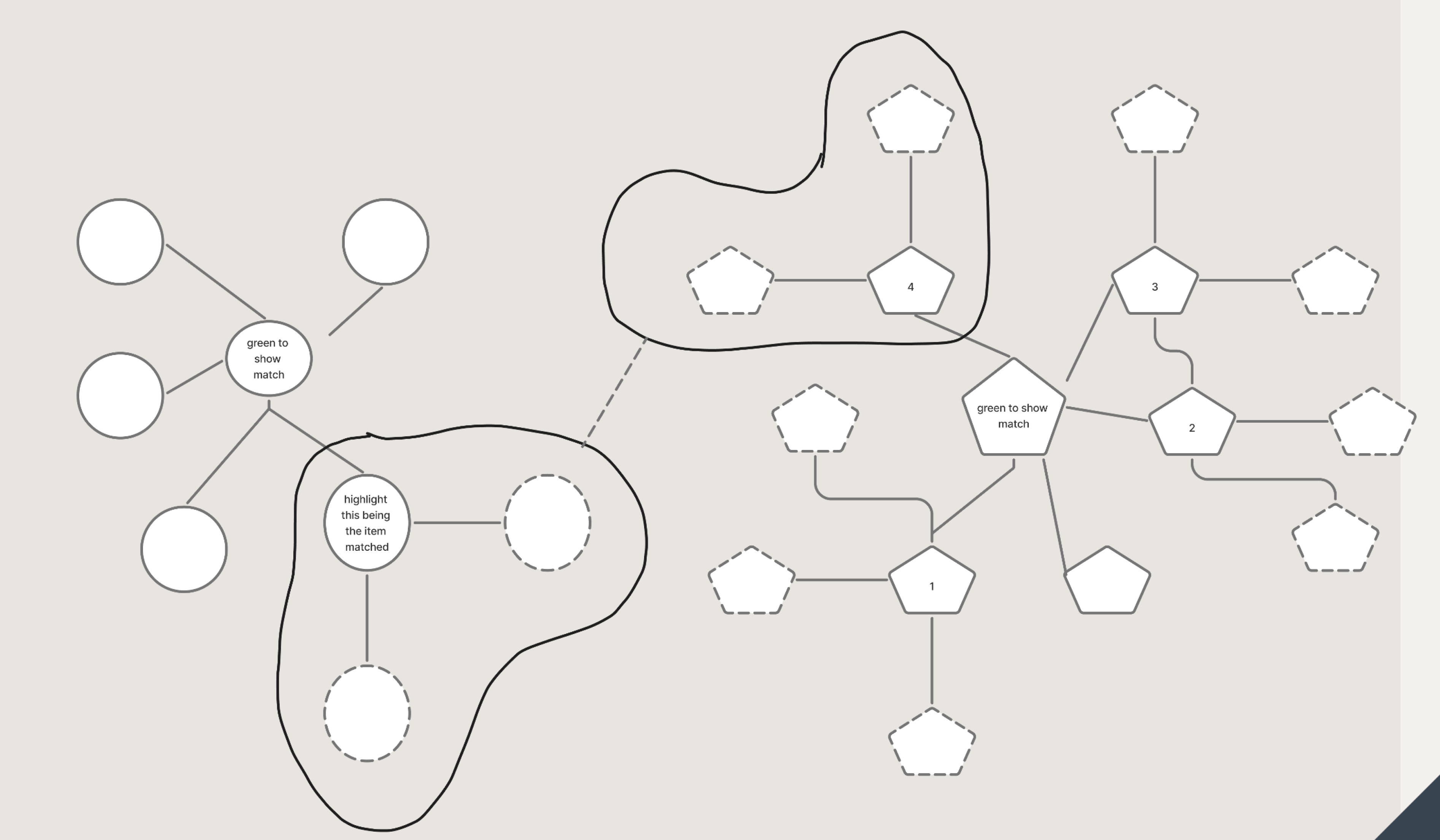
In this example, the diagram shows how unmapped transmission nodes are identified by comparing local network structure and electrical characteristics. The algorithm looks for nodes with similar neighbor patterns and compatible voltage levels, then assigns similarity scores to determine the most likely matches. The addition of color and line type add more variable indicators.
The diagram visualizes how the algorithm looks for similarities between the nodes. (In this case, the similarities are the yellow base shapes that extend from a green shape. The yellow shapes have two red dotted line connections.) The algorithm uses similarities to make educated decisions about what nodes match.

Step 4: Reduce text and increase structure

Visual hierarchy is extremely important with slide layouts. Text sizes, font choices, and color all contribute to how the eye reads the information. The eye starts in the upper left, reading the largest headline font, then the headers of the text because of the vibrant color, and the bolded text. The yellow callout box leads to the diagram.
Before the Redesign
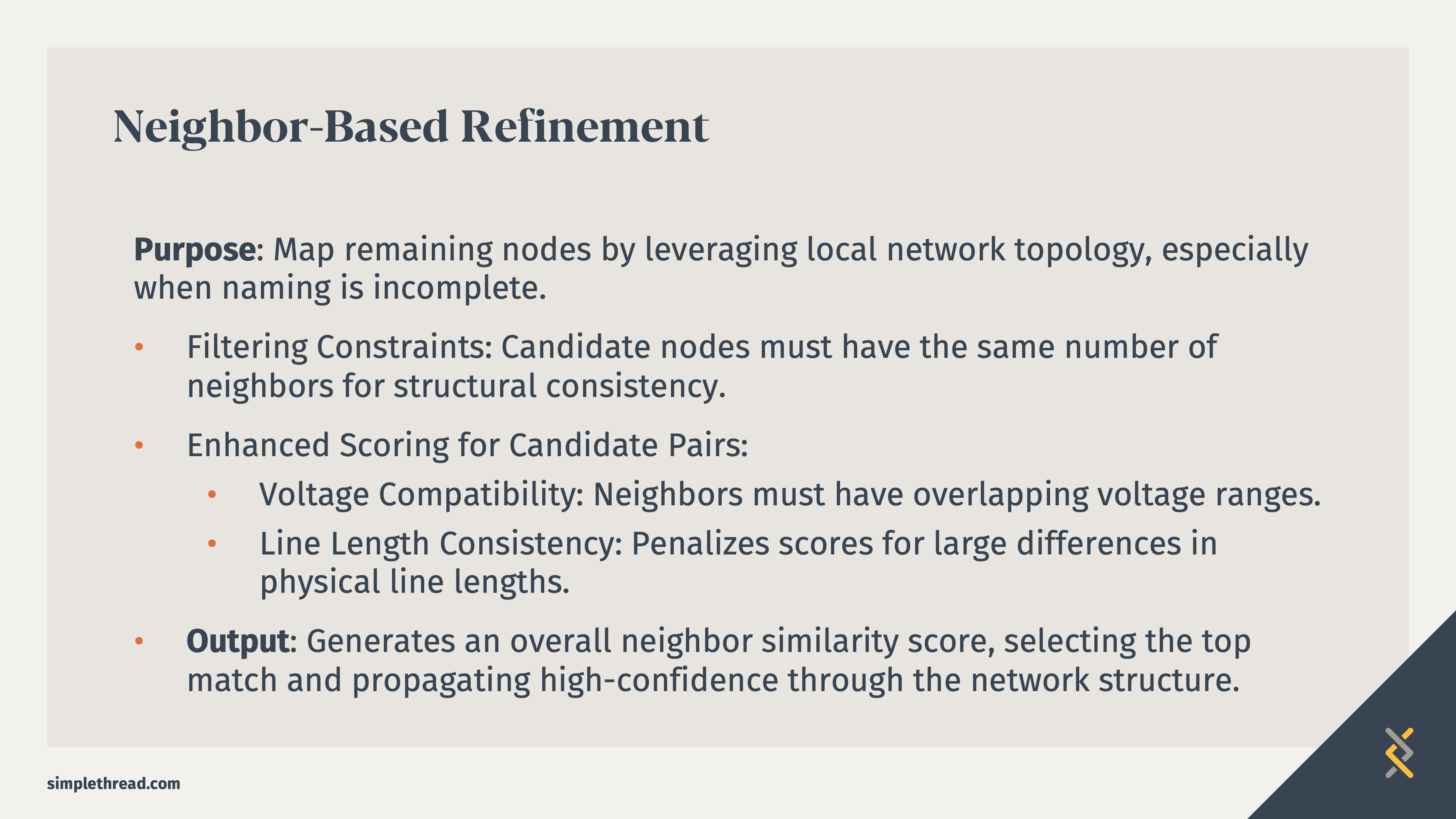
The original slide explained the algorithm using text:
- Filter nodes by neighbor count
- Evaluate voltage compatibility
- Penalize large line length differences
- Generate similarity scores
The explanation was technically accurate, but the audience had to mentally reconstruct the process.
After the redesign
Instead of explaining the algorithm in text, the slide shows the structural relationships directly.
The diagram illustrates how the algorithm compares neighboring nodes and identifies patterns that indicate likely matches.
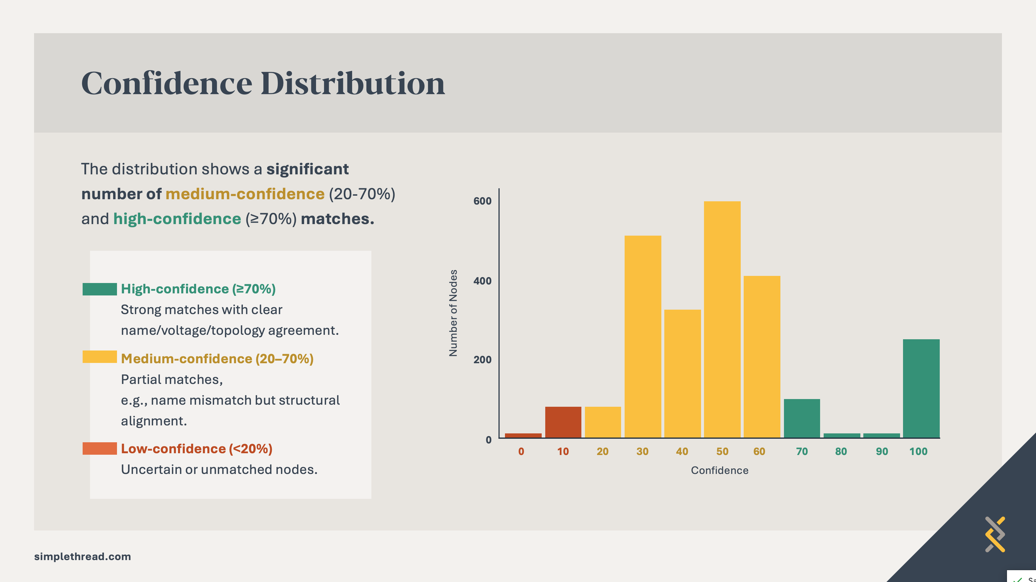
The example below uses color and structure to emphasize the takeaway—showing the majority of medium- and high-confidence matches.

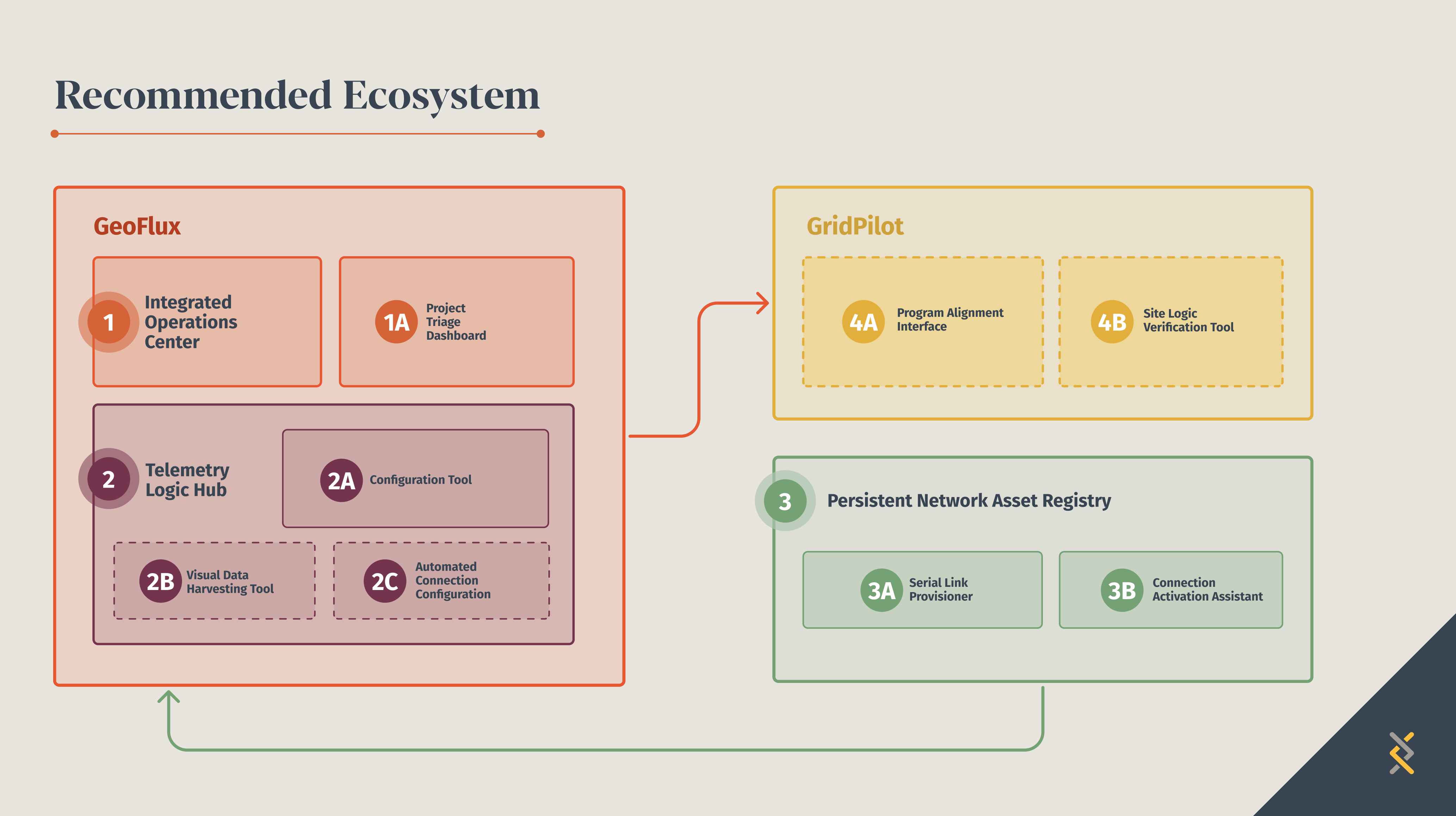
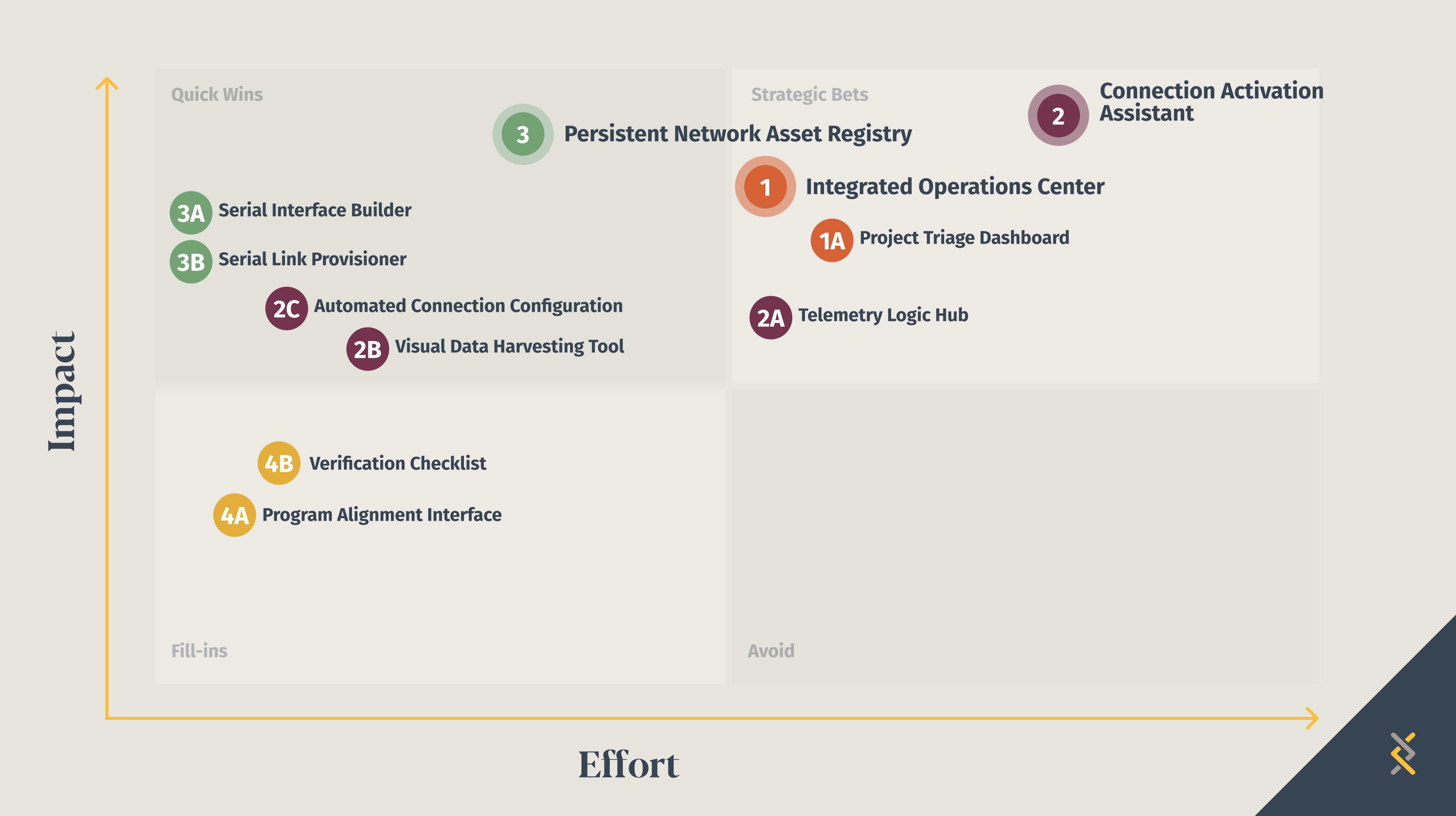
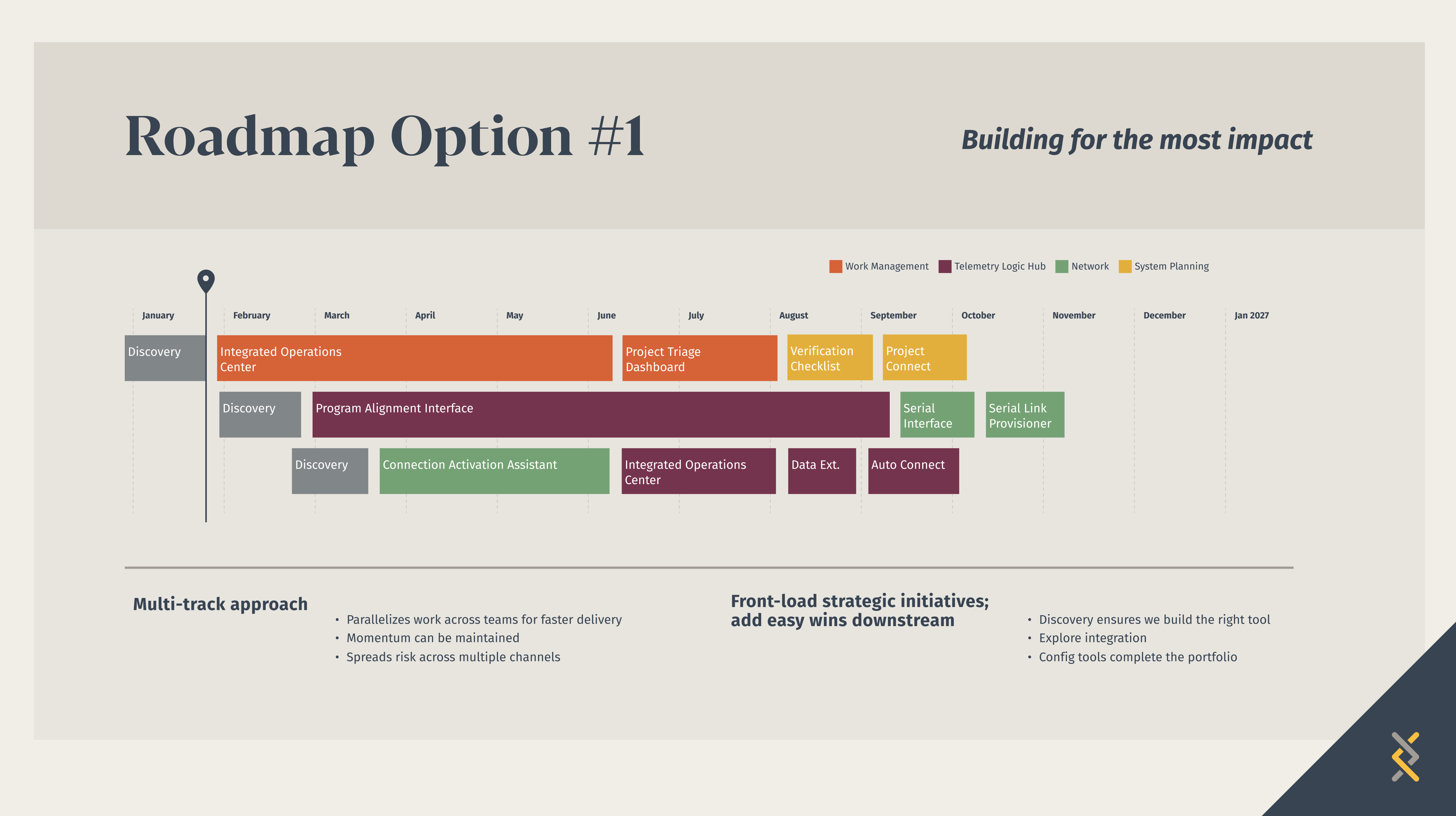
The following examples illustrate the power of using color throughout a presentation to support the audience’s understanding of connected topics. Each color represents a different project. Keeping the colors consistent emphasizes each point like where the project falls in the technology architecture or how long it will take in the timeline.
Visual thinking matters for communication
Engineers regularly work with systems that involve networks, workflows, and complex relationships. These ideas are inherently visual.
When those ideas are explained through diagrams instead of dense text, audiences can understand the concept faster and focus on the innovation behind it. Clear visuals don’t simplify the work, they help others see the insight behind it.
- Mary Potter et al., research on rapid visual categorization showing images can be identified in as little as 13–80 ms.
- Allan Paivio, Dual Coding Theory, explaining that humans process information using both verbal and visual cognitive systems.
Loved the article? Hated it? Didn’t even read it?
We’d love to hear from you.