
When I made the jump from my traditional graphic design role to a new position in UX/UI, I often found myself trying to describe the difference between the two. My friends and family would look at me with furrowed brows as I attempted to explain what the new role would entail. I realized in these strained conversations that the term “user experience” was apparently not as prevalent as I had come to believe. And graphic design seemed to be understood exclusively from the final product; the pretty picture, if you will.
I found myself saying things like, “more problem solving and functionality; less art,” to the unfamiliar audience. But was that true? Was what I was doing in graphic design all that different?
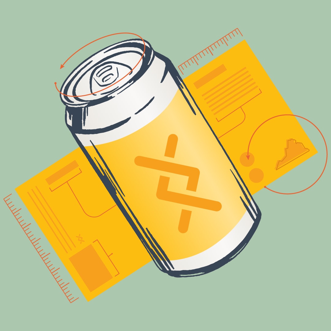
At Simple Thread, we often describe the UX process as a series of five phases – Research, Define, Prototype, Implement, Operate. It seems to me that these steps are critical to the design of just about anything, and I’d like to explore them through the lens of one of my favorite graphic design projects: the craft beer label.
Imagine we’re tasked with designing a beer label. That’s simple enough, right? We just need something that identifies the contents. Make it pretty. We need it by tomorrow. Is that enough to finalize a design? Maybe. But certainly not a good one.
Let’s explore the steps of the design process.
Step One: Research
For the design to be effective, we need to start by understanding the product, the brewery, the distribution plan, the audience, and the competition.
We have a lot of questions to ask: What is this beer? Are there any unique identifiers to this particular brew, like different hops or unusual ingredients? How does it differ from other beers at this brewery? How will it be distributed? Who is the audience?
Answering these questions is critical to delivering a successful design. Just like in UX, we need to fully understand the problem before we can begin to solve it.
The research phase is also multifaceted. We need to understand the product itself and the brewery that’s producing it, but we also need to consider the goals of the visual style. Looking for inspiration, sometimes on the supermarket shelf, will help us form a vision for things like color palette, typography, and illustration style.
Step Two: Define
Once the product is identified, more definition around the label comes into play. There are technical considerations to take into account like the size of the vessel (often 12 or 16 ounces), the availability and timeline of the materials, and the intended release date.
As we begin to think about designing the label, we need to know if it will be applied like a sticker to the can, shrink wrapped for full coverage, or printed on the metal itself. More involved production techniques are often only cost effective at high quantities, and understanding the process is critical to setting up our file correctly for the printer.
There are also legal considerations for packaging; rules that are more stringent for alcohol sales than much else. Part of defining the design is identifying what components are essential to include. In the beer label world, those elements include the legal warning, the address of the brewing and canning facility, the size of the can, the ABV, and the name and style of beer. With, might I add, some awfully specific rules like the text size, placement, and even character count per square inch for some of the more legal components.
We also need to define our goals for the visual language. Some breweries have visual systems that help buyers quickly understand what they’re getting. The blue one is a pilsner, the white is an IPA, etc. We need to decide if this label will fit within a pre-existing system, create a new system, or be a unique one-hit-wonder.
Step Three: Prototype
Now it’s time to put our elements together and start creating the bones of the label. A low fidelity mockup for a beer label is a rough placement of the brewery logo, beer name, legal requirements, and illustration footprint to gain an understanding of how the elements will interact with each other.
This wireframe, or sketch, gets wrapped around old cans and analyzed for things like type hierarchy and visual appeal. At this stage, we’re determining what elements should be most pronounced and why. If we’re designing for an established brewery with a solid reputation, there’s a good chance that a potential buyer might select this can based on the logo alone. If the beer itself is seasonal or includes unique ingredients, the name or style of beer might be the most compelling component.
The prototyping phase includes early wireframes and sketches which will later transition to more completed designs. This can be a tricky step because the design needs to be completed enough to communicate the idea, but not so complete as to sink precious billable hours on detailed design work that may or may not make the cut.
Step Four: Implement
After the trial and error of quick prototyping, it’s time to design the final label. This phase is what most people think of when they envision designing something – it’s the part when final colors, type, and layout come together to create something that didn’t exist before. It’s when the magic happens. But really, it’s the last step.
The implementation of the design requires knowledge from the research, define, and prototype phases to create an effective final product.
Step Five: Operate
The last phase of the UX process is to set the product free, let it operate, and measure the results. For our label, success may be measured by sales numbers in the taproom and in distribution, or by whether it was completed in time for canning day.
Conclusion
In UX, these five steps are a very iterative process. Results are measured and changes are implemented as new needs develop. The steps are not always adhered to in a perfectly linear fashion. On the flip side, once the beer label exists in the world, there it is. We can iterate on the next round of canning and make different design choices the second time around, but we don’t have the ability to update this version in real time.
The design for a craft beer label sounds simple, but the design process is closely aligned to that of the UX/UI workflow. I am still learning the myriad of ways they differ – the unique programs and processes, the more in-depth research, the iterative nature, and the focus on the user’s needs. But as far as I can tell, all good design should follow these steps. Form should always follow function, and it’s never been just about pretty pictures.
Loved the article? Hated it? Didn’t even read it?
We’d love to hear from you.