
Steam is the biggest digital platform for PC games with 120 million monthly active users. While it is primarily a storefront for buying and playing games, games published on the store also have community hubs where users can share artwork, guides, and other user-created content.
Developed by Valve, Steam is available on the web and downloadable as an app on macOS, Linux, Windows, and mobile devices, not to mention it’s built into Valve’s own handheld console, the Steam Deck. Needless to say it’s important for it to work across a variety of screen sizes and input devices. Since it’s so big and synonymous with PC gaming, I was curious how the website stacks up in terms of accessibility.
For this blog, I’m going to skip the low-hanging fruit such as low contrast and text scaling and focus more on things I haven’t seen talked about as much. What I’ve found is that Steam has some major pain points that make browsing the store a worse experience for both keyboard and screen reader users.
Invisible Elements

Many focusable elements aren’t visible and not all focusable elements have clear focus indicators. On the desktop home page it takes 16 presses of the tab key before the first visible item, the Steam logo, is focused. The mobile navigation menu is hidden, but only visually, requiring the user to tab through it. This menu can be hidden from screen readers and the tab flow using display: none.
On smaller screen sizes where the mobile menu is visible, it slides in and out from the left edge of the window. This could be why display: none isn’t used here. Until recently, CSS transitions didn’t work when changing display to and from none. CSS transitions and animations now support animating properties with discrete values. This is a new and experimental feature, so appropriate fallbacks need to be added for better browser support. An alternative solution that works on all browsers is to:
- Add
aria-hidden=”true”to the menu. This hides it from the accessibility tree used by screen readers. - Set
tabindex=”-1”on all of the links to prevent the user from focusing on them. - Toggle these attributes on and off whenever the menu is opened and closed.
Inaccessible Content
Un-focusable Interactive Elements

In a similar vein, many visible and interactive elements aren’t focusable with the keyboard. The language selector at the top uses a span which isn’t focusable by default. The site language can’t be changed with the keyboard alone, but it is possible using Voiceover on macOS. Using a button in place of a span instantly makes it accessible to keyboards and gives it a proper role in the accessibility tree. The only additional work needed here is to remove the default button styling. Adding this CSS gets it pretty close to the original styling:
{
  background-color: transparent;
  font-size: inherit;
  line-height: inherit;
  border: 0;
  color: inherit;
}
More work can be done to make the language selector more accessible but turning it into a button is already a big improvement and doesn’t take much effort.
Multiple Ways to Access Content

The global navigation bar at the top of the page contains dropdown menus that appear only when hovered and are completely inaccessible to keyboard users. This would be less of a problem if there were other ways to navigate to these subpages except there aren’t, not any that are easy to find at least. The top-level Community link sends users to a new domain, steamcommunity.com. The Community dropdown menu contains five other links: “Home”, “Discussions”, “Workshop”, “Market”, and “Broadcasts”.
The “Home” link routes to the same URL as the top-level “Community” link which fails WCAG 2.1 Success Criterion (SC) 3.2.4: Consistent Identification.* “Broadcasts” links to the same page with the Broadcasts tab open. “Discussions”, “Workshop”, and “Market” all link to the respective community subdirectories. Between all of these different community pages, the only apparent way to navigate between them is through the global navigation bar. This means entire sections of the website are essentially invisible to anyone who doesn’t use a mouse to browse, violating SC 3.2.5: Multiple Ways.
To give Steam some credit, most people probably aren’t interested in the top-level community pages (steamcommunity.com/discussions), but instead the game-level community pages (steamcommunity.com/app/870780/discussions). These include “Discussions”, “Workshop”, and “Broadcasts” which are all accessible from the individual game store pages or the game view from your library. The Community Market appears to only exist at the top-level. A persistent community navigation bar across the community pages similar to the store page navigation could alleviate these discoverability and navigable issues.

* Interestingly, this is where the website and the desktop client differ. The top-level links in the desktop client point to the last visited URL for that section so you can switch between sections without losing the last page you visited.
Unskippable Content
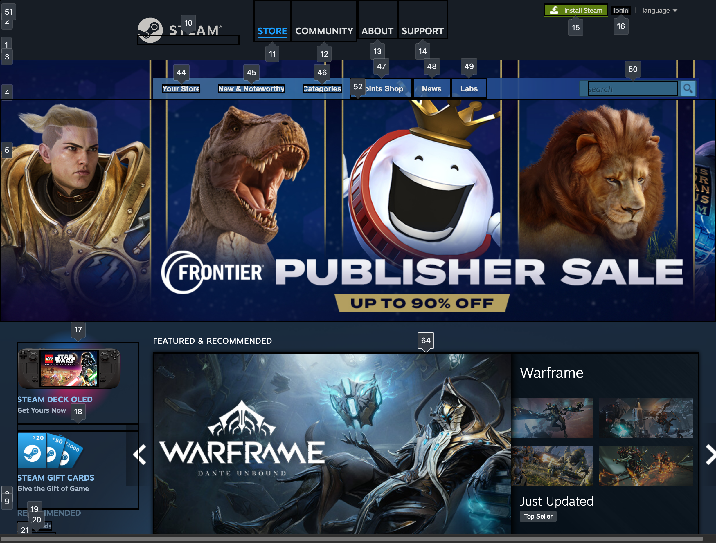
To reach the main content of the page, a user needs to tab through the hidden mobile navigation menu, the global navigation bar, the side navigation, and then the store navigation with the search bar. Mouse users can easily “skip” through all of this since they can just ignore and “hop” right over everything. Keyboard users have no choice but to wade through all of this content, failing SC 2.4.1: Bypass Blocks. Having to go through this on every page load is very tedious.
Improving Site Navigability for Keyboard Users
Adding a skip link to the main content area can make this experience more tolerable. A skip link is a link that is visually hidden and placed at the very first tab stop. When keyboard users first press tab, this link is focused and revealed. Depending on the implementation, this could skip focus past the navigation or more commonly, to the beginning of the main content of the page.
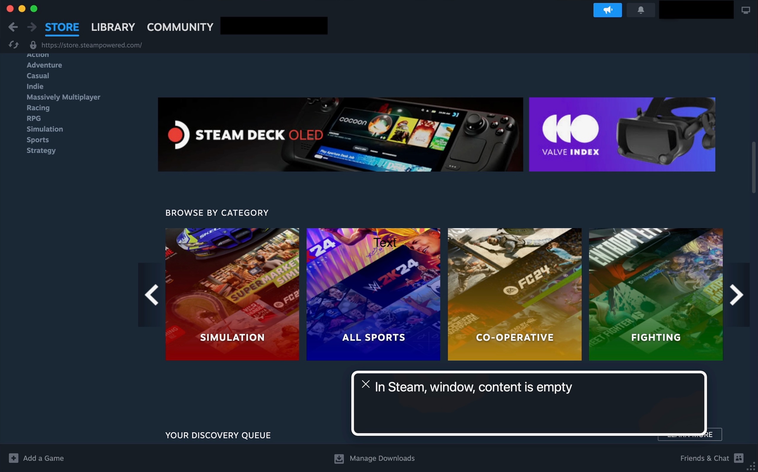
Even the main content area is cluttered with unskippable blocks. The first item in the main content area is the “Featured & Recommended” section which consists of a content slider or carousel. The only way to pass through to the next section is to tab through every single item in the carousel. The home page is filled with these unskippable sliders that need to be tabbed all the way through. A low-risk, low-effort solution for this is to add skip links between these sections. A good implementation of this is the Canva home page which uses skip links to skip forwards and backwards between sections:

Improving Navigation and Comprehension for Screen Readers
Screen reader users can skip around the page by navigating through the headings, although the home page heading structure could use better markup. Some of the headings contain superfluous text or aren’t accurately described. For example, the “Special Offers Browse More” section is named that way because the “Browse More” link is inside the header.

All of the “Midweek Deals” are for cards in the “Special Offers” carousel. A better, more accurate heading for these should include the name of the games, such as “Midweek Deal: Kenshi.” Furthermore, since these are inside the “Special Offers” section which has a level 2 heading, these should be level 3 headings. With descriptive headings and proper heading levels, screen readers can glance at the headings and quickly understand the organization of the page more easily.
Big Picture Mode
A Controller Friendly UI

Big Picture mode is an alternate UI available only on the desktop client. This interface is meant to deliver a console-like experience that is usable with a controller. Compared to the normal web version, UI elements and text are scaled up and everything has a clear focus indicator. Although it’s clearly designed for more of a couch setup with a gamepad, Big Picture mode also works well with the keyboard, which has the added benefit of being able to use arrow keys to navigate, allowing users to easily escape out of the same unskippable sliders on the web version of Steam.
Big Picture mode also works better than the regular website for those that require assistive technology to browse and play games, especially since it supports accessible controllers like the Xbox Adaptive Controller. However, it isn’t a reliable alternative to the website since it’s a feature of the client app which firstly needs to be installed and secondly doesn’t cover everything included on the website.
Note that all of this testing was done directly on the website. Most users probably use the desktop client, which doesn’t work at all with Voiceover on macOS. On Windows, I’ve read people have had workable experiences with JAWS and NVDA.
Minor Details Have Large Impacts on Accessibility
Valve originally developed Big Picture mode so people could have a better experience playing games from their couch. Why can’t they do the same for keyboard and screen reader users and make playing games as well as participating in these gaming communities more accessible to them? I’ve only scratched the surface of accessibility issues on Steam, but a lot of the issues uncovered here that have a big impact on accessibility experience can be improved with relatively low effort.
Improving accessibility isn’t a monumental task.
It would be a shame for the biggest gateway to gaming on PC to lag behind in inclusiveness at a time when more game developers are prioritizing accessibility in their releases.
Loved the article? Hated it? Didn’t even read it?
We’d love to hear from you.


Hi, I really enjoyed this article. I think it is very thorough. I downloaded and ran the Steam desktop client yesterday and am having trouble navigating it with JAWS and NVDA. Can you please share me the articles or posts you mentioned so that I can learn how to improve my navigation? Thank you.
Hi,
I’m not sure what your experience is with screen readers but this is a good start:
https://www.sarasoueidan.com/blog/testing-environment-setup/
As for steam-specific screen reader help, I’m not sure if there are any additional resources that can help. Back last June, Steam did push an update addressing some accessibility concerns, one of which included a built-in screen reader, although this is only available if you’re using steamOS.
https://steamcommunity.com/games/593110/announcements/detail/824835185591718586