
Schadenfreude Has a Posse
I’ll be honest, I haven’t paid much attention to Windows over the past 10 years. I’ve checked in periodically to chuckle at Metro Tiles, to meet and quickly say goodbye to Windows Phone, and to learn that skipping from version 8 to 10 was a totally cool and intentional choice. But like a lot of people in the tech industry, I gladly left Windows behind long ago and haven’t missed it since.
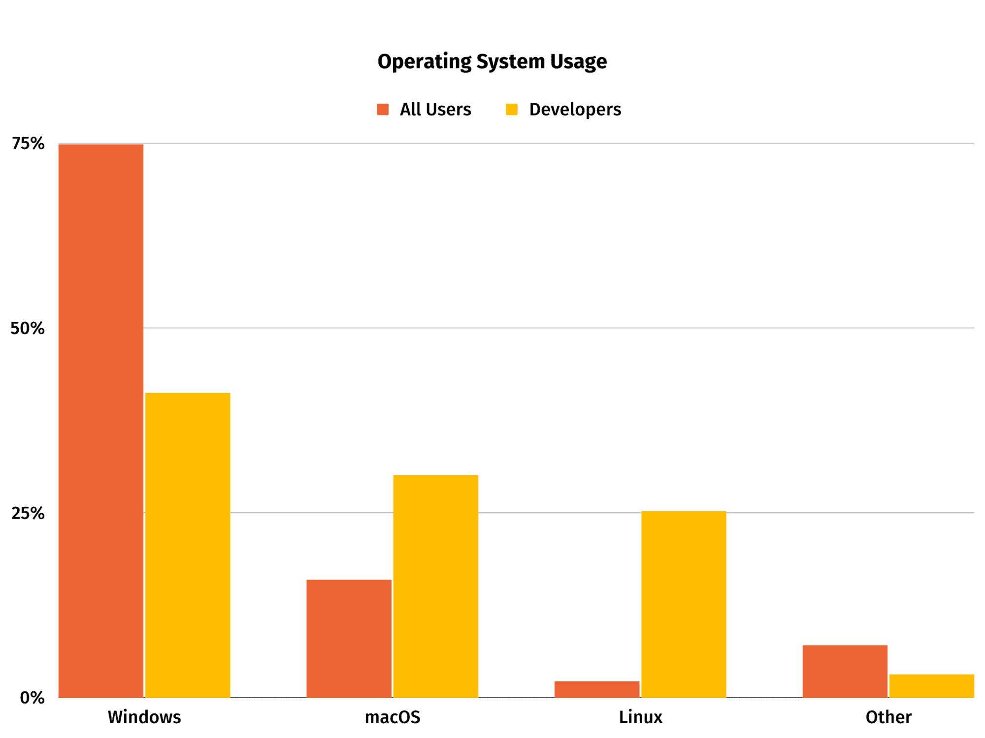
[percentage of developers by OS]
[percentage of all users by OS]
My preferences and biases aside, most of the world still uses Windows as their primary desktop operating system. The vast majority of those users are running Windows 10, with Windows 7 still hanging on to a good chunk, and then smaller and smaller slivers for 8.1, 8, and 11.
We Turned It Up To 11
What’s that? Windows 11 is here? And I’m hearing bad things? Well, off to the internet I go to see what all the fuss is about. Word on the street is this was a pretty haphazard redesign. It tried to borrow some good ideas from competitors but ended up being a garbled mishmash of old and new screens thrown together… and that’s when I saw it: the new save icon 💾.
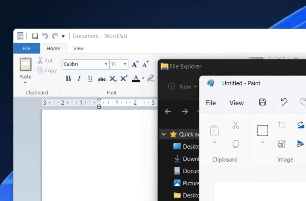
The YouTube video I was watching was highlighting the discrepancy between the new flat icon style in MS Paint and the older, skeuomorphic icon style in WordPad. But what really grabbed me when I saw it was that in both cases the icon was just sitting there all alone. No accompanying text, no additional context. Just that ubiquitous, square-ish shape we all reach for when we need to make sure our paragraphs stay right where we left them. Windows has actually been doing this forever, but the abstract icon style makes this one feel particularly egregious. It’s just few rectangles in a polygon. If you squint it kind of looks like Tree Trunks from Adventure Time. Kind of.

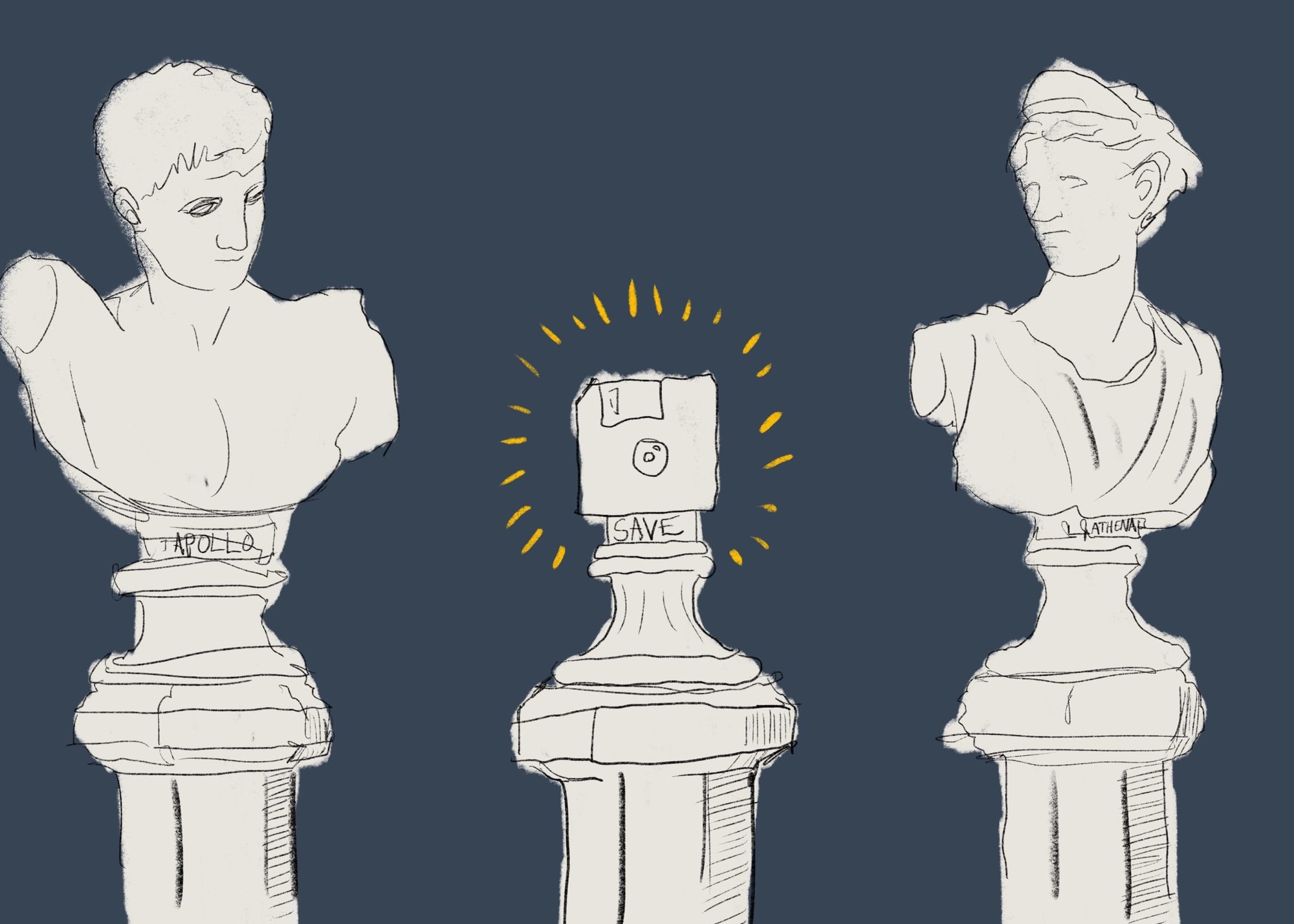
Windows is seemingly the last holdout in the long and storied history of operating systems relying on the image of a floppy disk to represent the concept of saving a file. As the rest of the industry has moved on to auto-saving, implicit saving, and simply using the word “Save,” Windows has planted a flag and said that the 3.5 inch floppy disk is too important an artifact to let fade into obscurity.
Skeuomorphin’ Time
A lot has been said about skeuomorphism. If you’re unfamiliar, skeuomorphic UI elements are “interface objects that mimic their real-world counterparts” to “make computers feel more familiar to users.” It has been immensely successful at bringing the masses into the Information Age by replacing unintuitive and downright scary command prompts with helpful pictograms.
But what happens when the once-familiar objects used for those pictograms become obsolete? Do the icons that mimic those objects lose their utility, or do the icons themselves now serve as the familiar guideposts users are looking for? Should skeuomorphic icons attempt to keep up with the times and be updated to match the latest iteration of the object they are meant to represent? Or should they evolve to reflect abstract concepts and become divorced from physical objects? Or should we attempt to do away with icons wherever possible and simply use our words?
An Icon is Worth One or Two Words
Language creates inherent limitations and guardrails for thought, from the ways we think of time, to colors, and even emotions. The same is true for visual language. The concept of “saving to disk” is inherent to the visualization of a floppy disk. But what does this visual metaphor do to help people who have never used (or even seen) a floppy disk before? Sure, it provides a fun little lesson about the history of computers but that’s not really the goal of a good icon. A good icon helps convey the meaning of the action that will be performed. To imply that the action of saving involves a disk that can be ejected and carried around is just plain lying.
The tiny extra cognitive load starts to seep in and muddy the waters of understanding.
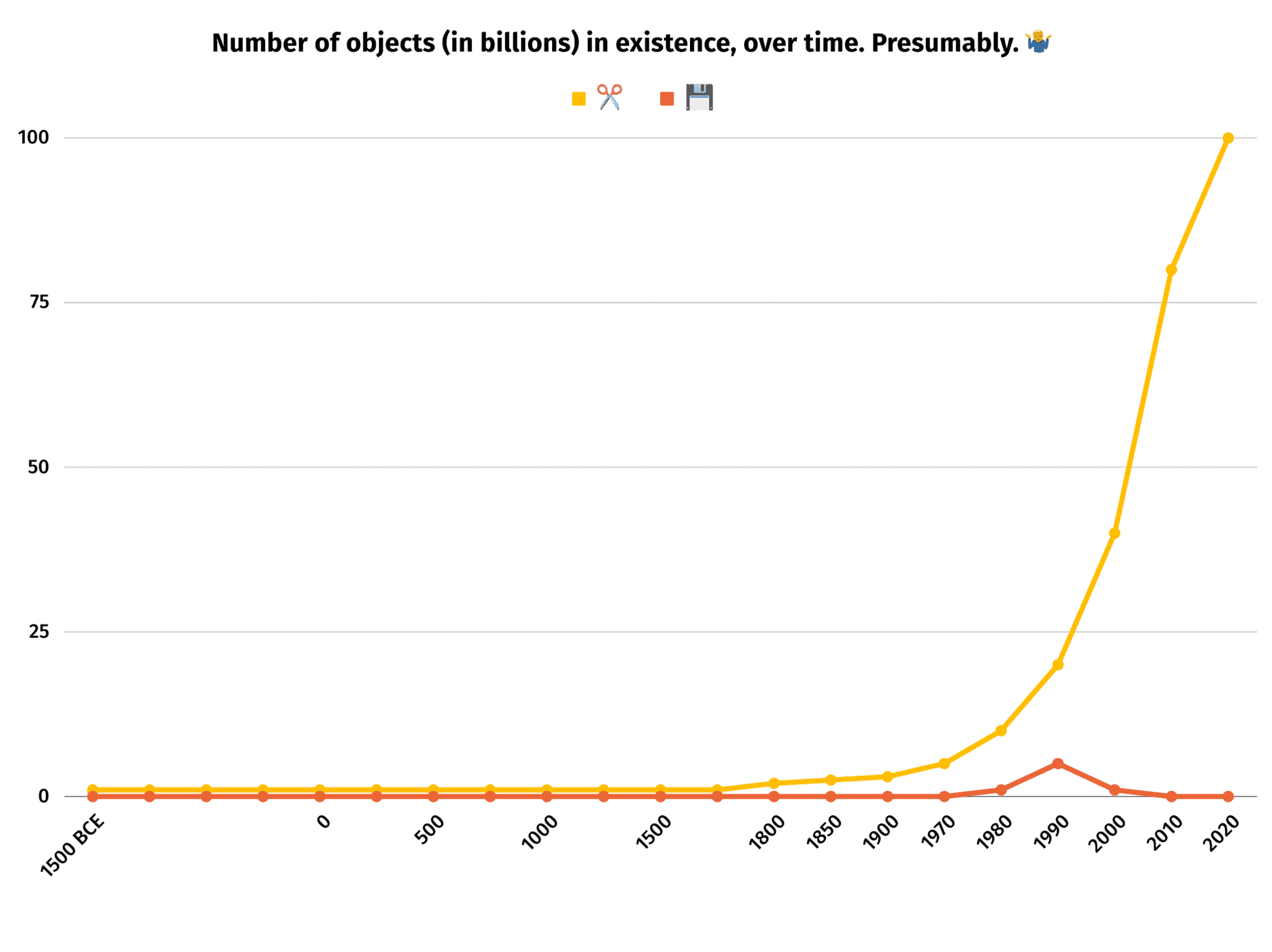
“What about scissors?” you may ask. “Surely users don’t think that tiny people inside the computer are running around with scissors cutting bits of text just because the icon for ‘Cut’ is a pair of scissors.” Don’t be ridiculous. Even the tiny people know it’s dangerous to run with scissors. But more to the point, scissors have been around for thousands of years and they are still found in most homes and offices. Their longevity and ubiquity makes for a much stronger mental connection than the floppy disk, which was only around for 20 or 30 years and is now found mainly in dusty boxes in the attic*.
*And before you try to tell me floppy disks are still used in nuclear missile silos, I have bad news for you.
Anachromorph: Shape Against Time
Since I love a good portmanteau, I’ve taken to calling these sorts of aging icons “Anachromorphs.” Anachromorphs are representations of bygone objects that were once commonplace but have since disappeared. In my mind there are two types of anachromorphs: irrelevant ones and immortal ones.
One example of an immortal anachromorph is the metal shield 🛡. Most people living in the modern world don’t walk around with shields (with a few notable exceptions). The people that do probably aren’t carrying metal shields from the Crusades. However, because they were so prevalent for so long and are so enshrined in the shared cultural psyche and pop culture of much of the world, they are still easily recognizable and useful as metaphors for protection and safety.
What does this button do?
The CD 💿, on the other hand, is an example of an increasingly irrelevant anachromorph. For a long time (*cough* 20 years) they were a ubiquitous type of physical media for music and data storage. But now newer cars and computers don’t even have CD drives. Whenever I stumble across a CD icon my first thought isn’t “Here is where I can read from or write to a disk.” I think, “Oh man, remember when we used CDs?”
To me that’s sort of the crux of the whole issue. The tiny extra cognitive load somewhere between seeing a thing, recognizing it, and interpreting what it means starts to seep in and muddy the waters of understanding. This is especially true for new users. When you’re trying to explain the concept of saving a file to a kid who has never used Windows and you tell them to click the icon that looks like a floppy disk, what will they be looking for?
“It’s that sort of square thing with one corner cut off.”
“Why is the corner cut off? Is that the floppy part?”
“No. I mean actually the whole thing was pretty solid plastic.”
“What whole thing?”
“The floppy disk.”
“Oh, so why was it called ‘floppy’?”
“Because the older kind used a more floppy kind of plastic.”
“You mean there’s something even older than this?”
Nostalgia? I Hardly Know Ya!
Which brings me back to Windows 11. I’m not going to use it, but presumably millions and millions of people will. With the new floppy disk icon becoming abstracted beyond recognition, Microsoft seems to be saying that this shape should enter into the category of immortal anachromorphs. The logical circle is:
- We’ve always used the floppy disk to mean Save
- Everyone is familiar with the floppy disk because we’ve always used it
- We keep using the floppy disk because everyone is familiar with it
- Repeat
But it gets worse. Reputable sources have informed me that Windows 11 goes a step further in the wrong direction by *removing* the save action from the context menu in some screens. In those cases the *only* way to save a file is to click the floppy disk icon that neither bears a strong resemblance to an actual floppy disk (whatever that is) nor includes the word “Save”.

“One Word: Plastics”
Listen, I’m not a monster and I’m not made of stone. I have plenty of warm feelings for the good ol’ days when everything I loved was a plastic rectangle. Videotapes, audiocassettes, Nintendo games, even the occasional floppy disk. Plastic rectangles were great!
But time marches on and now all our rectangles have touch screens or keyboards on them. You don’t even need to put any plastic rectangles inside them to make them do stuff. You can watch/listen/play/do anything on any one of these rectangles whenever you want. It will auto-save whatever you’re doing to a cloud or something and send you ads about it later. It’s super convenient and not at all problematic.
Breaking ⬆️ is Hard to Do
So why are we holding on to the floppy disk icon? Should Microsoft get to sit new users on their collective knee and try to teach them to respect their elders? Is the nostalgia for a brief window of time in the history of physical data storage more important than having a clear and understandable interface?
Is it because we ♥️ the 💾 so much? Are we scared that 👴 won’t know how to save a 📄 anymore? Or is it because nobody has a better 💡 for a save icon? I certainly can’t 🤔 of one, so I guess I’ll just put a 📌 in it. For now. 🔚
Loved the article? Hated it? Didn’t even read it?
We’d love to hear from you.