
What do the BBC, Pinterest, Netflix, and your favorite blog have in common? Card-based UI designs!
Card-based UIs have become a mainstay of UI design over the last decade. Take a look around the web and you’ll notice that cards are absolutely everywhere.
Here at Simple Thread, we embrace card-based UIs quite a bit. But what about this seemingly simple UI component makes it so versatile that it can be used across just about any industry on the web?
What is a Card Component?
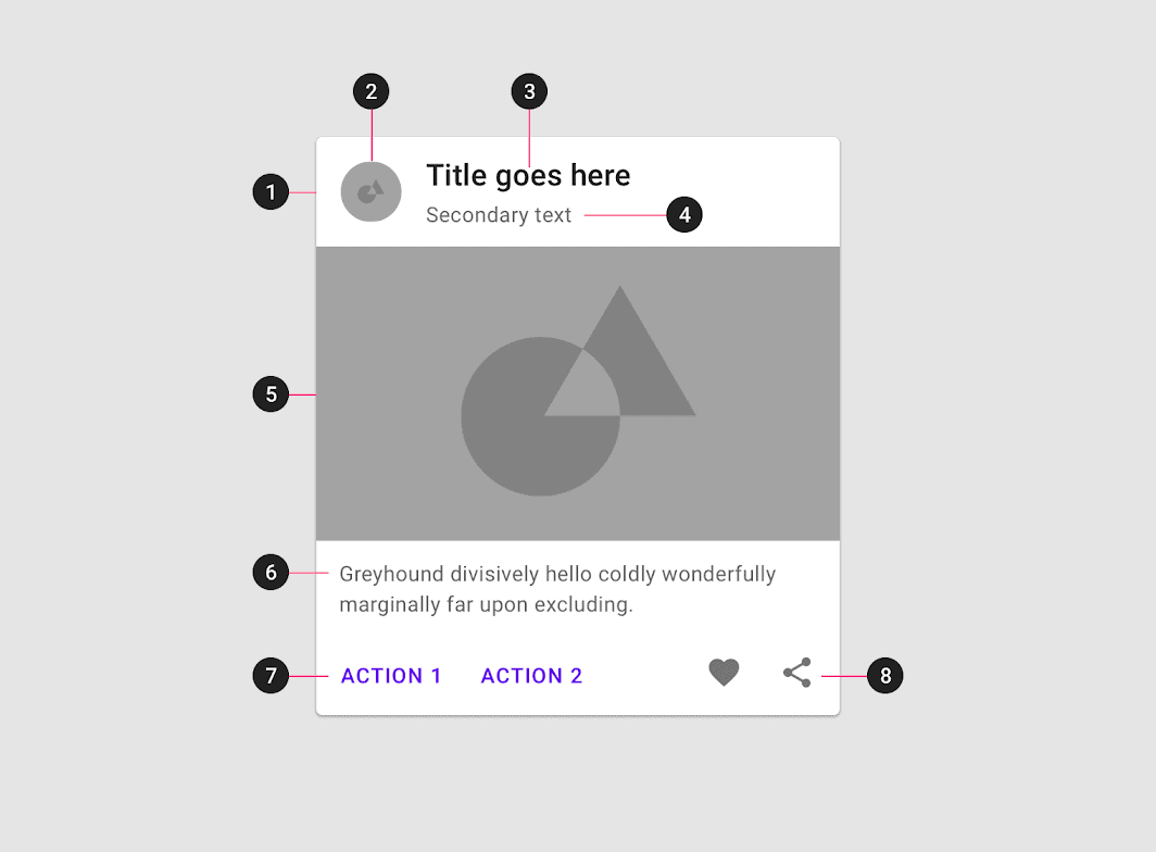
At its most basic level a Card Component is simply a container that groups like content together in a way that helps to make it clearly distinct from the content that surrounds it. There are many other elements that can make up a card, though what elements are used in a card highly depends on the goal of the application. The most commonly used elements in a Card Component (as defined by Google’s Material Design system) are:
-
Container
The only truly ‘required’ element, the container holds all of the other elements that make up a card component. This container is the primary element that separates the card content from the rest of the content in the UI. -
Thumbnail
An avatar, logo, or icon that typically denotes ownership over the content within the card. -
Header Text
The title of the card itself. -
Subhead Text
A subheading that typically contains metadata about the card content. For example, a byline and published date for a blog post. -
Media
Cards frequently include an image or video to help the user understand what content a card represents. This is especially useful when your card layout contains a repeating type of content such as properties on Airbnb. -
Supporting Text
Text that typically is a description of a card’s content. -
Buttons
Calls to Action with clear messaging on what the action is. -
Icons
Typically used for secondary actions like share or like.
Advantages of a Card-Based UI Design
Responsive as Hell
Card layouts can easily be adapted to just about any screen size. This is the primary advantage of using a Card-Based layout.
Easily Scannable
Card layouts are easy to scan no matter what the content is. Simple stacks of cards with a consistent design allow users to quickly find what they’re looking for.
Common
Card-Based UIs have been around for over a decade at this point. Their ubiquitousness means that users intuitively know what to expect because they’ve already interacted with many card-based UIs.
Modern Looking
In a similar vein, the commonality of Card-based UIs means that they are the modern standard (at least for now)
Actionable
Well designed cards make it abundantly clear to the user what actions are available to them with the content contained within a card.
Card Best Practices
While Card Components are a great way to present users with information in a nicely organized and visually appealing format, there are many pitfalls a designer can fall into when using cards, however, that can ruin the experience of a site or product. To avoid these, we’ve put together some best practices to follow.
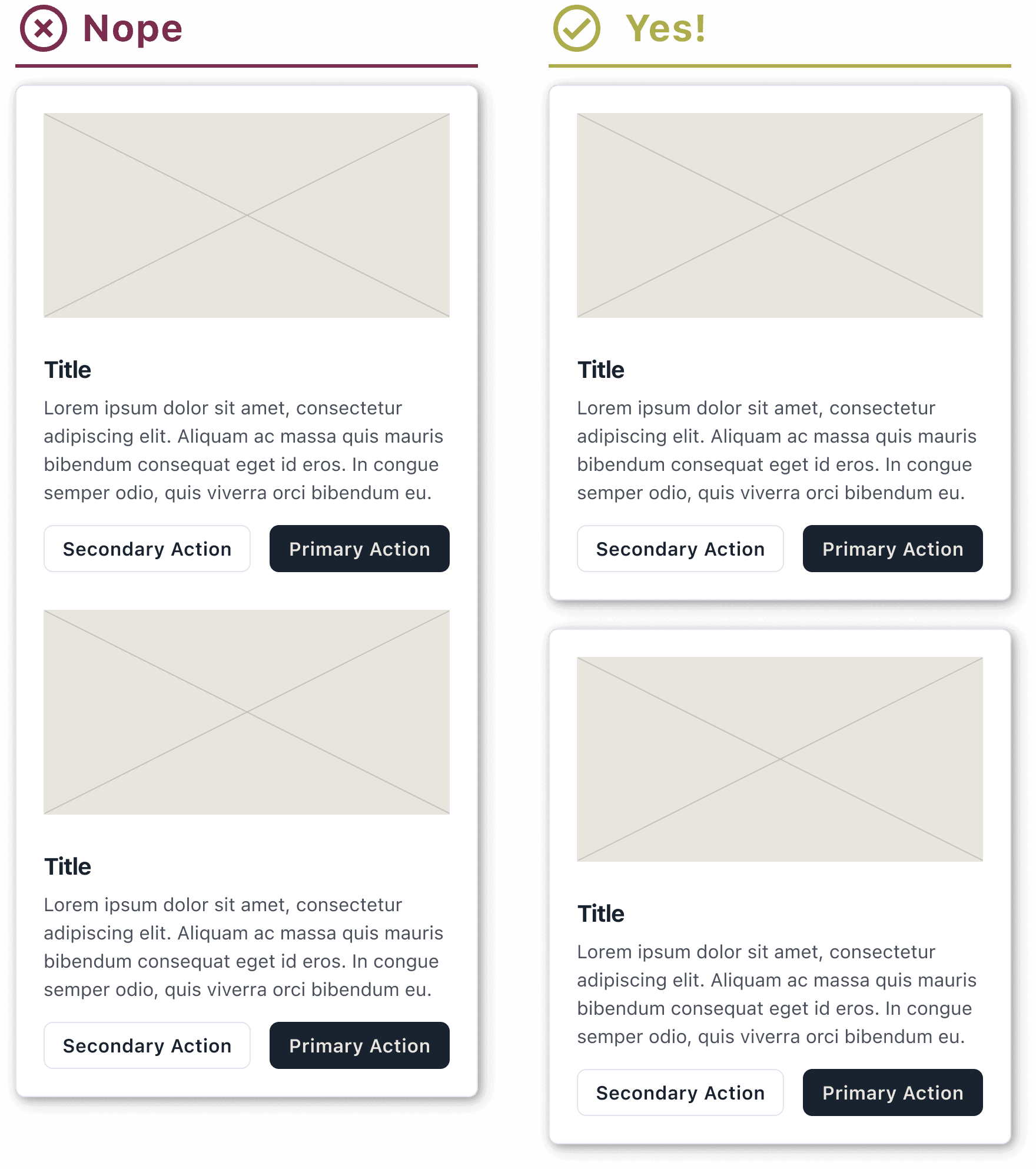
One Topic at a Time
Focusing a card to a single topic allows you to present a design that is highly scannable. Users are able to quickly understand the “One Card, One Topic” pattern, allowing them to navigate faster through your design as well as keeping their cognitive load lower than if the card had tried to shotgun multiple things at them at once.
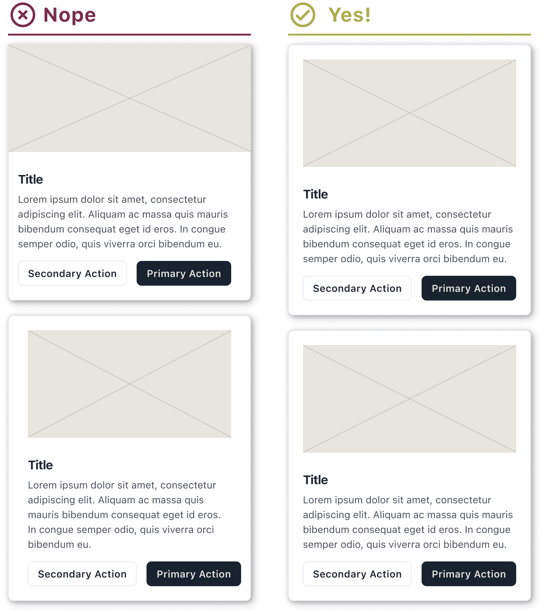
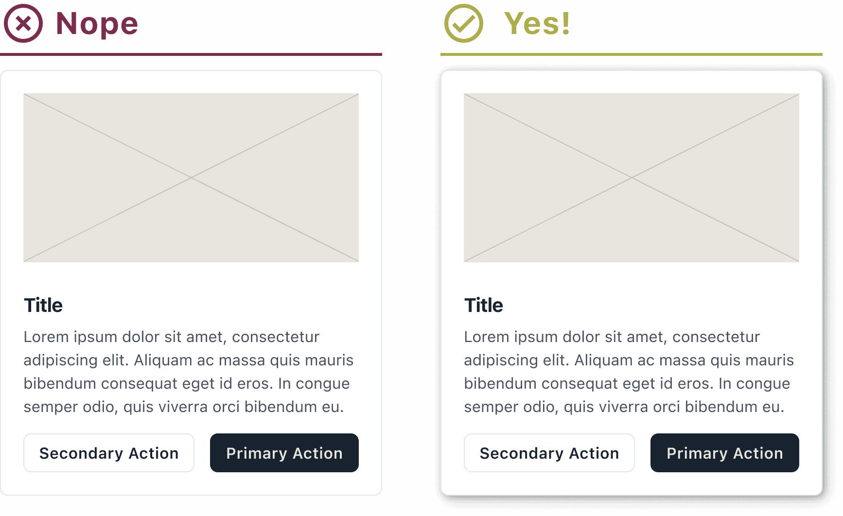
Consistent Padding and Spacing
When designing a card component for your project consistency is key. Having a design that changes wildly from card to card will bring a user to a screeching halt trying to understand what is being presented. Even small differences, while difficult to consciously notice, can slow down and frustrate a user. Make sure that you have a consistent system of padding around the outside edges of a card, as well as a consistent spacing system for the content within the card.
For spacing, we typically stick to an 8pt grid. This means that all of our padding and spacing values also keep to this pattern, allowing us to be very consistent in how our components look as well as keep a good rhythm that allows for better scanning.
Want to learn more about using an 8pt grid? Check out this article.
Lift Those Cards Up (or How to Use Drop Shadows to Great Effect)
The use of drop shadows when creating a card component might seem like a minor aesthetic addition and while using them does make card components look nicer, there are some key user focused reasons for using them.
Placing a drop shadow behind your card component adds depth and dimension to your user interface. This sense of separation that is created helps users to perceive each card as its own distinct and separate element within the user interface. Additionally, a well-implemented drop shadow can enhance the contrast between the card and the UI background, improving readability and accessibility.
It’s important to note that while using drop shadows can be helpful, they should be used wisely. Using a comically large and/or dramatic drop shadow will turn an orderly UI into an unreadable mess pretty quickly.
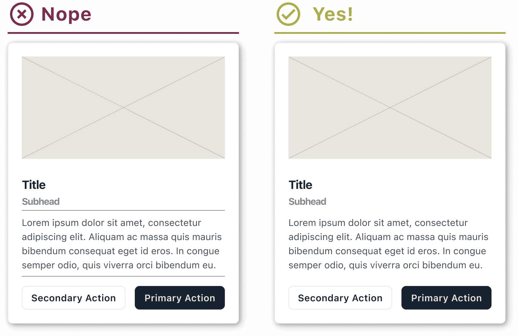
KYBSS: Keep Your Borders Simple, Stupid
A lot of new designers have a tendency to rely heavily on borders even within cards, to denote groups of like content. While borders within your cards can have a purpose, keeping them to a minimum will help your card components neat and readable.
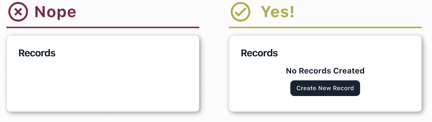
Empty States
Many of the cards we use are in the context of a dashboard. These cards typically display tables of data points or overviews of data within the application. Many times, the data for these cards needs to be created by the user which means that when a user first visits the page or opens the application, they’ll be greeted with empty cards. While this might seem like a problem, it’s actually a great opportunity to provide information and guidance to the user.
Messaging
It’s crucial to provide users with clear messaging to explain why they’re seeing an empty card. This messaging should be short and to the point. For example, the messaging for a card that contains individual records might be “No Records Created.” This helps the user to understand that to display anything here, at least one record will need to be created in the application.
Call to Action
To further reinforce that the user needs to perform an action on an empty state card, a Call to Action should be used as well. Continuing the example from above, the CTA might be “Create a Record.”
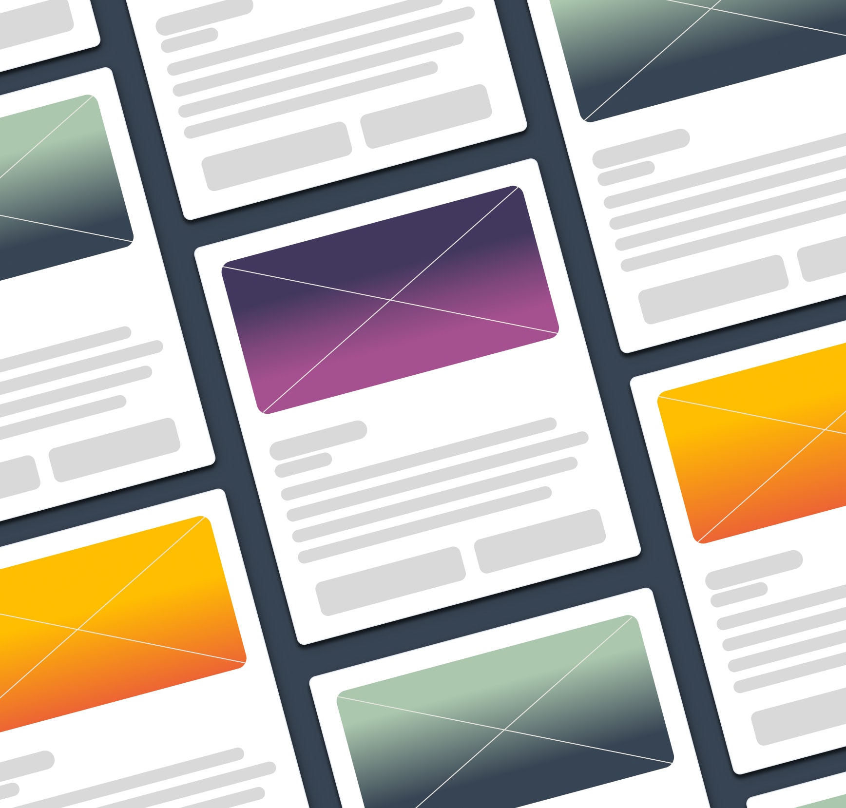
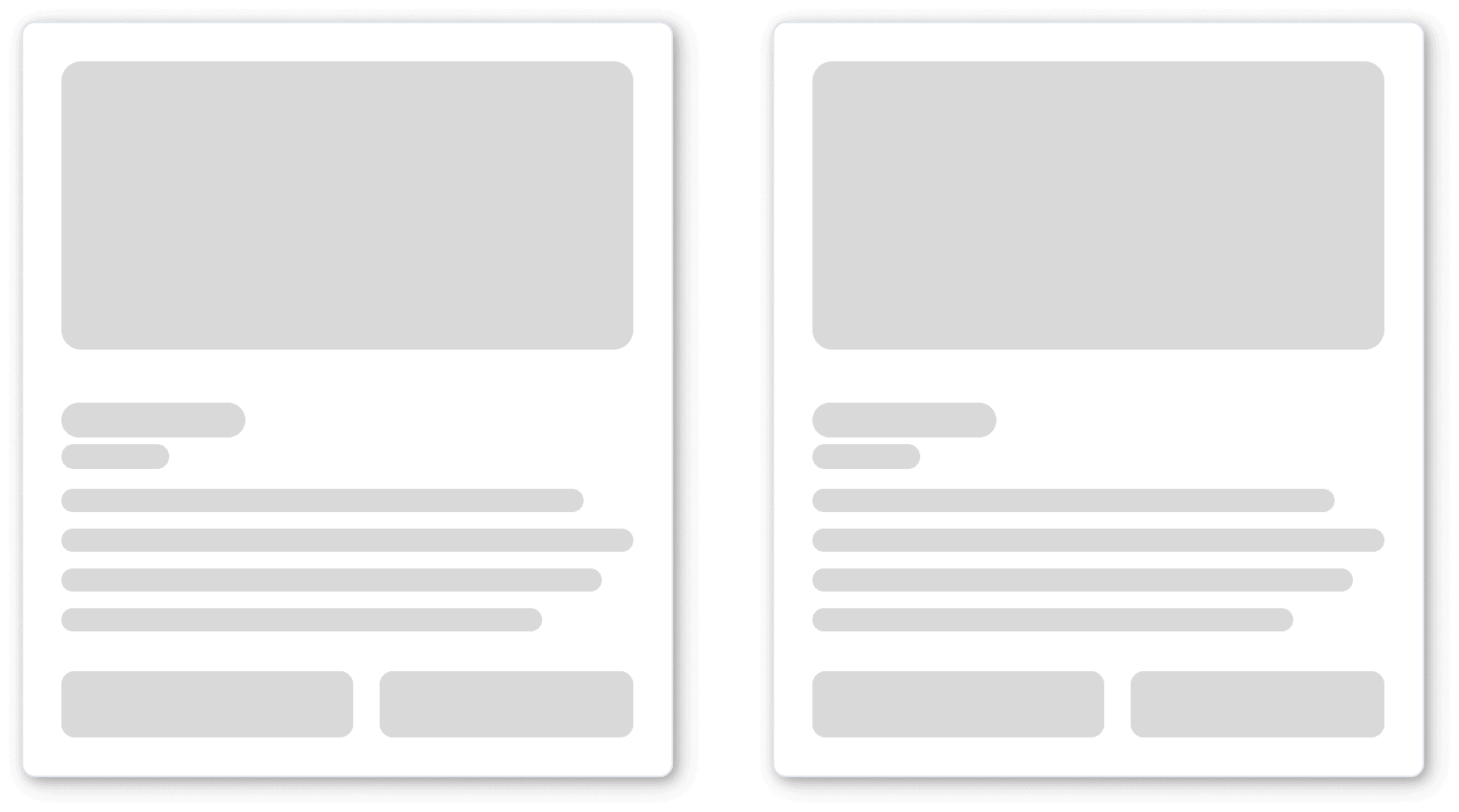
Skeleton Loading
Not everyone has a fast internet connection and not every site or application is going to have a lighting fast load time. To deal with these potential issues, you can use skeleton loading. Skeleton loading is using a wireframe-like or highly simplified version of the content of your card component during the load time of your site or application. This simple representation of the loading content keeps users engaged during load time and to increase the perceived performance of the site or application, using skeleton loading on your card components.
Conclusion
Card Components are in just about every corner of the web and it’s not a surprise. They are exceptionally user-friendly, remarkably responsive, and can effortlessly accommodate a diverse range of content. Save your users time and cognitive load by letting them focus on what’s actually important on a site or in an application – the content that they’re looking for.
Loved the article? Hated it? Didn’t even read it?
We’d love to hear from you.