
A Practical Guide to Form UI
Great form design is like a perfectly packed bag of groceries. Not only do the groceries fit nicely in the bag, but it’s not so heavy that it will tear, leaving you with a watermelon rolling down your driveway (yes, this happened to me). And when I get home my precious peaches are pristine and the bread loaf still has its bounce. Ideally, it’s packed so well that all the pantry items are bagged together, and all the fridge / freezer items are in their own bags. Could a mom’s life get any better than this? Yes…but I’ll take a win where I can.
Just like a perfectly packed grocery bag, there is quite a lot of nuance to form design. If given this much thought and detail, it can create a seamless, efficient experience for the user. I put together a few simple suggestions you can apply to your forms that will quickly improve your users’ experience.
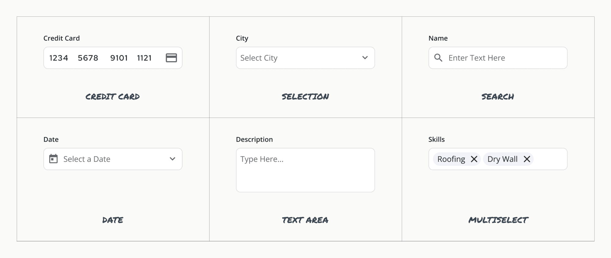
Modify the input type to work with the data being collected
I’m still surprised by the number of input field options – but when you consider all the types of data that need to be collected – phone numbers, credit cards, names, dates, multiselect, dropdowns, search – it makes sense. The formatting of the field should align with the content. This gives the user confidence in their inputs and makes the form easier to fill out. See below for a few examples.
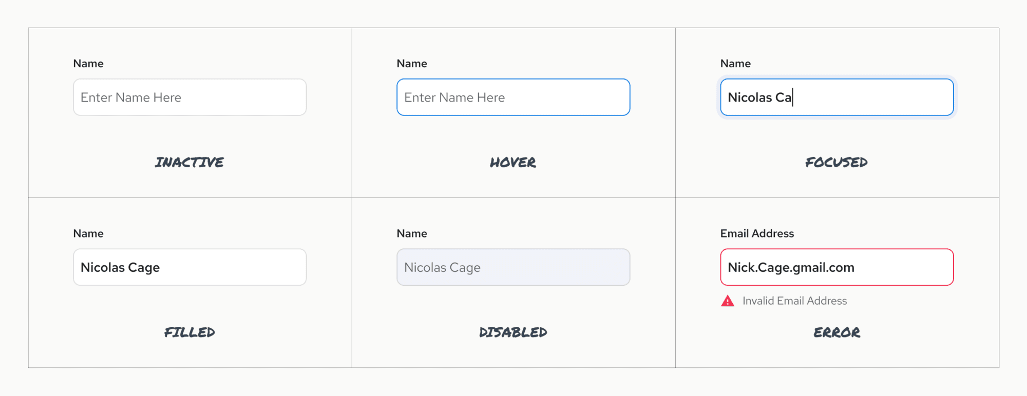
Design for field states and user interactions
Visual design should communicate the state of the text field. States can include: inactive, hover, focused, filled, disabled, error. By providing these visual cues it creates clarity for the user and an expectation for their interaction.
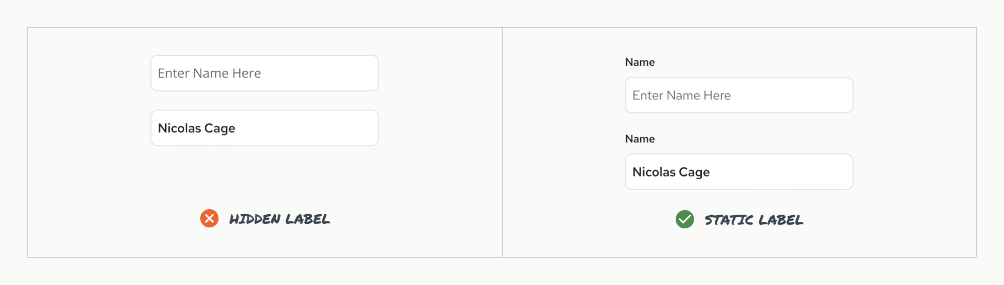
Always use a label
As designers we talk alot about minimalism and white space. But minimalism doesn’t mean removing content and cues that would make design easily scannable and understandable.
There was a trend per Google’s Material design to use placeholder text inside an input field (see below) which was in line with their minimalism, flat design. However this strains users short term memory and confuses users when they want to check their work. Google launched a study to remedy these problems (Evolution of Material Design Text Fields) and since has updated their design to include a floating label that bumps up when the user clicks into the field. Here’s a simple example of keeping the label visible.
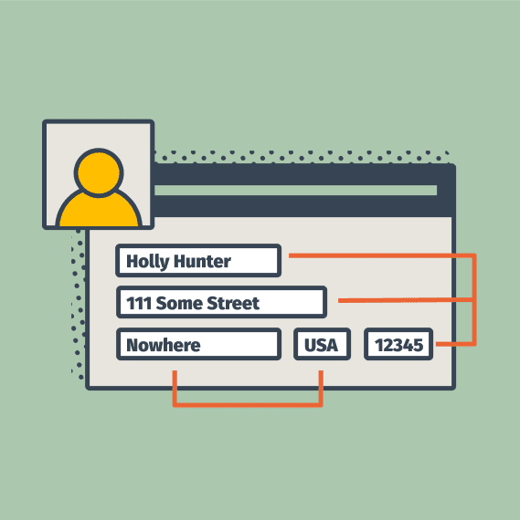
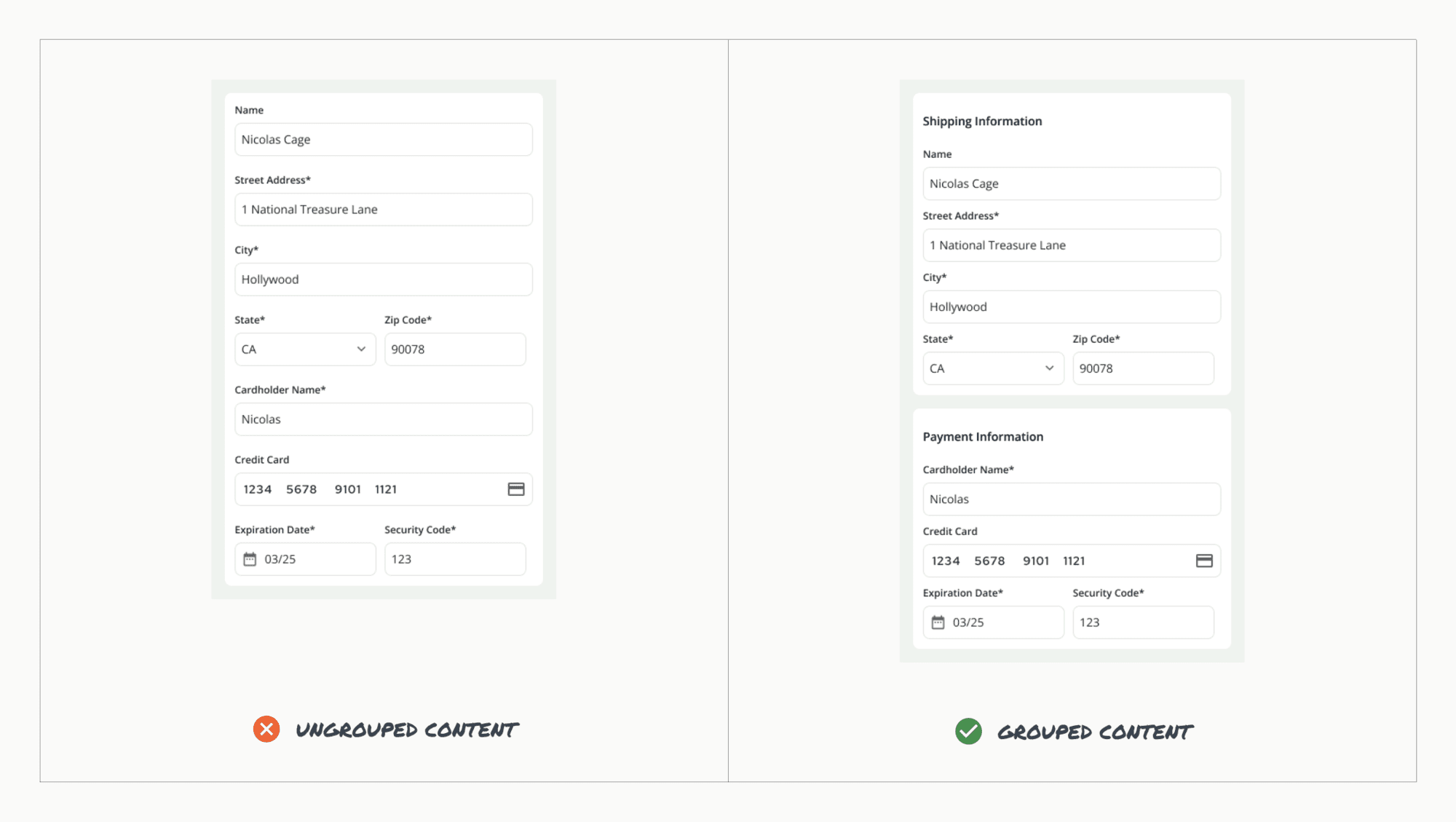
Group related fields
This one seems obvious but if the content is related, group it together in a container. This reduces mental load and context switching and makes it a more efficient process. There are many logical groupings, so you can employ card sorting to land on a grouping that makes sense for a particular user group.
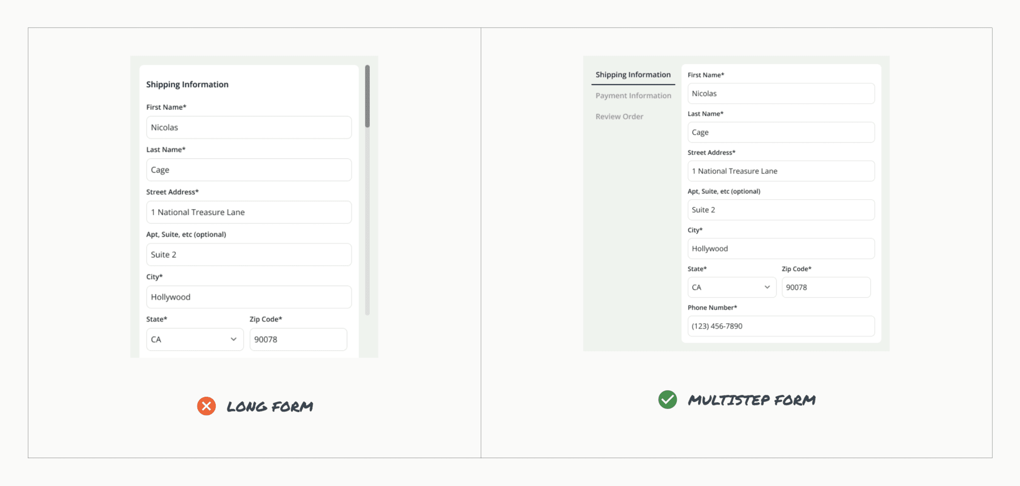
Break complex forms into a few simple steps
If a user needs to input a lot of information, grouping content into manageable steps can create a more delightful experience. For example, for a checkout experience, instead of one long form capturing your basic information, shipping and billing information, it would be ideal to have a multistep form that captures these sets of information and gives context to the number of steps in the process. This sets the form length expectation up front and gives the user a sense of accomplishment as they complete it page by page.
Multi-step forms have shown time and again that they greatly increase conversion rates, as they are less intimidating, despite the fact they may require more from users.
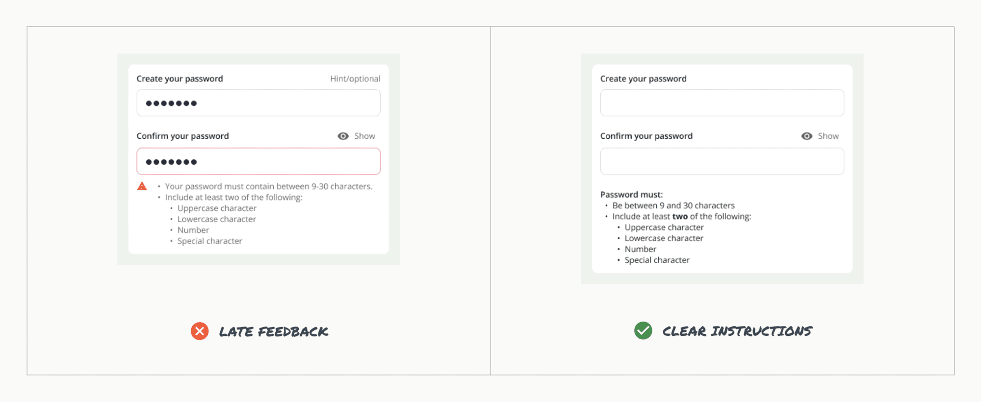
Give in-line hints for input field requirements
There is nothing worse than a password experience gone wrong. It can ruin an entire product, make you never want to use it again. I’m talking about creating a password, confirming the password, then getting told that you didn’t follow the password rules that you didn’t know about in the first place.
Prevent this by providing hints and context to the field requirements and ideally provide live inline validation. This means that when I type the password correctly, you tell me I did a great job. It can also mean that if I forgot the “@” in my email input, you tell me before I try to sign in to my account. But don’t tell me before I finish typing my email, that’s just rude.
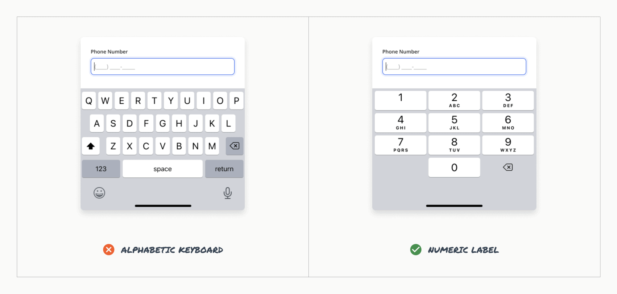
Use the appropriate keyboard type
It’s not fun using the alphabetic keyboard when you are trying to enter your birthday, phone number or any numerical value. It’s a simple rule but switch the keyboard on mobile to the below. It makes things so much easier and the experience more enjoyable.
Keep the watermelon rolling
These recommendations are just the tip of the iceberg when creating usable forms. Anticipating needs and accounting for them in design will contribute to the overall positive experience of your users.
Loved the article? Hated it? Didn’t even read it?
We’d love to hear from you.