A complex project is no place for the frail or the fragile. Project task dependencies lurk around every corner waiting to derail or subvert the nicely arranged roadmaps. Those risks need to be communicated and visualized. The first stop for many is a Gantt chart. But, unless you have some impressive project management tooling and the time to wield it, a complex project should not start with a Gantt chart.
Gantt charts are clearly a useful project visualization. They are simple to read and present pertinent project information clearly. At a glance you can see all the different tasks that will be in concurrent development. You can easily get a view of the project duration and whether or not things are on track. Gantt charts are a great tool for visualization, but they are a poor project planning tool.
What’s Wrong With Gantt Charts?
The same simplicity that makes Gantt charts great tools for communication makes them difficult to use for planning purposes. For the most part the tooling used for Gantt charts is non-existent outside of Microsoft Project. This means that each project task is either drawn or filled into an excel sheet. This approach creates a cascade of change to add new dependencies or changing dates. In the early phases of planning, this has a tendency to reduce the level of detail included in a Gantt chart. Which is again great for communication, but bad for planning.
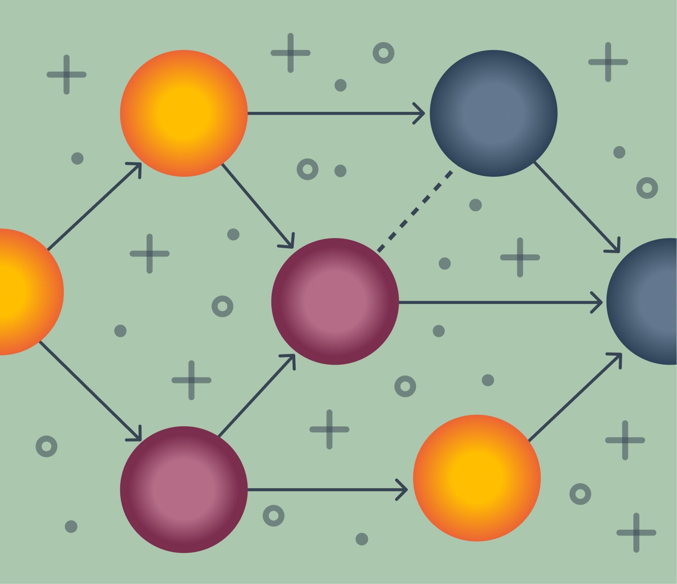
Gantt charts also do a bad job of communicating multiple dependencies. There are a few charting tools that will draw lines between tasks and their dependencies. But for the most part, a chart will rely on the assumption that when one task ends and another begins the two are related. Either lines or assumed relationships makes Gantt charts a fragile tool for planning a dynamic or complex project.
What’s the Alternative?
In 1958 the United States Navy developed a different approach to planning and scheduling. They called it the Program Evaluation and Review technique. It is called ‘PERT’ for short. PERT charts are a graph structure made of events and dependencies. Each event has an estimated duration and is displayed as a node on the graph. And the dependencies are lines drawn between the nodes. By looking at the graph it is possible to get a clear picture of the dependencies involved in a project. And by looking at the longest path between start and end, the overall project duration is easy to calculate. This longest path is called the Critical Path. The US Navy may have developed the PERT chart to manage the complex process of building nuclear submarines, but it can be a useful planning tool for smaller projects too.
A PERT chart should be the data that a Gantt chart is visualizing. The graph structure has several advantages over the Gantt chart for planning. This first is that a graph is flexible. If there is a new dependency identified during project planning there is no need to redraw the entire chart and move dependencies. A new node can be added and dependencies drawn appropriately. A PERT chart can also improve visibility into the impact of timeline changes. If the delivery estimate for a task changes, a PERT chart makes it easy to determine if it will impact the project’s critical path.
For smaller projects and project planning phases, the biggest benefit is that a PERT chart is made of simple nodes. This makes it more amenable for brainstorming and discovery than a more heavyweight Gantt chart. The dependencies and events for a PERT chart can be drawn onto a white board or even written down in more of a word cloud approach.
If you also happen to enjoy coding, the simple repeated structure of PERT chart events lends itself well to computational analysis. In 1958 mainframe computers were used to calculate the longest path of the project graph and determine the project duration. Seventy years later it’s pretty simple to build a directed acyclic graph to sum a path weight. In fact, it takes about 20 lines of code ( 30 lines of the example are just displaying the graph ).
That means we could use a simple yaml layout to brainstorm, document, and maintain our project dependencies. The example below is just generating a graph and calculating the critical path. Extending this approach we could use the same document to generate a Gantt chart or other documentation. In short, use a PERT chart to build and maintain a plan. Visualizations should be built from that data.
What’s It Look Like?
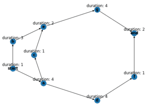
A yaml file can be used to build up and describe the project events and dependencies. Here we are describing each event with a duration and a list of dependencies. There is a bit of yaml anchor magic used to remove duplication, but otherwise the structure is very simple.
start: &start
  duration: 1
a: &a
  duration: 4
  dependencies:
    - start: *start
end:
  duration: 2
  dependencies:
    - g:
        duration: 4
        dependencies:
          - e:
              duration: 2
              dependencies:
                - b:
                    duration: 3
                    dependencies:
                      - start: *start
                - c:
                    duration: 1
                    dependencies:
                      - a: *a
    - f:
        duration: 1
        dependencies:
          - d:
              duration: 4
              dependencies:
                - a: *a
The full code is available at https://github.com/gkontos/pert-graph, so I won’t paste the whole program here. But I did say that it took about 20 lines of code to generate a chart. Parsing the dependency structure is about the only work the code does.
def parse_nodes(deps, graph):

   """Traverse the dictionary and add the nodes and edges to our graph

   We are also adding the duration as an attribute of the nodes and edges.

   Adding the attribute to the node allows us to display the information on the label,

   Adding the attribute to the edges allows us to calculate the project duration.

   """

   for k, v in deps.items():

       graph.add_node(k, duration=v["duration"])

       if v.get("dependencies") is not None:

           for item in v["dependencies"]:

               parse_nodes(item, graph)

               for childkey in item.keys():

                   graph.add_edge(childkey, k, duration=v["duration"])

   return graph
Once the data has been loaded, the networkx library takes care of the heavy lifting. In our main method the dag_longest_path and path_weight methods will calculate the duration of our chart’s critical path.
def main():

"""Generate a graph from our yaml file.

   The methods nx.dag_longest_path and nx.path_weight are from the networkx project.

   Together they calculate the duration of the Critical Path -- which required a super computer in 1958

   """

dependencies = load_dependencies_from_file()

graph = nx.DiGraph()

graph = parse_nodes(dependencies, graph)

print_with_labels(graph)

path = nx.dag_longest_path(graph, weight="duration")

print(f"The critical path is {path}")

duration = nx.path_weight(graph, path, weight="duration")

print(f"The expected duration is {duration}")

return
With a little bit of formatting our yaml file provides this chart:
Happy coding, my friends.
Loved the article? Hated it? Didn’t even read it?
We’d love to hear from you.