
Accessibility concerns often tend to come to mind closer to the end of a development cycle than at the start. Part of the reason for this is unfamiliarity. Another is that the specs are expansive and necessarily complex. Which is fantastic! Because making complex things easier is what software engineering is all about.
Crafting Components in Terms of A11y
Components are one of the most common tools for a frontend engineer to encapsulate and break down complexity. The idea here is to build components in terms of accessibility; especially in those of aria roles and the accessibility tree. Much like other X-driven-development flavors, this one seeks to highlight a change in outcomes simply by changing focus to another part of the process.
In this post I give a very simple if somewhat contrived example. However, I’d expect much more significant findings by applying this method to much more complex interleavings of component architectures.
The Application
A simple shape on a page and a menu to manipulate it. It uses React because…I guess everybody can read React, Typescript to make it a little more descriptive, and Vanilla CSS because you don’t need to see the CSS…don’t even look at it. But you can look at it. The entire app is on Stackblitz.
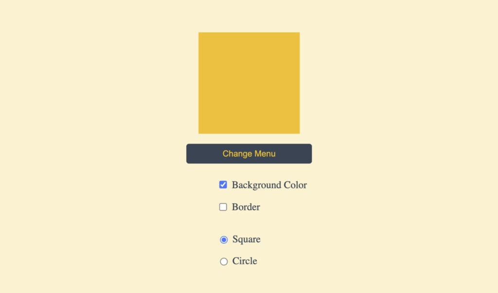
<AppBefore/>
What are we looking at here? ARIA menus are a fairly easy-to-follow pattern. So, I took examples from MDN, made some modifications to fit our specific use case, and then React-ified the modified example to add statefulness and functionality.
/* <AppBefore/> */
import * as React from 'react';
import './style.css';

export default function App() {
  const [isMenuOpen, setIsMenuOpen] = React.useState(false);

  const [shouldHaveBackground, setShouldHaveBackground] = React.useState(true);
  const [shouldHaveBorder, setShouldHaveBorder] = React.useState(false);
  const [shape, setShape] = React.useState<'square' | 'circle'>('square');

  const checkBoxClasses = `${shouldHaveBackground ? 'background-color' : ''} ${
    shouldHaveBorder ? 'border' : ''
  }`;

  return (
    <main>
      {/* display */}
      <div className={'display-container'}>
        <div className={`display-object ${checkBoxClasses} ${shape}`}></div>
      </div>
      <button
        type="button"
        aria-haspopup="menu"
        aria-controls="display-menu"
        aria-expanded={isMenuOpen}
        onClick={() => setIsMenuOpen((isOpen) => !isOpen)}
      >
        Menu
      </button>
      {/* menu */}
      {isMenuOpen && (
        <div role="menu" id="display-menu" aria-label="Color Options">
          {/* checkbox group */}
          <ul role="group">
            <li role="menuitemcheckbox" aria-checked={shouldHaveBackground}>
              <input
                type="checkbox"
                id="background-color"
                name="background-color"
                value="background-color"
                checked={shouldHaveBackground}
                onChange={() => setShouldHaveBackground((x) => !x)}
              />
              <label htmlFor="background-color">Background Color</label>
            </li>
            <li role="menuitemcheckbox" aria-checked={shouldHaveBorder}>
              <input
                type="checkbox"
                id="border"
                name="border"
                value="border"
                checked={shouldHaveBorder}
                onChange={() => setShouldHaveBorder((x) => !x)}
              />
              <label htmlFor="border">Border</label>
            </li>
          </ul>

          {/* radio group */}
          <ul role="group">
            <li role="menuitemradio" aria-checked={shape === 'square'}>
              <input
                type="radio"
                id="square"
                name="shape"
                value="square"
                checked={shape === 'square'}
                onChange={(e) => {
                  setShape('square');
                }}
              />
              <label htmlFor="square">Square</label>
            </li>
            <li role="menuitemradio" aria-checked={shape === 'circle'}>
              <input
                type="radio"
                id="circle"
                name="shape"
                value="circle"
                checked={shape === 'circle'}
                onChange={() => {
                  setShape('circle');
                }}
              />
              <label htmlFor="circle">Circle</label>
            </li>
          </ul>
        </div>
      )}
    </main>
  );
}
The comments in <AppBefore/> hint at the structure we aim to achieve to ensure accessibility. Notably – menu, group, menuitemcheckbox, and menuitemradio roles. It’s worth mentioning that these ARIA roles were already present in the markup borrowed from MDN. However, in more typical scenarios, these pieces are missing and the markup may already be scattered across multiple components throughout the app. In an effort to add accessibility, engineers spend a significant amount of time trying to match the right branch in the tree to an accessible name tag. We may even wonder if the current component structure allows for a concise way to link an element to its descriptive parts. And, we question if we have enough time to understand and refactor to make the entire experience accessible.
So then, assuming there isn’t a place to steal the structure from, there’s a step before <AppBefore/>. That involves identifying the correct accessibility structure before writing <AppAfter/>-like code.
<AppAfter/>
Now the fun part. In <AppAfter/>, we can see a component corresponding to each of the roles that were visible in <AppBefore/>. Put another way, each of these components was designed with its role within the accessibility tree in mind. Or, they were built in terms of a11y.
/* <AppAfter/> */
import * as React from 'react';
import Menu from './components/Menu';
import MenuGroup from './components/MenuGroup';
import MenuItemCheckbox from './components/MenuItemCheckbox';
import MenuItemRadio from './components/MenuItemRadio';
import './style.css';

export default function AppAfter() {
  const [shouldHaveBackground, setShouldHaveBackground] = React.useState(true);
  const [shouldHaveBorder, setShouldHaveBorder] = React.useState(false);
  const [shape, setShape] = React.useState<'square' | 'circle'>('square');

  const checkBoxClasses = `${shouldHaveBackground ? 'background-color' : ''} ${
    shouldHaveBorder ? 'border' : ''
  }`;

  return (
    <main>
      <div className={'display-container'}>
        <div className={`display-object ${checkBoxClasses} ${shape}`}></div>
      </div>
      <Menu id="display-menu" label="Change Menu">
        <MenuGroup>
          <MenuItemCheckbox
            id="background-color"
            name="background-color"
            value="background-color"
            isChecked={shouldHaveBackground}
            setIsChecked={setShouldHaveBackground}
            label="Background Color"
          />
          <MenuItemCheckbox
            id="border"
            name="border"
            value="border"
            isChecked={shouldHaveBorder}
            setIsChecked={setShouldHaveBorder}
            label="Border"
          />
        </MenuGroup>

        <MenuGroup>
          <MenuItemRadio
            id="square"
            name="shape"
            value="square"
            isChecked={shape === 'square'}
            setIsChecked={() => setShape('square')}
            label="Square"
          />
          <MenuItemRadio
            id="circle"
            name="shape"
            value="circle"
            isChecked={shape === 'circle'}
            setIsChecked={() => setShape('circle')}
            label="Circle"
          />
        </MenuGroup>
      </Menu>
    </main>
  );
}
Admittedly this is a contrived simulated experience. But what is being simulated? As engineers, whenever we are constructing something (menus in this case), we can spend time identifying the connections our elements are going to need. The point of the simulation is to promote identifying needs to the start rather than in the middle or at the end of the development process. The result is a component structure that inherently captures accessibility requirements.
<Menu/>
There is another subtlety I’d like to point out within the <Menu/> component. On the Props type, both id and label are required. Then, the id is used to build another id ${id}-trigger-button which is then used on aria-labelledby on the element with the role=”menu”. This particularity highlights an advantage of componentizing (encapsulating) these together. Whenever an engineer uses the <Menu/> component, they will automatically label the menu by putting text into the button. With Typescript tagging along, the compiler will make it really difficult to avoid this particular brand of accessibility.
/* <Menu/> */
import * as React from 'react';

type Props = {
  id: string;
  label: string;
};

export default function Menu({
  id,
  label,
  children,
}: React.PropsWithChildren<Props>) {
  const [isMenuOpen, setIsMenuOpen] = React.useState(false);

  return (
    <>
      <button
        id={`${id}-trigger-button`}
        type="button"
        aria-controls={id}
        aria-expanded={isMenuOpen}
        onClick={() => setIsMenuOpen((isOpen) => !isOpen)}
      >
        {label}
      </button>
      {isMenuOpen && (
        <div role="menu" id={id} aria-labelledby={`${id}-trigger-button`}>
          {children}
        </div>
      )}
    </>
  );
}
I should say what I’m not saying. That all menus should necessarily be labeled by the button that opens them. But, what I am saying is that there is a path to utilizing the tools of componentization and static testing (Typescript) to bake in subtle concerns without having to delve deep anytime you need to build a menu. By frontloading, it streamlines the development process, reduces potential errors, and ensures that accessibility concerns become an integral part of a codebase.
Conclusion
By prioritizing a11y in the code-designing stage and leveraging tools like componentization and static testing, we can raise the DX of the core pieces of our applications. My hope in this exercise is that this will encourage us to build applications that consider accessibility to be more fundamental rather than tacked on at the end. And in a way that can provide cleaner code, better DX, and a better UX for everyone.
Loved the article? Hated it? Didn’t even read it?
We’d love to hear from you.