
What Are Render Functions?
Render functions are what Vue uses under the hood to render to the DOM. All vue templates are compiled into render functions which return a virtual DOM tree and get mounted to the actual DOM.
This template:
<div>hello</div>
is compiled to
h(‘div’, ‘hello’)
Vue gives us the option to skip writing templates and instead directly author these render functions. Templates are so much easier to read and write, so why and when would you ever want to use render functions? That’s something I’ve always wondered about until something came up on a project I was working on a few months ago.
Background
The project I’m working on is pretty heavy on tables. We have multiple tables which display different data so naturally we built a component that takes data and displays it in an HTML table.
Our primary table started out simple but grew in complexity. Instead of displaying text in each cell, some cells needed to render out links, icons, buttons, tooltips, and other custom components. We did this by building new components for each of these new types of cells, but all of these new components became difficult to maintain.
In addition to this added complexity, our table grew in size. We started out with less than 15 columns but it ballooned to more than 50. Even after implementing virtual scrolling, with all 50 columns, the scrolling performance on the table was poor, especially on our client’s work machines. This performance drop was because 50+ component instances for each row needed to be mounted as they scrolled into view.
It seemed like the clear answer to both of these problems was to reduce the number of components being used, but how? One solution that we turned to was using slots and render functions.
Project Overview
I’ve built a starter project that takes user data and displays it in an HTML table. You can check it out on Stack Blitz.
The BaseTable component takes two props: source which is the data that we’ll want to display, and columns which is an array of column definitions.
<template>
  <table>
    <thead>
      <tr>
        <th v-for="column in columns" :key="column.sourceKey">
          <HeaderCell :title="column.title" />
        </th>
      </tr>
    </thead>
    <tbody>
      <tr v-for="row in source" :key="row.id">
        <td v-for="column in columns" :key="column.sourceKey">
          <component
            :is="column.component"
            v-bind="column.props(row[column.sourceKey])"
          ></component>
        </td>
      </tr>
    </tbody>
  </table>
</template>

<script setup>
import HeaderCell from './HeaderCell.vue';

defineProps({
  source: {
    type: Array,
    required: true,
  },
  columns: {
    type: Array,
    required: true,
  },
});
</script>
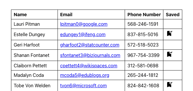
This is what our user object looks like:
{
  id: 1,
  name: 'Lauri Pitman',
  email: 'lpitman0@google.com',
  phoneNumber: '568-246-1591',
  ip_address: '250.99.76.244',
  saved: false,
  avatar: 'https://robohash.org/nequenonfacere.png?size=50x50&set=set1',
  rating: 2,
},
And a column definition:
{
  sourceKey: 'name',
  title: 'Name',
  component: BaseCell,
  props(value) {
    return {
      sourceValue: value,
    };
  },
},
This object indicates what attribute from our data objects to use for each of the columns. It also provides a title which BaseTable uses as the column header, what component to use for the column cell, and a props object that is bound to the indicated component.
Our BaseCell component is pretty simple. It takes a single prop sourceValue and renders it directly:
<template>
  <div>
    {{ sourceValue }}
  </div>
</template>

<script setup>
defineProps({
  sourceValue: {
    type: [Array, String, Object, Number, Boolean],
    default: null,
  },
});
</script>
There are two other components being used in our table: LinkCell and IconCell which are being used for the ‘email’ and ‘saved’ columns respectively. LinkCell displays an email-to link and IconCell displays an svg icon that we import as a component with the help of vite-svg-loader. We’re going to update these columns to use BaseCell with the help of slots and render functions.
Implementing Render Functions
We want to use a render function to generate HTML and insert it into a slot in BaseCell.
We’ll start by adding a slot to BaseCell and keeping sourceValue as the default slot content. Now that we have a slot, we’ll want to add a prop called slotContent that takes a render function. We’ll also invoke it and save the return value into a variable called SlotContent. Since render functions return a virtual DOM node, we can insert this into a slot like any other component or tag.
BaseCell should look like this:
<template>
  <slot>
    <SlotContent v-if="slotContent" />
    {{ sourceValue }}
  </slot>
</template>

<script setup>
const props = defineProps({
  sourceValue: {
    type: [Array, String, Object, Number, Boolean],
    default: null,
  },
  slotContent: {
    type: Function,
    default: null,
  },
});
const SlotContent = props.slotContent && props.slotContent();
</script>
Now that BaseCell is ready to work with render functions, we can use it in our other columns.
Basic Usage
We’ll start with the email column. This column uses LinkCell which renders a simple mailto link.
Instead of using LinkCell in the email column, we can now try using BaseCell. In our props object, instead of sending in a sourceValue prop, we send in a render function in our slotContent prop which renders a link:
props(value) {
  return {
    slotContent: () => h('a', { href: `mailto:${value}` }, value),
  };
},
The first argument to this indicates the root tag to use which is an anchor tag. The second optional argument is an object where you can define props or attributes. In this case we want to set an href with a mailto link. The third argument sets the node’s children, which in this case is a string.
Conditional Rendering
Next we’ll convert the ‘saved’ column. In the ‘saved’ column definition, instead of using IconCell we can change it to use BaseCell and add another render function:
return {
  slotContent: () =>
    h('div', [
      value
        ? [
            h('span', { class: 'visually-hidden' }, 'yes'),
            h(BookmarkAddedIcon, {
              height: '24',
              width: '24',
              'aria-hidden': true,
            }),
          ]
        : h('span', { class: 'visually-hidden' }, 'no'),
    ]),
};
There is a bit more going on here than last time. First is the use of a ternary operator. This operates like v-if which we’re using to display a bookmark icon only if the value of our column is true. In the case that it is true, we also have multiple children under the root node: a bookmark icon and screen-reader only text. We’re also setting various attributes: a visually-hidden class for hiding the screen reader text, width, height, and an aria-hidden attribute for the svg.
Previously in our IconCell component, all of this was baked in. If we wanted to make any of this dynamic or if it needed to be used differently, we’d need to add more props and more functionality making it harder to maintain.
Using a render function this way helps separate the implementation of our components from our actual component code, making them simpler to maintain.
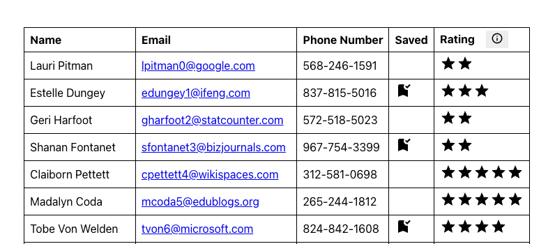
Loops and Slots
Next, we’re going to add a new column to our table – a ratings column. Each of our users has a rating 1-5 and instead of displaying the numeric value, we want to display the equivalent number of stars. We’ll start with a basic column definition:
{
  sourceKey: 'rating',
  title: 'Rating',
  component: BaseCell,
  props(value) {
    return {}
  }
},
We can render loops by using the map function:
slotContent: () =>
          h('div', [
            h('span', { class: 'visually-hidden' }, value),
            [...Array(value).keys()].map((star) => {
              return h(StarIcon, {
                key: star,
                height: '24',
                width: '24',
                'aria-hidden': true,
              });
            }),
          ]),
Here, we’re simply creating an array with the same length as our user’s rating and iterating through that to render the equivalent number of stars. Now we should have a new ratings column that displays a star rating for each user.
What if we want to see an average rating that gets displayed in the column header as a tooltip?
We can start by setting up HeaderCell similar to BaseCell resulting in this:
<template>
  <div>
    <span>
      {{ title }}
    </span>
    <slot>
      <SlotContent v-if="slotContent" />
    </slot>
  </div>
</template>

<script setup>
const props = defineProps({
  title: {
    type: String,
    default: '',
  },
  slotContent: {
    type: Function,
    default: null,
  },
});

const SlotContent = props.slotContent && props.slotContent();
</script>
We’ll also add a new key headerProps to our column definition so we can bind props to our component with v-bind:
          <HeaderCell
            v-bind="column.headerProps && column.headerProps(column)"
            :title="column.title"
          />
For our tooltip, we’ll install floating-vue which gives us a Tooltip component we can import in App.vue. This tooltip component contains two slots: a default slot that’s used for the trigger which we’ll put a button in, and a slot named popper that displays the tooltip content. In order to pass children into component slots, we’ll need to use slot functions.
headerProps() {
      return {
        slotContent: () =>
          h(Tooltip, null, {
            default: () =>
              h('button', [
                h('span', { class: 'visually-hidden' }, 'average rating'),
                h(InfoIcon, {
                  height: '18',
                  width: '18',
                  'aria-hidden': true,
                }),
              ]),
            popper: () =>
              h(
                'span',
                `Average: ${
                  source.reduce((acc, m) => acc + m.rating, 0) / source.length
                }`
              ),
          }),
      };
    },
Now we should have a button in the ratings header that opens up a tooltip that displays the average rating across our users. Without using render functions, we would have either needed to add that functionality to BaseCell or create another component that would just serve as a wrapper for Tooltip. Additionally, since Tooltip takes slots, we’d be constrained with what we can put in them.
This is how our completed table should look:
You can see the final result of this here.
Closing
Using render functions helps simplify our application code and adds more flexibility when rendering out data with dynamic logic. I hope this served as an informative introduction to render slots and how you can use them.
Loved the article? Hated it? Didn’t even read it?
We’d love to hear from you.