

On one of the projects I worked on recently, we were implementing a visualization for a sophisticated outage forecasting system. I was tasked with bringing the main study chart to life so that the data could be displayed to the user in a usable manner.
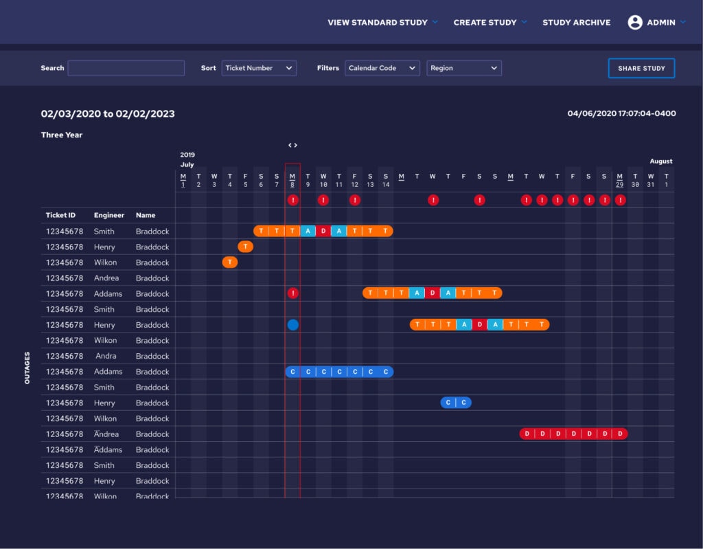
Implementing the initial chart was fairly straightforward since the design team at Simple Thread had crafted a client library with examples of features such as the filter bar, table, modals, and popovers that defined the page. I jumped in, crafting the Django view and serializers and constructing a Vue page and components using the examples as a foundation. The initial version of the study chart came together in just a few short days. When we only needed to display a few weeks of study data, the page was lightning fast and without a single hiccup. But as you can probably guess, this initial implementation ran into some trouble when we tried to load three years worth of data.
Throwing out the naive implementation
With three years of data the initial page load took 30 seconds and I immediately knew this was going to be a challenge. Filtering the data or changing the way it was sorted took close to 20 seconds. Even opening a modal or popover took 1-2 seconds. I opened Chrome developer tools and got some numbers. The table was 35,618×42,635 or roughly 420x my screen resolution. The number of DOM Nodes was 377,014, only slightly above the 1,500 recommended by Google. It was a performance and usability nightmare. Time to dig in.
After profiling and reloading the page using the Chrome Developer Tools performance tab it became clear I had two different areas that I needed to explore separately. First, fetching and processing the data from the server took around 12 seconds. And then once that was done, it took Vue around 18 seconds to render the table and the massive size of the table made any page updates incredibly slow. I started with optimizing loading the data from the server.
Reducing the data
The first change I made was to simplify the data I fetched on page load. In the initial version of the page, I used serializers that included everything in the model (and any related models) needed by the page. Now, I took a different approach. Any data not needed to build the table was removed. Modals and popovers that needed additional data would load that data when opened. I could have started with this direction, but in my opinion, it is almost always better to start with a naive approach and then optimize once you have proven there is a performance problem.
With those changes in place, it was time to make sure the server view actions were working as expected. I started logging SQL to the console in Django so I could see what commands were actually being run when I called them. One of the actions had an N+1 problem. Serializing a related model resulted in over a thousand SQL commands being run in a single action. This was fixed by modifying the command that created the queryset to prefetch the related model. Indexes on foreign keys are automatically created by Django so nothing else had to be done to increase database performance.
The last change I made was to fetch the data concurrently instead of waiting for each fetch command to finish before calling the next. These changes reduced fetching and processing the data from 12 seconds to around 2 seconds. To my surprise, I could eagerly load the data and in this instance, still have an acceptable page load time. I know that 2 seconds sounds like a lot, but for how regularly these studies were being used, it was reasonable given the implementation tradeoff.
Tackling Vue Rendering
While the server side performance issues could be solved by improving upon the naïve solution, (reducing queries and reconfiguring how data was fetched), the Vue rendering was going to require a bit more of a creative solution. There just wasn’t a reasonable way to render that many DOM nodes with Vue and keep the performance acceptable. So I started off by only loading a small part of the table. The computed properties used for outages and dates would limit the initial data set to the first 50 outages and the first 90 days. As the user scrolled down the number of tickets would increase in 50 outage increments and as they scrolled right the number of days would increase in 90 day increments until the entire study was loaded.
After this change the study chart loaded in just a few seconds. Filtering or sorting the data and opening modals or popovers felt instant. That was great, until you started scrolling and loading more of the chart. Then the issues started to return. In addition, the chart was still a usability nightmare. Finding a short duration outage in the second year of a study took a lot of scrolling.
Going back to the drawing board
After discussing the performance and usability issues with the design team, we decided that with larger studies, even if we could optimize it to get decent performance, that still wouldn’t be usable. So instead of always showing each day in a study, we’d roll the data up into months and allow the user the option of expanding or collapsing the month. Everything in the study would start off collapsed, except for the first month.
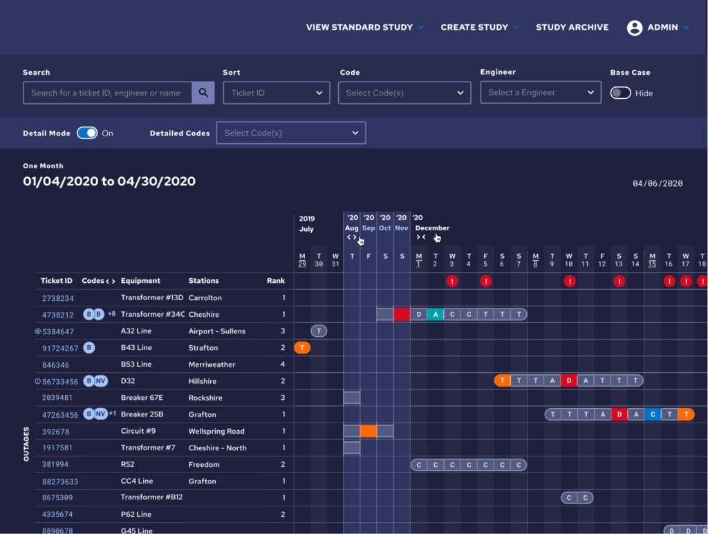
This solution solved pretty much all of our issues. We could show the entire length of the study on load with a minimal performance hit and users could visualize the entire study on one screen. In addition, a button was added to each outage that would automatically expand the months the outage was in and scroll to the first day of it. Clicking on a different outage would collapse the months the previous outage was in and do the same, ensuring performance didn’t degrade over time.
Holistic Optimization
Sometimes when you’re running into an optimization problem, you need to step back and ask yourself if the current solution is optimal for the user. There are certainly valid situations where loading a ton of data and displaying it to the user is ideal. But often if you’re running into performance issues because you’re showing too much data, you’ve passed the point where the user can reason about what you’re showing them. At that point it can be time to step back, think about what your user needs, and redirect your efforts.
Loved the article? Hated it? Didn’t even read it?
We’d love to hear from you.