

Every day at 7:45pm a reminder pops up on my phone: Peloton.
Translation: Workout tonight. Ideally by this time my kids are in bed, and I can start scrolling through the classes to figure out what workout I want to do.
I usually don’t have a plan. I decide what I want to do based on how I feel at that moment.
- What kind of class? Strength or Cycling.
- Which instructor? Tunde, Robin, or Christine.
- How long? 15, 20 or 30 minutes.
- What kind of music? Pop, Rock, Reggae or something else.
- Should I check out an artist series class? That Lizzo ride was fun…
There are a lot of classes to choose from, and no matter what I pick, I know I won’t be disappointed. The classes and instructors are really, really good. The quality of their programming and expansive class offerings keep the workouts challenging, diverse and fulfilling. The same can be said for the instructors. That’s why Peloton is so successful; they have phenomenal content.
However, my experience using their platform leaves a lot to be desired. For starters, navigating through these classes is disappointing. Even when I have a specific class in mind, finding it is harder than it should be. Beyond that, the app itself lacks features that are attentive and intuitive to user needs. It misses the mark in so many ways, from issues with discoverability and customization opportunities, to inferior class experiences.
It’s such a stark contrast to the programming and message they preach: empowerment, prioritizing quality, and being the best version of yourself. How can they so obviously deprioritize user experience in the app?
Peloton, here’s my challenge to you: make the app better. The instructors deserve better. Your users deserve better. The whole Peloton community deserves better.
Put the same care and effort into UX that you put into the classes. In the words of Robin Arzón, “You did not wake up to be mediocre.” Let’s make this app’s UX worthy of the content.
“If Britney can get through 2007, you can get up this hill.” – Cody Rigsby
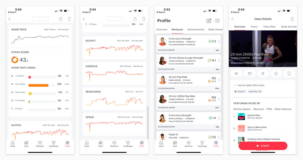
Hell yeah, I did get up that hill! Now show me how I got up that hill faster and with more resistance this time around versus the last three times I took the class.
A big miss on Peloton’s part is leaving out historical data as it relates to classes I’ve already taken. Since I repeat classes a lot, I’d love to see how my strength has increased, or dipped, over time. Fitness levels change slowly. I may not notice it, but the trends won’t lie.
Right now, the only way I can see this data is by painfully scrolling through my previous workouts, or while I’m riding, which is very limiting. I’d love to see a more robust comparison feature where I can see various metrics ranging from heart rate, to my strive score, to cadence and resistance for each time I took a class.
When you can see where you started and how far you’ve already come, you’ll naturally be more motivated. Nothing is more motivating than seeing progress, but in the platform it’s mostly hidden.
“Consistency is key.” – Dennis Morton
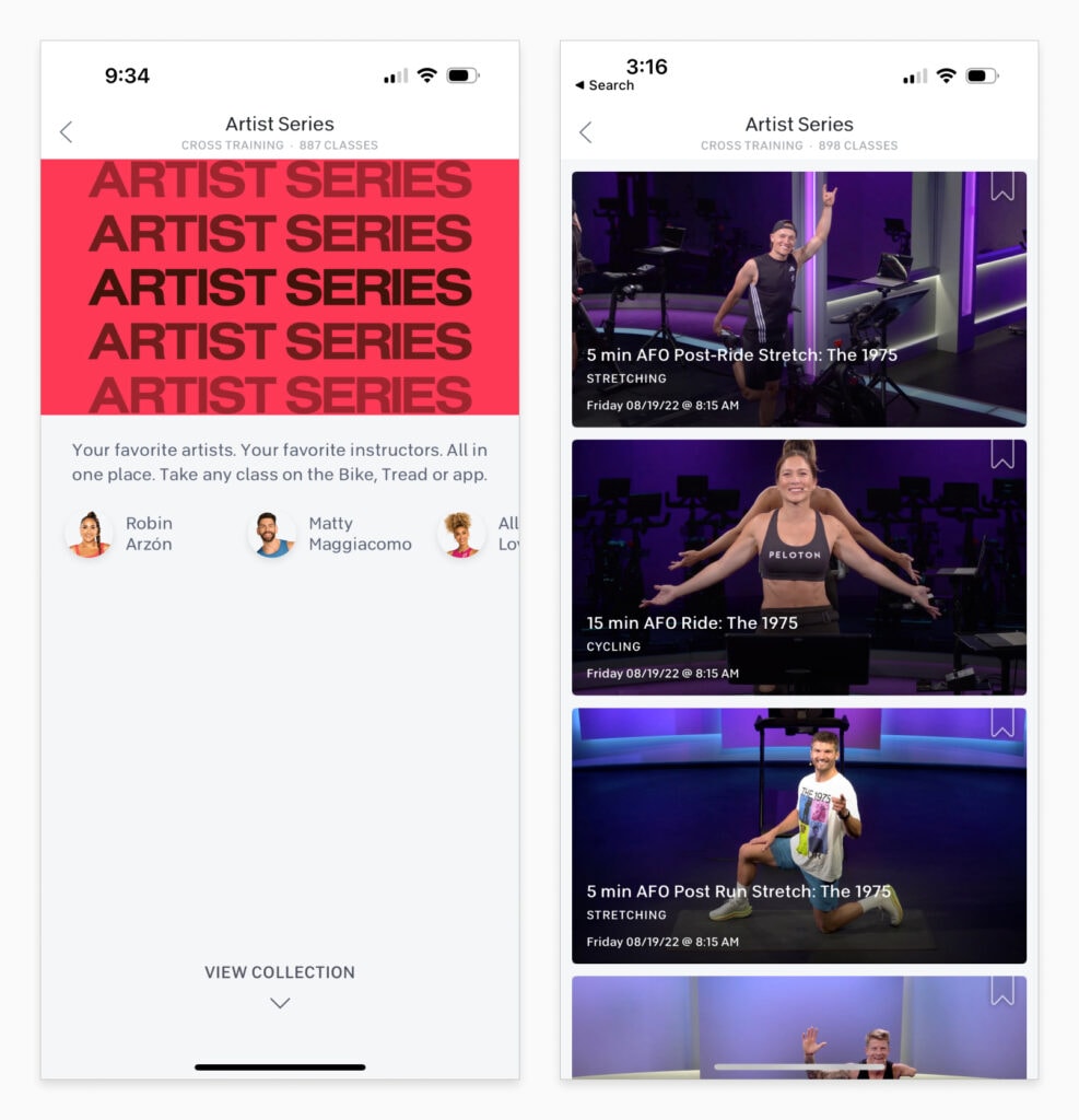
Filtering should be consistent and available across all class lists. Right now there are a few exceptions, including the Collections area of the app, which groups classes by type, artist or theme.
One Collection I frequent is called “Artist Series.” This collection has 887 classes across 49 different instructors and probably 170+ artists. They are sorted alphabetically by default, and there are no other sorting or filtering options. So if I want to check out classes with the artist The Weeknd, I have to scroll and scroll past 800 classes until I find classes featuring that artist. 800.
This seems incredibly easy to change into a better experience. Add filters, at the very, very least. Save me the time and energy figuring out if the class I want even exists, and then make it easy to find it.
You have such amazing content. So much work goes into producing these great artists series. Don’t hide behind a mediocre user experience.
“Make modifications not excuses” – Alex Toussaint
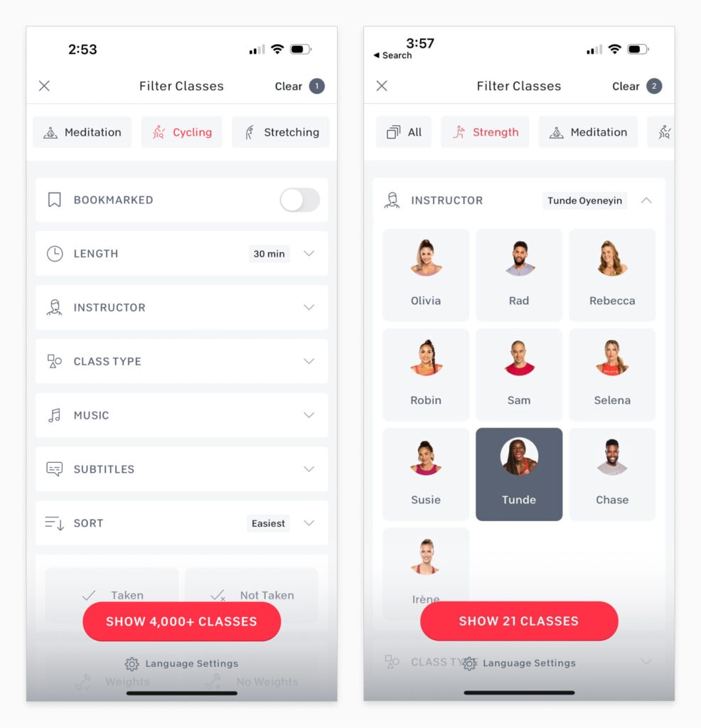
Where filtering exists, it’s fine, not great. A few tweaks could greatly improve the search capability.
It would be ideal if the app allowed me to save filters and assign them as a default. I take classes from two instructors regularly, and occasionally rotate between a few others when I want to switch things up. I’d love to save these presets and only see their classes by default so I don’t have to apply the filters every time I go into the app.
Likewise, exclusionary filters would be great for discovering new programming. For example, I can filter rides to only those with specific instructors, but there’s no way to exclude certain instructors. Imagine that I want to see the most popular 20-minute rides not led by any of my favorite instructors. It’s not possible.
Again, it feels like the UX is hiding content and adding unnecessary friction to the process of exploring the platform.
“How you do anything is how you do everything.” – Jess Sims
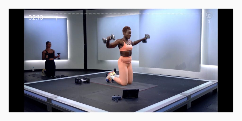
During on-demand cycling classes you can see target metrics, which are “metric ranges based on the instructor’s in-class recommendations.” These cadence and resistance metrics automatically update per the instructor’s cues throughout the class, allowing you to follow along.
Being able to see these in real time is a game changer. I don’t have to be actively listening 100% of the ride or strength class. I can focus on the push, the climb, or focus on finishing out my reps, even if the instructor has moved on.
However, they do not include these cues in the mobile app for cycling classes, and neglect to include weight and rep targets for strength classes, regardless of the device. This creates a distraction while I’m working out. I’m worried about listening and following along instead of simply focusing on my body and its capabilities.
Not only is this inconsistent with the bike experience, it also goes against the messages the instructors are constantly preaching – put your baggage aside and focus on the moment.
“Keep your squats low and your standards high.” – Robin Arzon
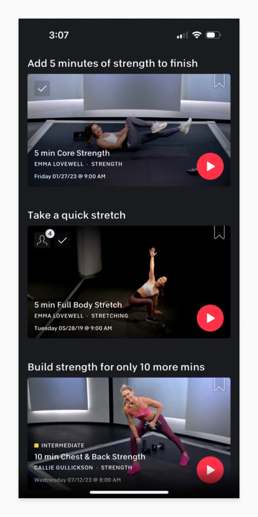
After I take a class I am prompted to continue working out with suggested classes. These can range from any type of class with any instructor. With this being the case, I find that I’m almost always passing on their suggestions.
This is a huge missed opportunity. It takes time and effort for me to bypass these suggestions, go back to the search, and find something I want to do. By that time, I might decide I’m done working out.
Granted, I could plan my workouts better, creating my own program and stacking classes back to back prior to starting my workout. But it would also be great if they suggested classes with instructors I often take and/or with types of classes I often stack.
With modern software tools, the platform should be able to learn what I like, certainly get closer than their current generic recommendations. For example, I rarely finish a 30 minute cycling class and then wish I could take another ride. I’m almost always going to do a short core class, a cool down or stretch, and within those categories, I have preferred instructors.
Post workout is not the time to suggest an instructor I rarely workout with. It’s a time for familiarity and easy decision making. I’d love to see suggestions more aligned with my interests.
Together We Go Far
Overall, Peloton has pushed me forward in so many areas of my life and I’m grateful that it has guided me in investing in my health, both mentally and physically.
I’d love to see Peloton take all of the love and attention the instructors put into their programming and apply it to the software. What I’ve outlined are small feature upgrades but together they would go far to making the experience so much more enjoyable.
Loved the article? Hated it? Didn’t even read it?
We’d love to hear from you.