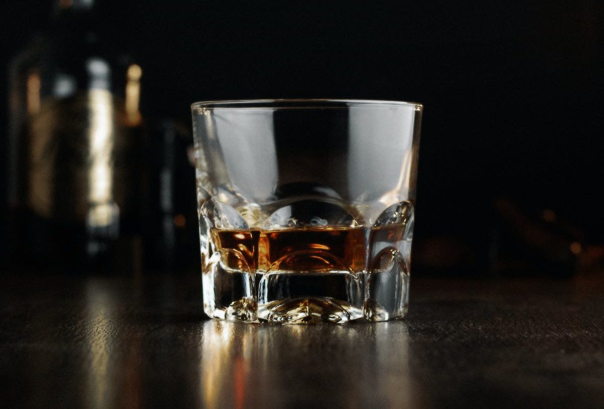
We all have our indulgences and for many of us at Simple Thread one of the biggest is bourbon, so we decided that for National Bourbon Day (June 14th) we’d talk about some of our favorite bourbon designs. Now to be clear, we aren’t at all talking about the bourbon itself. Not all bourbons are created equal (trust me my wife once bought me some bourbon distilled in Sweden and it was undrinkable) and not all bourbon labels and bottles are designed equal either. The bourbons we’ve chosen have impeccable design in either their bottle, their label, or both and deserve a little shout out. So without further ado and in no particular order, here they are.
Burnside Goose Hollow RSV Bourbon
East Side Craft Spirits & Craft Canning
Design by: Sandstrom Partners – https://sandstrompartners.com/
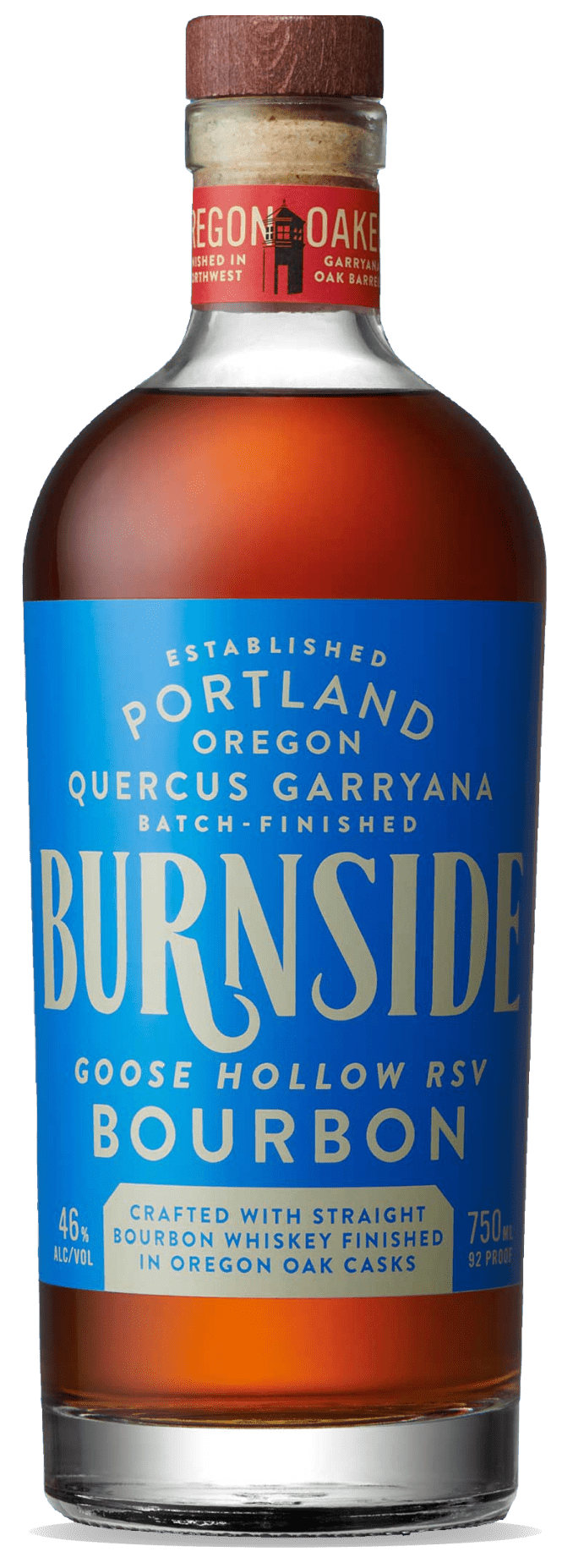
The label for Burnside Goose Hollow is a nice departure from the look you usually tend to see in bourbon labels. It eschews the overly ornate lettering for something far simpler which gives it an air of sophistication. The choice of a blue label helps the bottle stand out on a shelf full of black and silver/gold labels.
We give this 4.5 out of 5 rocks glasses.
Missouri Ridge Bourbon
Coastal Distillery
Ginger Monkey Design – https://gingermonkeydesign.com/
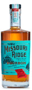
Relying on a stipped down but traditional look, Missouri Ridge still uses an eye-catching label design. Distilled in Missouri but imported and bottled in the UK, Missouri Ridge makes great use of etching styled illustrations (hey, kinda like us!) that help to make the gold foiled lettering jump off of the bottle at you.
We give it 4 out of 5 rocks glasses.
Bond & Lillard Bourbon
Campari Group
Designed by: Moxie Sozo – https://moxiesozo.com/
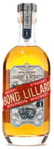
Bond & Lillard reaches back into its past for this label with the red band as well as the 1904 St. Louis World’s Fair grand prize seal being two elements that were brought over from some of its earliest packaging which, according to Moxie Sozo, allows “consumers to explore the brand’s authentic past.” Overall, this label makes you feel as if you’re drinking from a bottle that’s been waiting for you for 117 years.
We give it 4 out of 5 rocks glasses.
In The Woods
Wigle Distillery
Designed by: David Pini – https://www.dmpini.com/
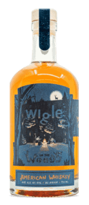
Another departure from the norm on the bourbon shelf, Wigle has distinct labels across their entire line of bourbons but this one is our favorite. Using a great illustration as the main focus of the label, letting even the brand name sink into the background, this design makes us want to just go live in the woods.
We give it 3.5 rocks glasses out of 5.
Eighteen 33 Straight Bourbon
Boone County Distilling Co.
Designed By: Neltner Small Batch – https://www.neltnersmallbatch.com/
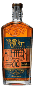
Eighteen 33 leans hard into the normal aesthetic you expect to see on a bourbon bottle. Ornate type filigree abound, making it look as if this bottle came right out of a stereotypical western movie. That being said, it’s no worse off for it, in fact, it’s one of our absolute favorites BECAUSE it hits all of those notes just right.
We give it 4.5 out of 5 rocks glasses.
Let us know what your favorite bourbon or bourbon label is and have a happy National Bourbon Day!
Loved the article? Hated it? Didn’t even read it?
We’d love to hear from you.


