

In product design, sometimes relaxing the precision of what is captured can yield a simpler and more pleasant experience.
Recently, Al wrote about taming complexity in software. Since then, a couple of our designers stumbled into a scenario that illustrated one way to gracefully manage complexity in a product design. I offer up the following account of our experience while designing this feature.
Dramatization: The following is a fictional account of real events.
Details were changed in order to make my point clearer and to make me sound smarter.
There we were, deep into our discovery process for a custom project management system. We sat, surrounded by digital reams of gathered user research. Iterations of wireframes and screens were strewn about our figma file. Chaotic masses of prototype wiring led from buttons and links every which way across our screens.
We knew it was coming and we’d been procrastinating long enough. It was time to design the Time-Off Request experience. A small but important feature; we had to get this one right. The rest and relaxation of the entire user population was at stake.
We rolled up our sleeves, gathered our wits, and scheduled some interviews with our representative users. They were each polite, thoughtful and forthcoming. “Who is involved in this activity?” we asked. “What information do they need to exchange?” We carefully and empathetically listened to the responses, accumulating these findings and observations:
Team Supervisors need to know
- The start date of the period of time off
- The end date of the period of time off
- For each day, is it a partial day or a full day off?
- If it’s a partial day off, the start time of the time off?
- If it’s a partial day off, the end time of the time off?
Team Members who made the request need to know
- Am I approved for this time off?
Other Team Members need to know
- Are my teammates here today?
- Does anyone have any upcoming time-off scheduled?
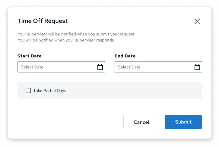
Yes, yes. This all seemed so straightforward and logical. We set to work wireframing something just to handle the initial requests. Things got complex quickly. We thought for simpler cases where the contributor is requesting a few full days off, the UI would need at least three input fields:
-
- datepicker for start day
- datepicker for end day
- Check box for partial days, defaults to unchecked
Not so bad. But how about a more complex scenario. Say a contributor is requesting a week off with every other day a half day. Sounds… unlikely. But with the ability to work remotely, we did hear examples of time off requests that involved being out for a week except for certain key meetings on certain days. There’s any number of ways we could design for this, but here’s a pretty straightforward attempt:
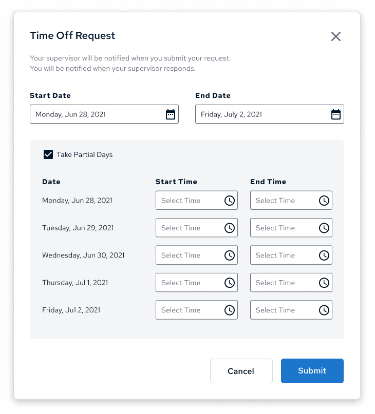
-
- datepicker for start day
- datepicker for end day
- Check box for partial days, defaults to unchecked
- If Partial Days is checked:
- A nested control for start time for each day
- A nested control for end time for each day
Oof! The complexity gets very high once you afford for partial days and it scales linearly with the number of days off in the request. For two weeks off, that could easily be 23 input fields. No thanks!
As a designer trying to make this a pleasant experience, no thanks. As a developer trying to build and handle all this data, no thanks! As a user— NO THANKS!
What did we miss? We asked pretty good questions and got pretty clear answers. The interviewees were so helpful and in such agreement. Why was this simple sounding task shaping up to look like such drudgery? Why was it so complex? This was the moment we realized we needed to take a step back. Remember what was at risk. How would anyone rest and relax-ate with a nightmare set of inputs like this? It would surely haunt every sip of their well deserved beach Mai-Tais. Tinge every slurp of their exotic shave-ice. We’d have to find another way. For the users!
It was then that my fellow designer looked at me and asked “Didn’t you just ask off for that epic bike trek? How did that work?” I slapped my forehead so hard it left a mark that I hoped my helmet would hide. JUSTWORKS. It was so painless, I didn’t even remember it. I logged into my account and navigated to the “Time Off” tab.
It. Was. Beautiful.
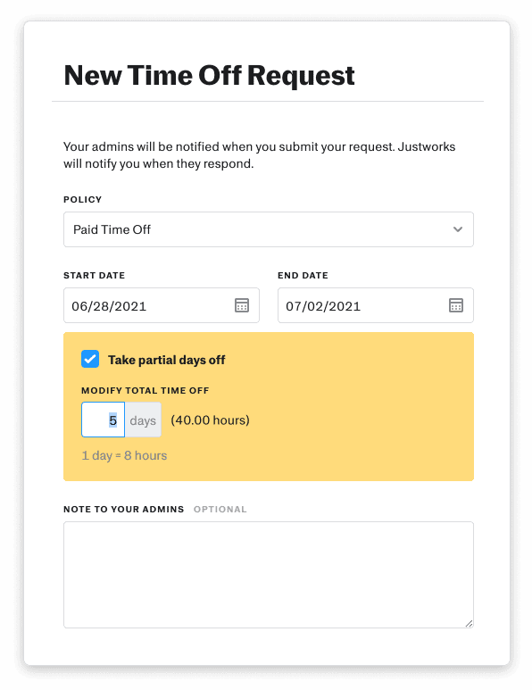
A total of four input fields that can handle every possible version of time-off requests. Even multiple days with some partial days. I guess they don’t need to know what part of the day folks are taking off. Alas, our users did say they needed to know those times because… well, they didn’t really say why. With Justworks’s pattern, we could still surface all the days that a person has requested off. We could still show an indicator next to their profile image marking them as out that day. Accounting could still use the data to generate an accurate paycheck. Where would noting the precise hours actually be meaningful? Would they even tend to be accurate weeks after they were submitted? We took the Justworks example and our questions back to our users. They agreed. There was really no reason to track precise times of partial days and it definitely wasn’t worth the pain of all those date and time picker fields. It really was just a shared assumption of how the thing should work that crept into our interview responses and observations.
Perfect timing. I left for my bicycle adventure and my fellow designer adapted the Justworks approach into our design. Later, user testing showed that folks submitted their time-off requests and were haunted zero times during their simulated vacations. Success!
end dramatization
When things feel overly complex in a user experience, scrutinizing the requirements driving that complexity can reveal that some were unnecessary. Or, at least they might be non-critical and well worth dropping in favor of a simpler, more graceful experience.
Also, look for reference from existing solutions and never be afraid to go back and ask more questions.
Loved the article? Hated it? Didn’t even read it?
We’d love to hear from you.


Well written. Now I want to know more about that epic bike adventure.
Ha! Me too.