

Just last week my business partner called me a bit flustered. He was trying to configure our remote meeting service so that a project manager on our team could schedule a meeting, and then anyone on our account could start that meeting. We didn’t want the project manager to have to be present in order for the meeting to start. We also wanted this to be the default setting across our entire account, so others wouldn’t have to deal with it.
It seemed like a fairly innocuous request, but we had no idea what we were in for. The next 30 minutes was like going on an archeological dig through a system that had layer upon layer of functionality that slowly accreted over time without any awareness that the experience as a whole was rotting.
I’ll attempt to give you a quick overview of the process we went through, but while you’re reading through this, I want you to keep this quote in your mind:
“If the user can’t find it, the function’s not there.”
Source Unknown
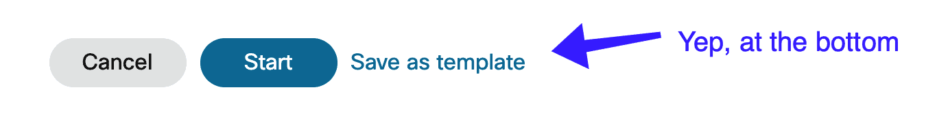
We started by looking for an account setting for this feature, and quickly figured out that this isn’t a setting. Instead we needed to create a “meeting template,” which can only be created from the “schedule meeting” page. It made sense once we found it, but the location of the functionality felt like it was added in the easiest possible place, not the one that was the most easily discoverable.
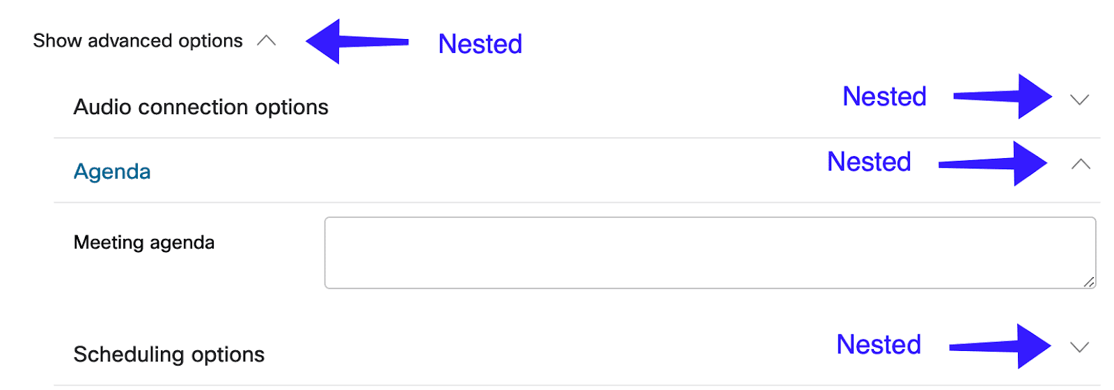
Next we had to find the setting on the scheduling page that enables the behavior we want. This took some doing, since it was hidden within two nested collapsible menus. Nested, nested, nested!
Okay! With our options set up, we were ready to save this sucker!!!
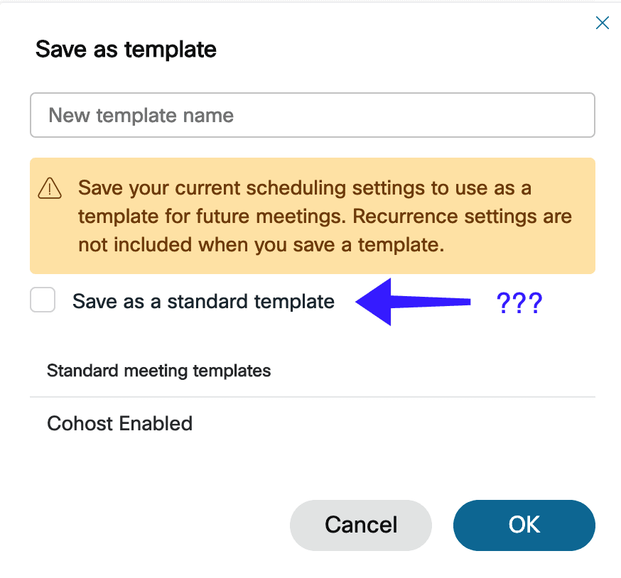
What? No help text, nothing. No idea what a “standard template” is, but after a little Googling we found out it meant that it would be available to all users. That’s just what we need to do, but couldn’t that option have just said “Make this template available to all users?”
Time to make it the default template
I guess that wasn’t so bad, now we just need to make this template the default. Should be as simple as finding the option, right? Wrong. We hunted around the preferences of the site, and these were all the sections:

Nothing about templates. Okay, interesting. We start hunting around the UI and find this:
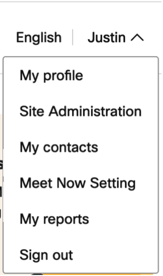
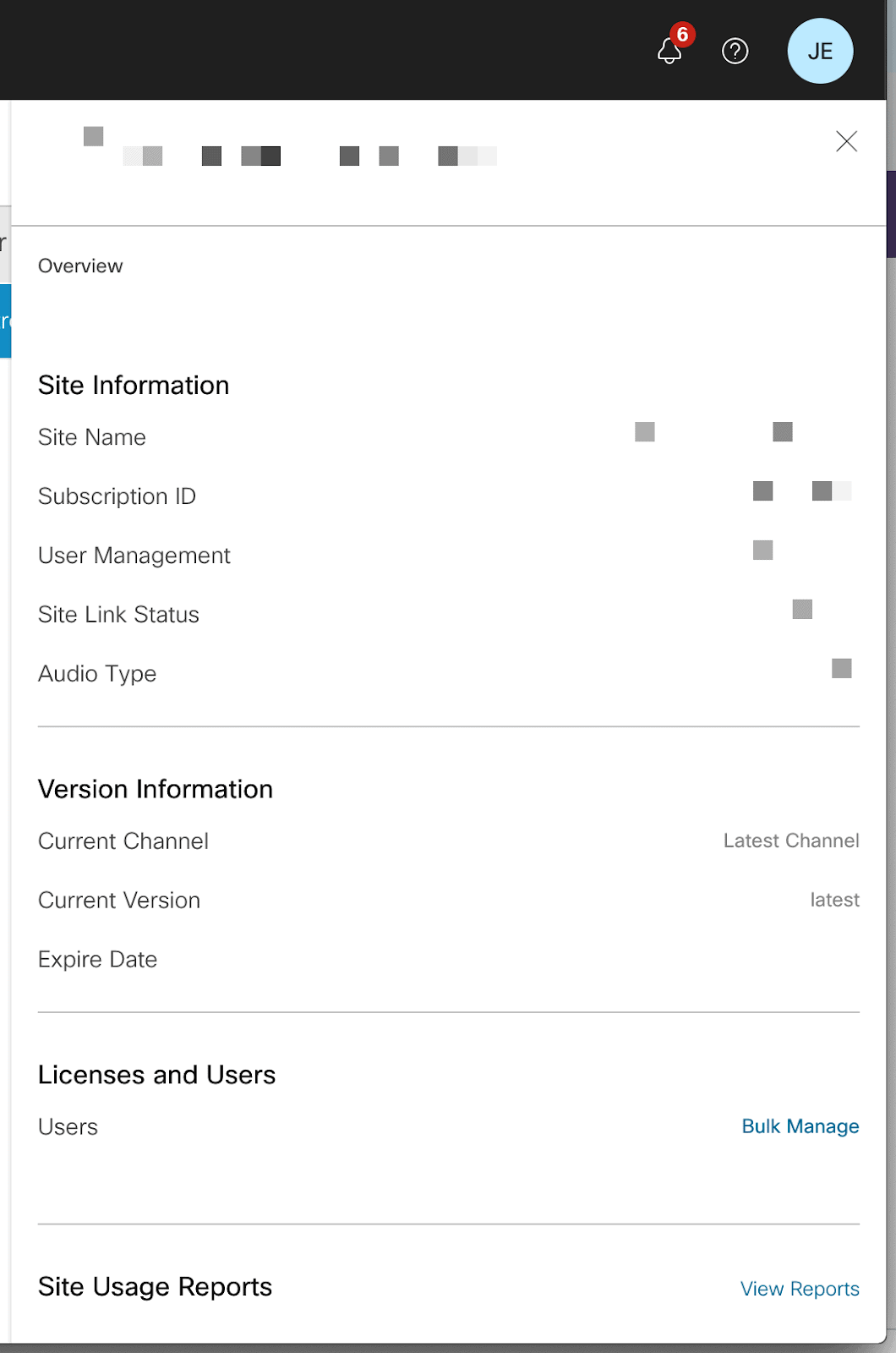
Under my profile menu, there is an option called “Site Administration”. Not sure what a “Site” is, but “Administration” sounds like a reasonable possibility. So we clicked it, which opened an entirely new tab and whisked us away to a new site with a totally different design and experience.
At first glance it looked like it was just billing information and user management. We started to lose hope. But, before we gave up, we decided to check the profile menu again. It worked for us last time, why not give it another try?
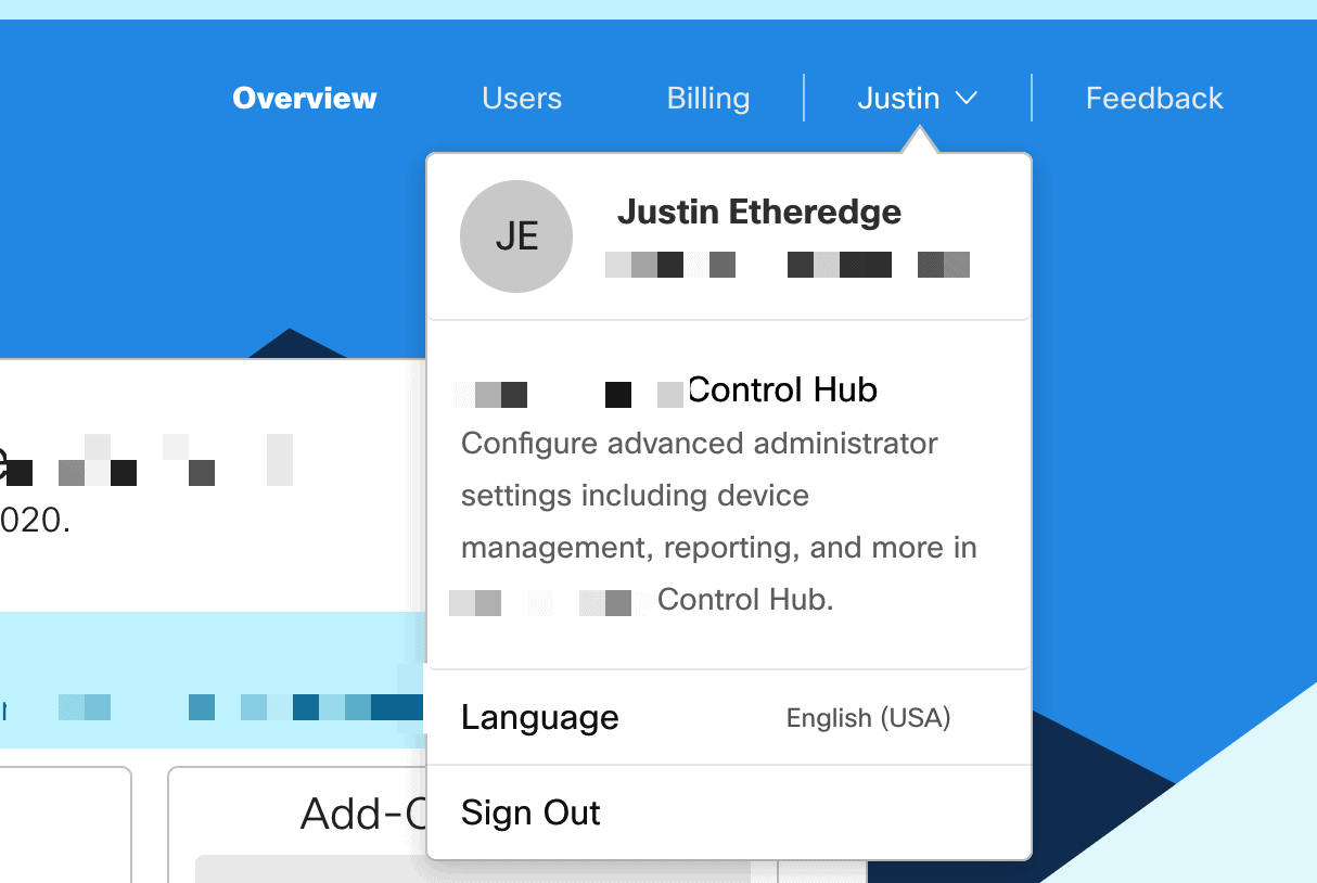
Underneath the menu was something called the “Control Hub”. Not sure what that is, but it sounded like a possibility. We clicked on it. I’ll let you guess what happened next…
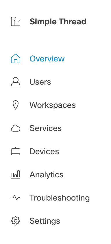
A third site, with a third design and user experience
Yep, a whole new site. This one looked like an administrative dashboard you would expect out of an enterprise tool—a dashboard full of service statuses, devices, onboarding, updates, etc. It was a jarring change from the previous two sites which looked more business consumer-focused.
In the menu on the left we found this:
We were looking for a setting for a service, so “Services” felt like the only possible option here. We closed our eyes and clicked it. We were presented with a grid that contained a number of options, but one of them looked like this:
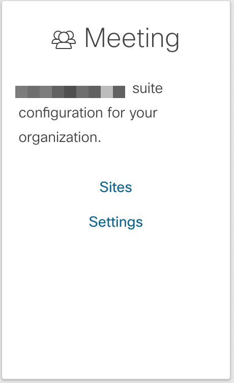
Settings! Great! We’re getting warmer! Wrong. Clicking that link went to a separate page where there was a *single* setting that had nothing to do with our search.
At this point, you’d be right to wonder why we kept going.
With no other good leads, we clicked on “Sites,” which took us to a page with a single row:
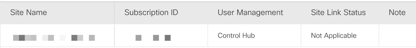
Hovering over the row turned it blue, and even though the cursor didn’t change, it turned out to be clickable. Once we did, a tray slid out from the side of the screen (this is the first slide out tray we had seen up to this point):
At this point, we thought we had reached the end of the road. However, by random chance I realized that this panel scrolled, revealing a button at the bottom.
Behold!
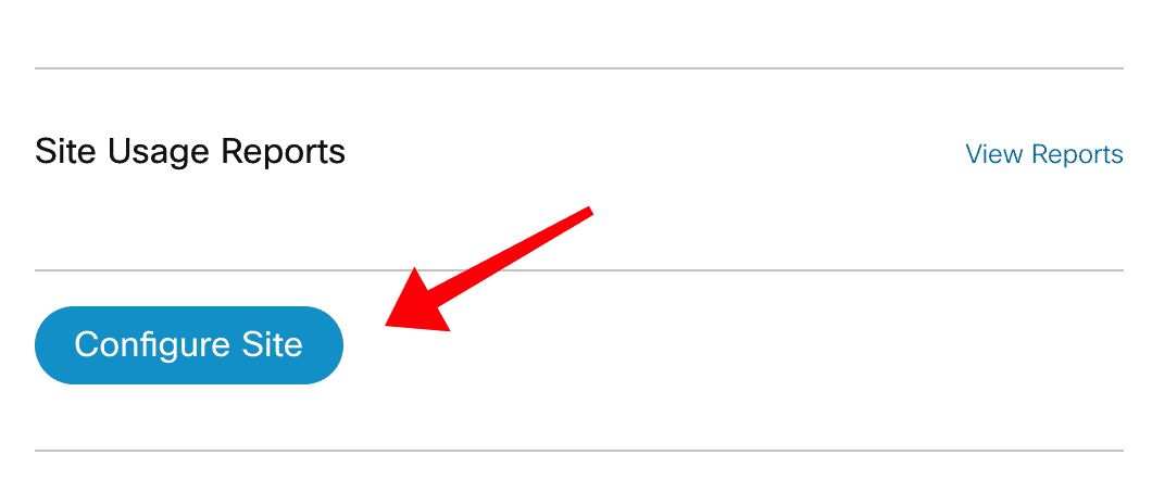
Time to configure the site! Still not sure if we were getting anywhere, but at least we were digging deeper and deeper through the layers of sediment. (At this point, we had to be somewhere around the Permian period.)
Just when all hope was lost…
Now that we’d been dumped on a screen with a bunch of settings, it became a kind of “Where’s Waldo” hunt to find the template settings, which we finally found at the bottom of the middle column:
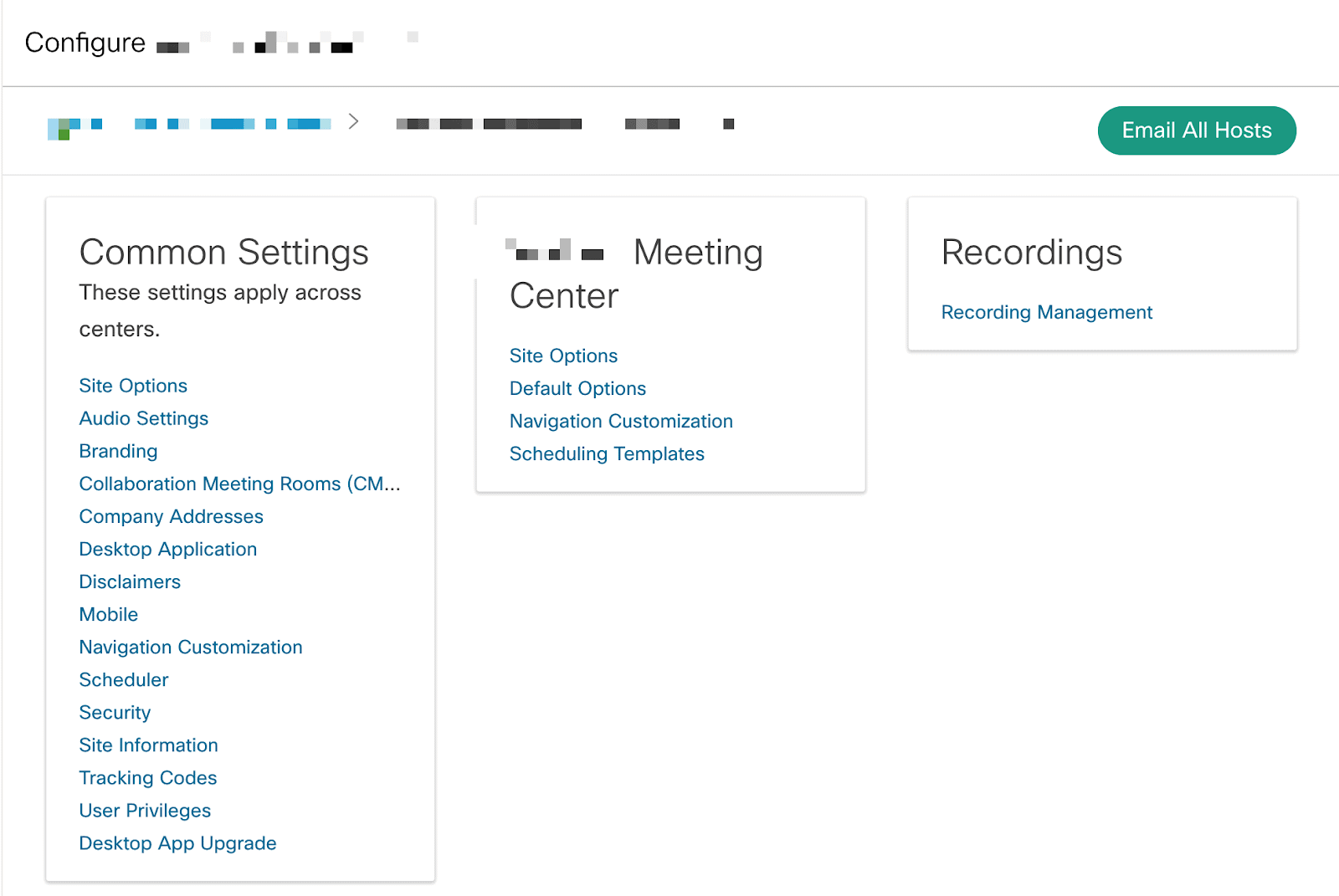
Clicking on the “Scheduling Templates” option took us to a screen where there was a “set as default” column and a save button:
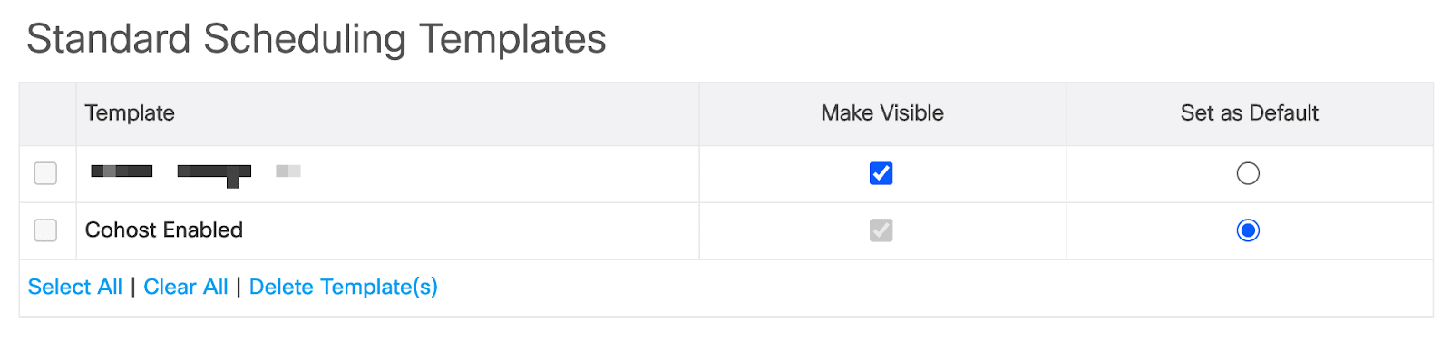
When we got to this page, we both sat in a bit of stunned silence. I’ve skipped most of the false starts and rabbit holes we went down to get here, and so the joy of actually finding this setting was lost among the disbelief at the effort it took to get there.

If you made it all the way through that, congratulations. It was a Rube Goldberg machine of confusing settings, random menus, multiple domains, hidden buttons, different designs, conflicting interaction paradigms, missing affordances, and nonsensical options. I’m still amazed we persisted long enough to find it.
Most of us know how this happens
It might seem hard to believe that anyone could have let a system get to that point. But I think a huge portion of the software engineers reading this post are starting to feel pretty defensive right about now, because we all know exactly how systems get to this point:
- The system is commissioned. If you have a design team, they are brought in to talk to users and stakeholders. Hopefully some user research is done, and then journeys, flows, wireframes, and mockups are put together. If you’re working in a very small environment, most of this work is probably done by the engineering team and business stakeholders.
- The initial system is built. The design evolves along the way, but hopefully the initial system feels cohesive and works well. It was all designed together after all!
- New features are requested. Design may, or may not, be brought in to work with the new features. Users may, or may not, be consulted about the new features. The new features change the system in small and barely perceptible ways. A screen gets one more menu option, one more button, one additional line of text, one more step.
- Repeat step #3 about 500 times. During this process the design and engineering teams make every effort they can to maintain some semblance of consistency, but it is challenging given timelines and budgets.
- The system starts to feel really cumbersome. Nobody understands exactly what happened. Time for a rewrite. A new system is commissioned. The timeline for rebuilding the new system is set for about six months, even though the initial system took many years to build.
- You get one year into the six month rewrite and you discover that you just can’t recreate all of the functionality of the old system given the constraints. The investment is too high, stakeholders are upset, and so you decide to leave the old system up and use parts of it linked to the new system. You end up with multiple databases, duplicated functionality, different UI paradigms, links to the old system, etc…
- Go to step #5 and repeat.
The deeper you get into this cycle, the more buried you get. Everyone is optimizing for the short term win, and by the time you get through a few cycles you’re stuck. It would take a monumental effort to perform a full rewrite, which for small software companies, is an existential risk. For large companies it becomes competitively infeasible to “stop the world” long enough to attempt a rewrite.
But my product isn’t that bad
You’re probably reading through the list above thinking, “There is no way my software is that bad.” You might be right, but I would argue that you really don’t have any way of being sure if the only data you have is your own experience.
If you watched a relatively new user navigate your product and attempt to accomplish a set of specific tasks, you might be surprised. You’d get to see how often they get lost, pick wrong options, configure things incorrectly, have poor mental models, and in general do things that you would consider nonsensical.
But that’s because you’re looking at the system with an expert’s mind. Once you’ve worked in a system for many years it can be nearly impossible to see the system with a beginner’s mind. You understand the system in a deep way, and so your experience and your choices are influenced and enhanced by the existing system knowledge you already have.
“In the beginner’s mind there are many possibilities, in the expert’s mind there are few.”
Shunryo Suzuki
When a beginner looks at your product they see an infinite number of possibilities, which makes performing tasks significantly more confusing and error prone. They don’t have any intuition about where to start or where to look for something. They aren’t familiar with the terminology. They don’t understand any of the history of the system. They experience a very different product than the one you experience.
How can we fix it?
The answer is to perform consistent user testing of your application as it evolves. Easy, right? Well, kinda.
Let’s say you’re out of shape, and you go to your doctor. She is going to tell you to exercise more. The act of exercising is very simple, but the solution is incredibly hard. You’ve got a busy life, you’ve got kids, you’ve got a demanding job, and you’d need to carve time out of every day in order to fit it in. You’ve got to rearrange your life in order to make a change like that.
You’re in the same situation here. The task of user testing is actually very simple, the pain is in the long-term execution. You can’t only perform user testing on new features. You can’t only perform user testing on updated functionality. You have to perform consistent user testing on the experience as a whole. You need to watch users (often new users!) perform everyday tasks with your software and make sure that you still have a usable and cohesive experience. As I said earlier, if you have extensive experience with the software, you’re no longer able to tell if this is the case or not.
You don’t have to find a dozen users to do this testing. Jakob Nielsen from the Nielsen Norman Group recommends five, but I would argue that if you’re doing consistent testing you can get away with much fewer than that. In Nielsen’s article he says, “As soon as you collect data from a single test user, your insights shoot up and you have already learned almost a third of all there is to know about the usability of the design.” If you’re doing ongoing user testing, then with just a single rotating user you can uncover a huge amount of data about the usability of your product.
When your user testing shows that your experience is deteriorating, you need to make changes to get it back in shape. But that takes energy, and it takes time. For many companies it takes a fundamental shift in how they think about building software.
A shift from projects to products
Many companies realize the importance of maintaining the experience in their software and continually invest in it. But for companies that aren’t doing this, often the biggest thing holding them back is being stuck in a project-based mindset. If all of the resources for your software are allocated around new features and updated functionality, then how will you find the resources to continually monitor the experience of your software and then invest in the necessary changes to keep it from rotting?
The answer is: you won’t. Budgeting for any kind of system maintenance is a challenge for many organizations, even for critical items like security. In order to make a long-term shift, your organization must face the reality that software products continually evolve and need to be constantly maintained—not just from a security perspective, but from a design and architectural perspective as well.
User testing, an investment that will pay off manyfold
In my opinion, keeping your interface usable and consistent is far more important than adding new features and functionality. If you’re not doing consistent user testing then you won’t be aware of how the user experience of your product has deteriorated until users start complaining or worse, leaving your product.
There are a lot of quotes about the value of user experience and usability testing, but many of them aren’t based on good studies or real data. The Nielsen Norman Group has done some of the most extensive ROI testing around usability and found that “estimated productivity gains from redesigning an intranet to improve usability are 8 times bigger than the costs for a company with 1,000 employees.” Even assuming some margin of error here, the ROI still points to improving the happiness and experience of software.
But don’t take my word for it
But if, like many people, studies from consulting groups don’t quite convince you, then how about you run an experiment? Do a bit of user testing yourself and watch customers (or employees) use some of your existing applications. See what they run into. You might be surprised.
If you continue to run experiments over time, you will see the number of usability issues that your testing is finding, and will be able to tell whether you’re making progress. Then, adjust the level of user testing accordingly. It’ll be an investment, mostly in time, but the worst thing that will happen is your software will stay the same and you can end the experiment. If, however, you uncover some real issues, then you’ll be in a good position to justify the continued investment.
Fight the rot
It is hard to battle the rotting of a user experience. Entropy is a powerful force, and over time if you’re not fighting it, all user experiences will degrade. But, it doesn’t have to be this way. Through regular and targeted user testing, you can continue to ensure that the user experience of your software is being maintained. That way you won’t wake up one day with an email outlining the 30 minutes of their life someone gave away in order to find a simple setting in your software.
Loved the article? Hated it? Didn’t even read it?
We’d love to hear from you.