
After 4 years of med school, an additional year doing research, many stressful months spent studying for the USMLE Step 1 and 2 exams, and weeks spent getting feedback and letters of recommendation, my girlfriend was finally ready to submit her residency applications.
I sat as a second pair of eyes as she double checked everything in her application one last time. After a few nervous clicks she submitted her application a couple days before the deadline, and then it was time to wait.
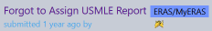
A week later her phone buzzed in the operating room with an email from one of her top programs she applied to. The email asked her if she could attach her USMLE scores to her application since they couldn’t see them on their end. Her application was technically “incomplete.” All of the 50+ applications she’d sent out were incomplete. She ran out of the operating room to get to her laptop and figure out what went wrong. I then got a panicked, expletive-filled text message explaining the situation. “How was that possible,” I thought. I saw that everything had green check marks, and there weren’t any warnings or errors when she submitted it. What happened?
The Problem
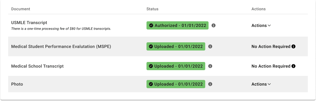
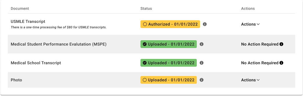
Here’s a screenshot of the problem (well, a Figma recreation of a screenshot). Do you see where she went wrong?
Me neither.
But apparently, even though there’s a giant green-checkmarked section that says “Authorized”, she also needed to click the dropdown labeled “Actions”, and inside that click a button labeled “Assign” to actually attach her exam scores to all of the individual applications.
A chance at getting into a residency program and thousands of dollars in application fees were thrown away because a button was hidden inside of a dropdown.
After attaching her scores to all of her applications, she then had to track down all of the emails for program coordinators and beg them to re-download her application so she can get a chance at interviewing with them.
Potential Solutions
According to the internet, this problem has been happening for years.

People she knows who are involved in the residency process for other programs mentioned that this year their applicants also ran into the same problem she did.
As a front-end web developer, bad UX, especially UX that’s so potentially damaging like this, pisses me off to no end. So how would I fix it?
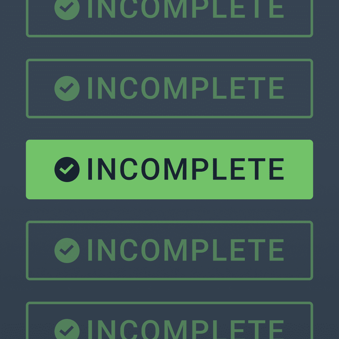
The Easiest Fix
Two things humans love: finding patterns and completing things. Unfortunately that love of patterns is causing a lot of pain here. The USMLE Transcript section is green with a green checkmark, which users instinctively think means “finished” based on…pretty much everything else in the world.
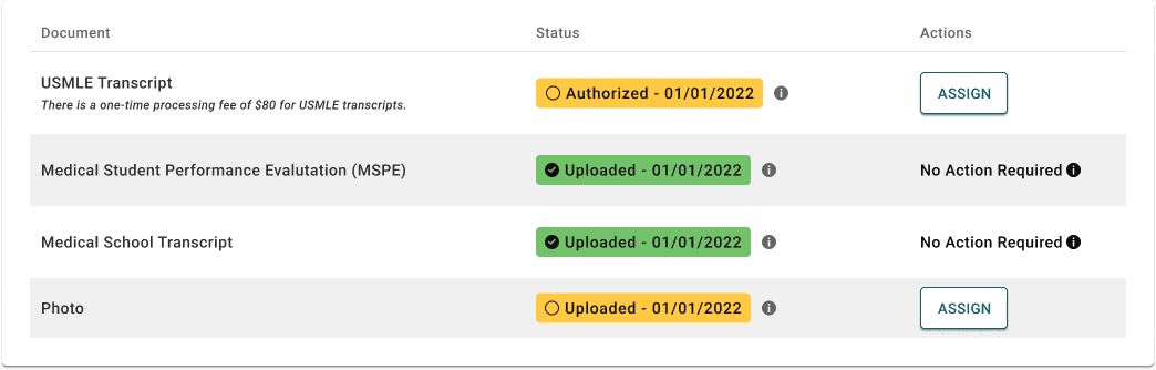
So, the easiest fix is simply to change the background color and get rid of the check mark.
Here we’ve changed the background color of the sections that have more steps to yellow. Classically yellow is used as a warning color, and we’re using it the same way here. “Hey, you need to look at this again because you haven’t assigned your scores and photo to your residency program applications!”
A simple color change is probably enough for users to take a second look and investigate ways to turn the yellow, green.
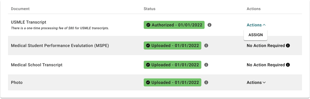
Uncovering Actions
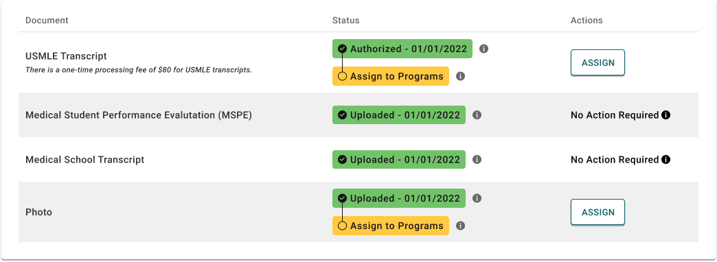
The other big problem with this is that the actions are hidden away in a dropdown. Most of the time when options are hidden in a dropdown, it’s because they’re rarely used. Options like “Delete” or “Edit” will sometimes pop up in action dropdowns, and that’s usually fine. Deleting and editing in most cases are secondary actions the user will be taking.
But in this case, assigning your test scores to your applications is a primary action. Every student applying to residency will be assigning their scores, so why the heck is it hidden under a dropdown?
(This “assign” button kind of looks like a “secondary” button since it’s white, but I’m just using the color from the dropdown hover state. I don’t actually know what the rest of the buttons on the site look like.) Nevertheless, the information is always visible, which is exactly what we want.
If you have multiple actions, you can just stack buttons on top of each other like you already have in the dropdown. It’s better for everything to be visible and tall, than hidden and compact.
Spatial Progress
My final potential fix would be a bit harder to implement, but I think it would do a lot towards getting the whole picture of what has happened and what needs to happen.
We’ve already established the problem is that users think they’re done, but they’re not. Imagine you’re sitting on the couch reading a book. You get halfway through and at the bottom of the page it says “The End.” Would you just close the book then and there? Of course not! You can see that there’s a whole other half of the book. Your spatial recognition of book progress doesn’t match what the book is telling you the progress is.
In this mockup, I’ve created a vertical timeline of the different steps the user needs to take. As steps are completed, they’re checked off, and the next step the user needs to take is highlighted in yellow. Because all the steps are always visible, no information is lost when moving from step to step.
Stay Vigilant
As software developers, it’s our duty to empathize with our users. We must imagine the worst kinds of headaches and heartaches our designs can cause, and do our best to mitigate them. Sometimes problems are truly unexpected, and sometimes tight deadlines prevent us from putting in the time necessary to make things right. Always be listening to feedback, and always be fighting for the time to make things right for the user. Even small fixes can create massive wins.
Hopefully this bad design didn’t ruin my girlfriend’s career, and hopefully it’ll get fixed so it doesn’t ruin anyone else’s.
Loved the article? Hated it? Didn’t even read it?
We’d love to hear from you.